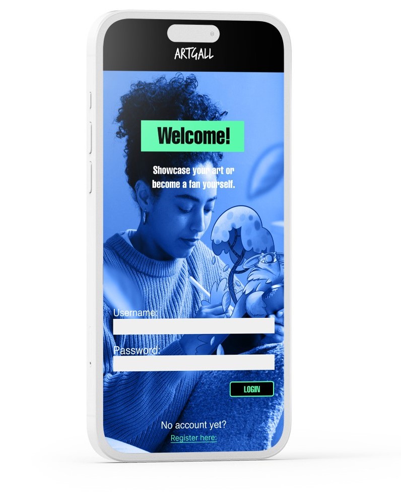
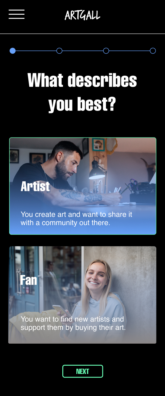
This is a mobile app made for artists and art enthusiasts who want to share their work online and eventually make a living out of it. It’s meant to facilitate the connection and making of community interested in art.
Challenges
It is very expensive to do a physical art exhibition so doing an online one would be more budget friendly for people who are just starting.
Many art fans don’t want to go to a museum because they waste too much time and are bound to the opening hours.
The world is very globalized and many artists don’t specifically have their fan base in their hometown but the place they currently live in.
The Goal
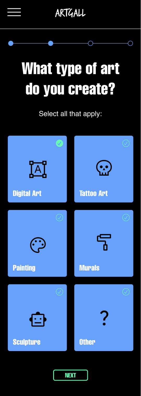
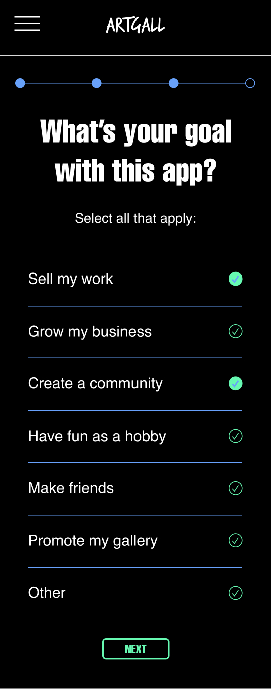
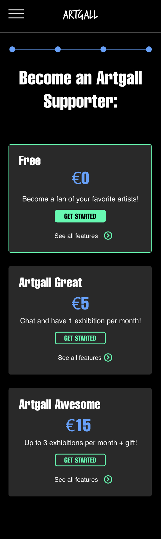
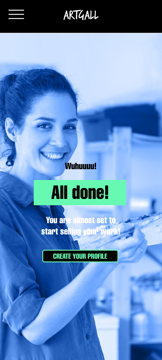
Our art gallery app will let users showcase their art, make online exhibitions, create a fanbase and connect with people which will affect independent artists who want an uncomplicated and fair option to make money from their art by getting financial support on a monthly basis from their fans & keeping 95% commision of the sales they make with from their artwork. We will measure effectiveness by tracking the number of new artist profiles created, monthly fan subscriptions and sales made by each artist.
Understanding The User
I conducted interviews and created empathy maps to understand the users I’m designing for and their needs. I identified through research that people interested in art don’t often visit museums because they find it inconvenient, boring and expensive.
Also there are many artists who want to sell their art or want to make an exhibition, but they don’t have a huge budget to make it at the beginning. According to research, an online platform would make things easier for them and could support them by giving them visibility and helping them sell their work.
Meet the Users
Primary
Sendaya López, 28, Digital Illustrator
Sendaya is a digital illustrator living in a foreign country who needs an easy, language accessible and cheap way to present her art & make money out of it because normal exhibitions are expensive to do and doing it alone in a tight budget is too complicated.
Secondary
Matt Noori, 31, Developer
Matt is a developer & art enthusiast who needs a convenient way to contemplate art without visiting a museum exhibition because museums are too expensive & time consuming, besides one can’t interact directly with the artists.
User Journey Map
Sendaya
Matt
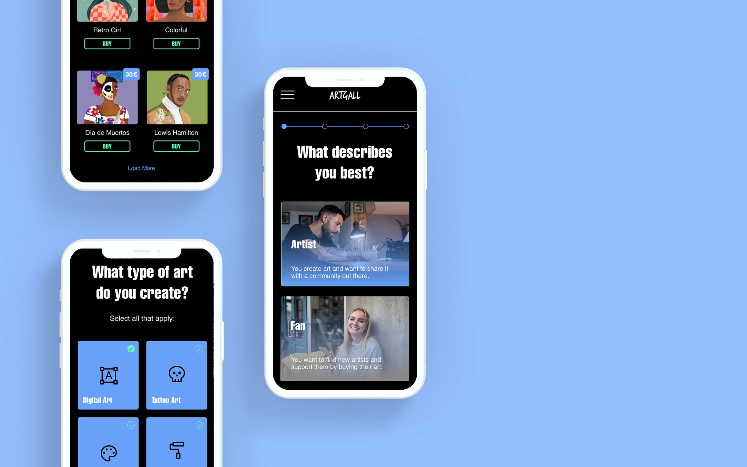
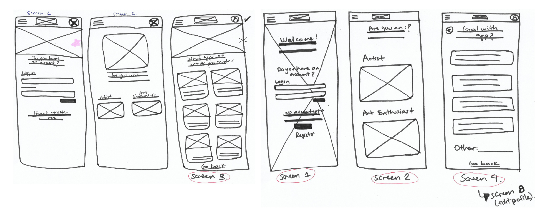
Paper Wireframes
Before moving onto high fidelity wireframes and mocks, I wanted to get a feel for what the core of the app would look like when put in front of me. Paper Wireframes can be a bit messy because it’s the perfect way to put your ideas into life and make quick iterations 😉
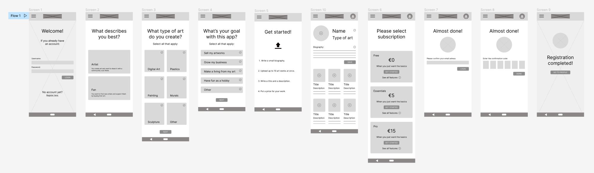
Low-Fidelity Wireframes
Lorem ipsum dolor sit amet, consectetur adipiscing elit. Ut elit tellus, luctus nec ullamcorper mattis, pulvinar dapibus leo.
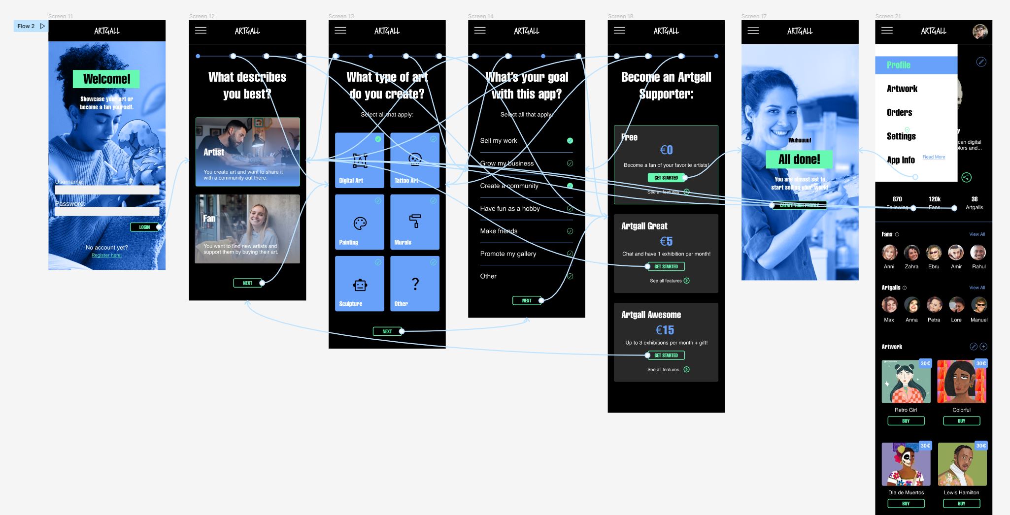
Wireflow
Lorem ipsum dolor sit amet, consectetur adipiscing elit. Ut elit tellus, luctus nec ullamcorper mattis, pulvinar dapibus leo.
Results
Accesibility Considerations
I used a lot of contrast in the color palette I chose. It is very easy to read the info with the dark mode app design. Also the brighter green attracts the user’s attention for example of the buttons.
The typefont I used is very legible and also the size I used for the titles and main info is also very readable.
The user flow is very clear and straightforward. There isn’t much that the user can do wrong and the user can navigate from step to step backwards and forwards thanks to the navigation bar.
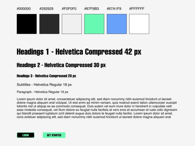
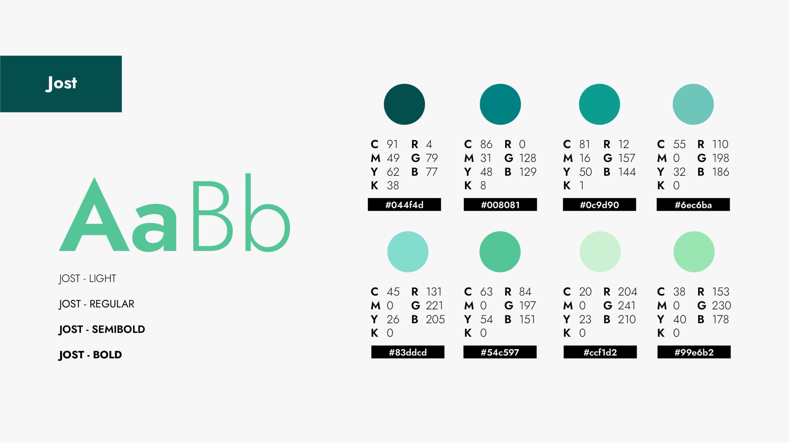
Small Style Guide
I defined a color palette together with the right font to give a singular personality to Artgall. This colors are vibrant, modern and full of energy, just how the app is too.
Takeaways
Testimonial
The App is a great opportunity to get to discover new art and at the same time give the artists the recognition and compensation they should get in “The age of mechanical reproduction”. – Maximilian Grunwald
What I learned:
I learned so much about the user research process at the beginning and how much time you need to invest on the iterations for your high-fidelity prototypes. The design is very important but it’s just based on the previews insights found by the research.
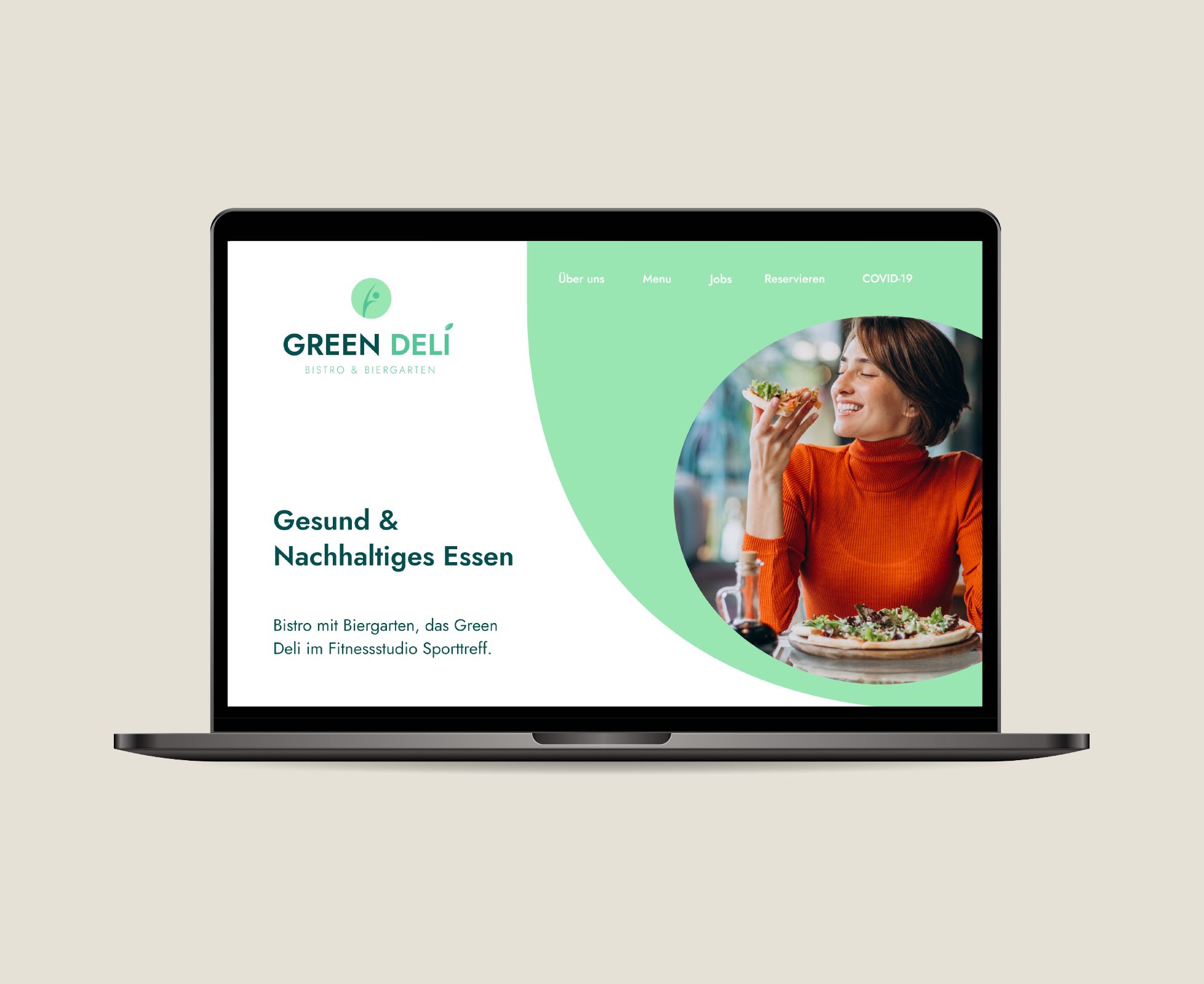
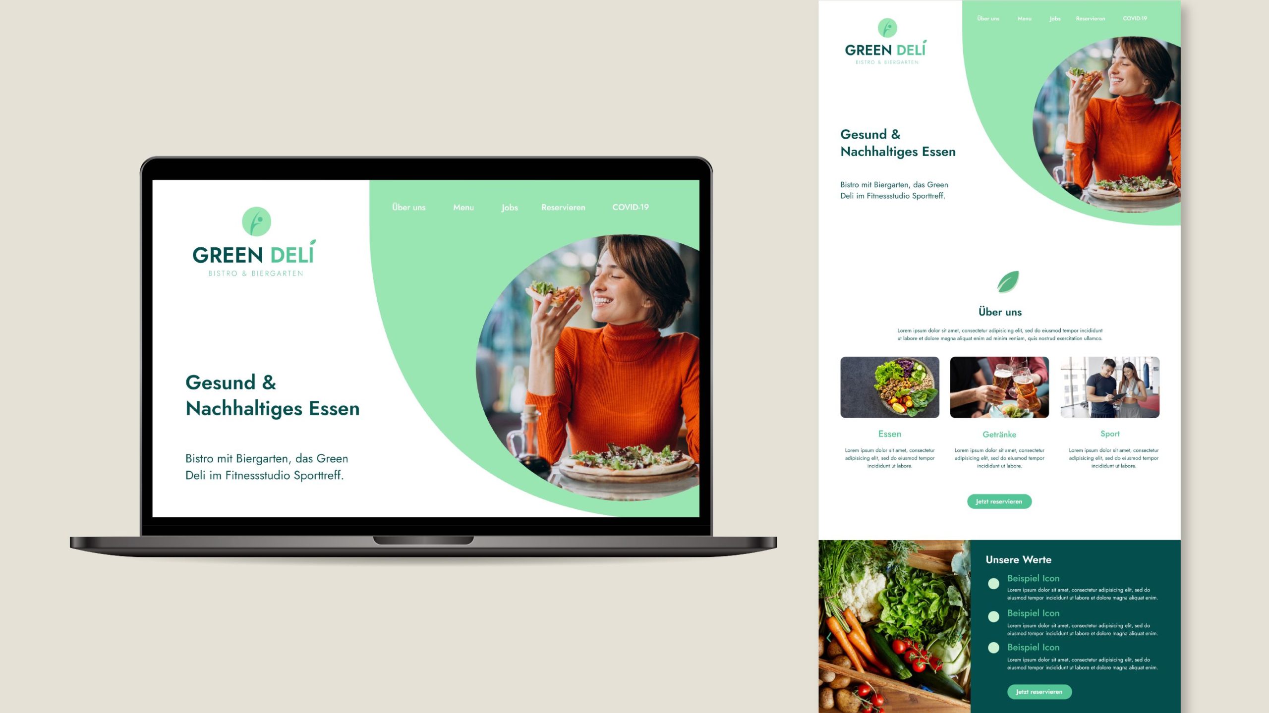
Green Fit is a Fitness Studio located in Mainz, Germany before known as “Sporttreff”. Right next to it is Green Deli, a restaurant that offers high-quality, regional cuisine with a large selection of modern and vegetarian dishes. They both are a subsidiary company and are own by the same person.
"Alexa created a modern logo and website mock-up for our bistro GREEN DELI in a creative and constructive way. The corporate design guide was also implemented quickly and professionally.
The cooperation was uncomplicated and efficient. We feel well advised by Alexa and are already looking forward to the next joint projects."
"Alexa hat auf kreative und konstruktive Weise ein modernes Logo und ein Website Mock-Up für unser Bistro GREEN DELI geschaffen. Auch der Corporate Design Guide wurde schnell und professionell umgesetzt.
Die Zusammenarbeit war unkompliziert und effizient. Wir fühlen uns gut von Alexa beraten und freuen uns schon auf die nächsten, gemeinsamen Projekte."
Challenges
Company's named changed
The company used to be called “Sporttreff” and now they wanted to turn that into “Green Deli” and “Green Fit”.
2 Different Companies yet still belong together
Although Green Fit and Green Deli offer different services, they still are right next to one another and people should understand that both concepts belong together
Attract younger generations/ Modern Look
“Sporttreff” was thought for an older audience. Now Green Deli and Green Fit should attract younger generations without losing their current loyal clients.
Strategy
Analyse what used to be "Sporttreff".
Identify pain points to avoid for the new branding.
Create a completely new branding for both companies that reflects this new business phase.
Bring Green Deli and Green Fit to life and let people know despite their different services, they still belong together.
Solution
Services provided:
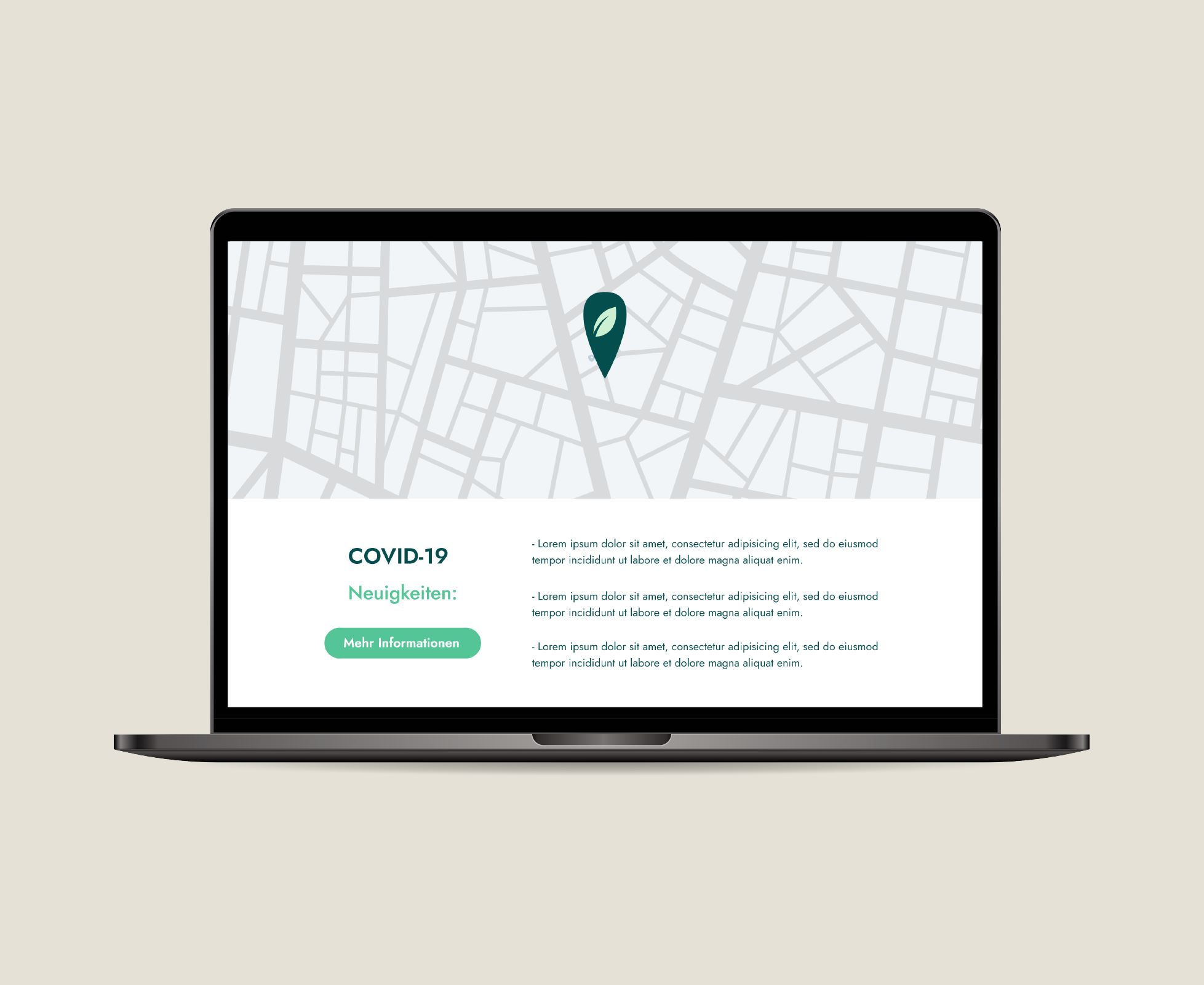
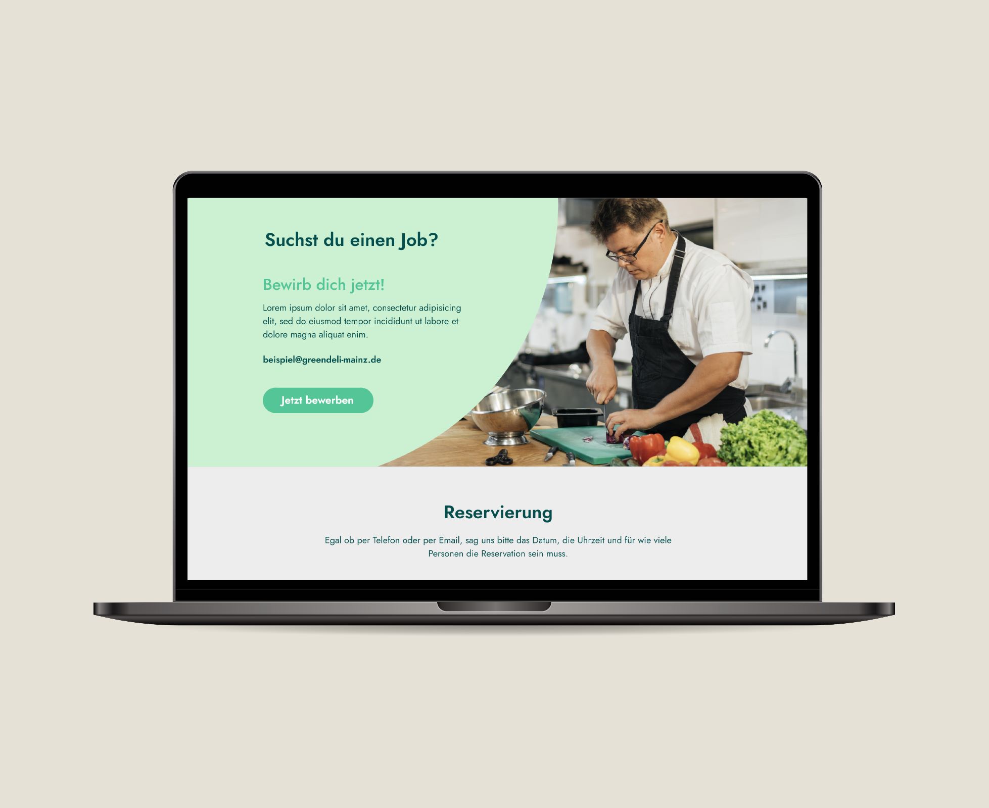
• Corporate Identity (Color Palette, CI Guide, etc) • Social Media Content Creation • Landing Page Design (High-Fidely Mockup)
Benefits
Modern & Fresh Look
Green Deli & Green Fit image was taken in a good way by their audience and with the new more modern branding they could attract younger clients.
Former clients returned and new clients were gained
Many clients that used to support Sporttreff kept on visiting now Green Fit. New clients were also acquired during this process for Green Deli.
Social Media Success
Sporttreff had no Social Media presence. With the new Banners and other Social Media Templates, Green Deli & Green Fit could slowly build an online community.
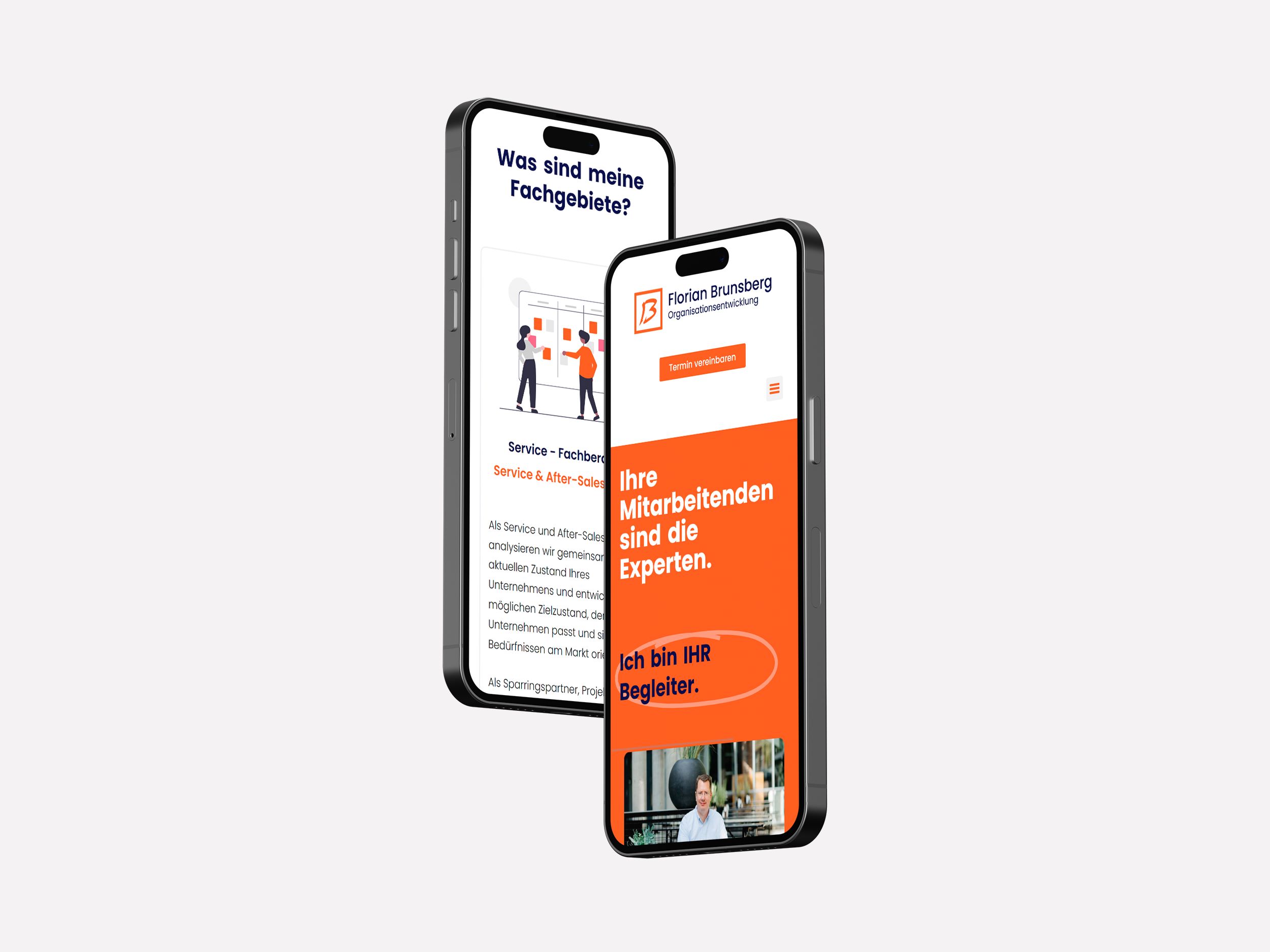
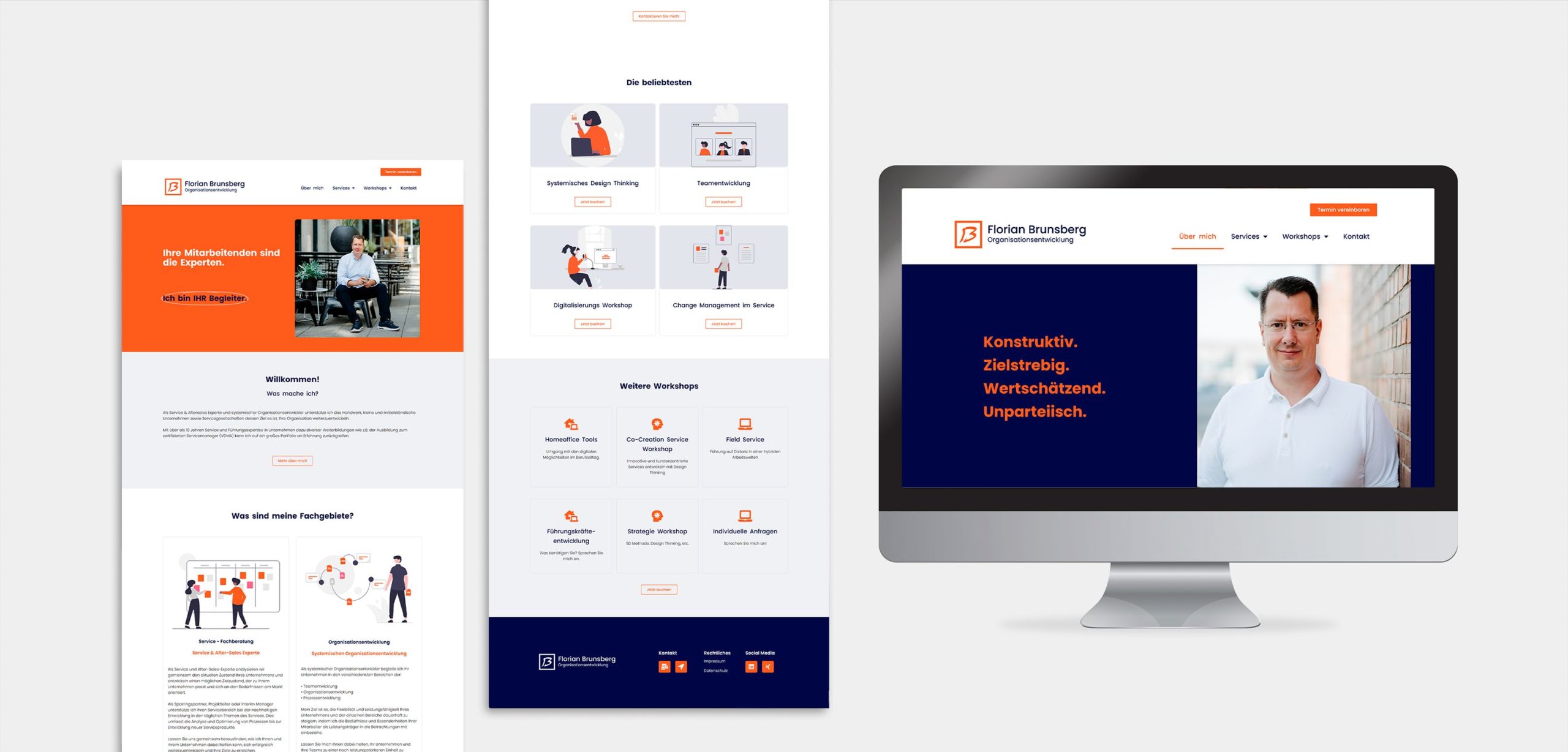
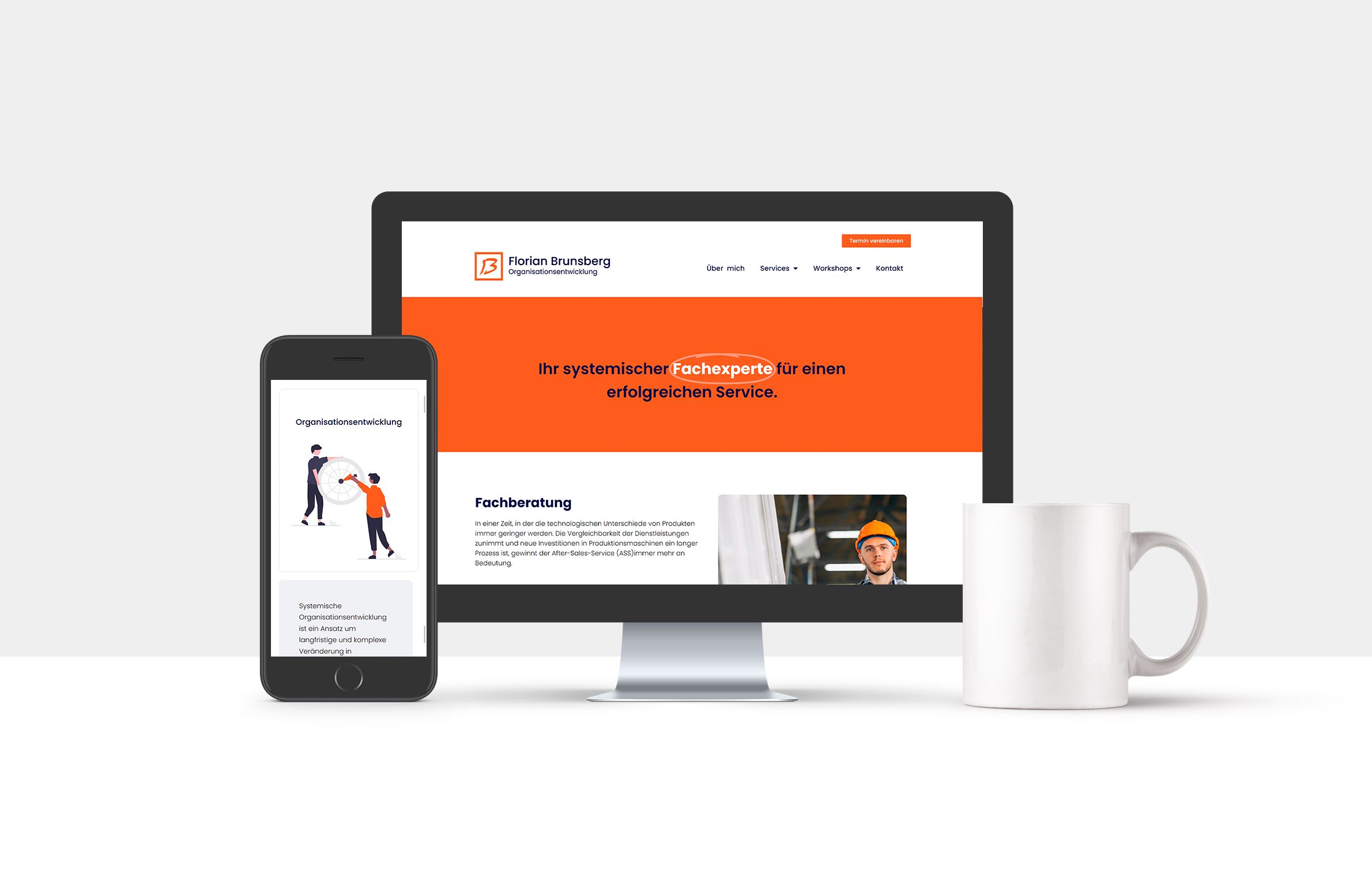
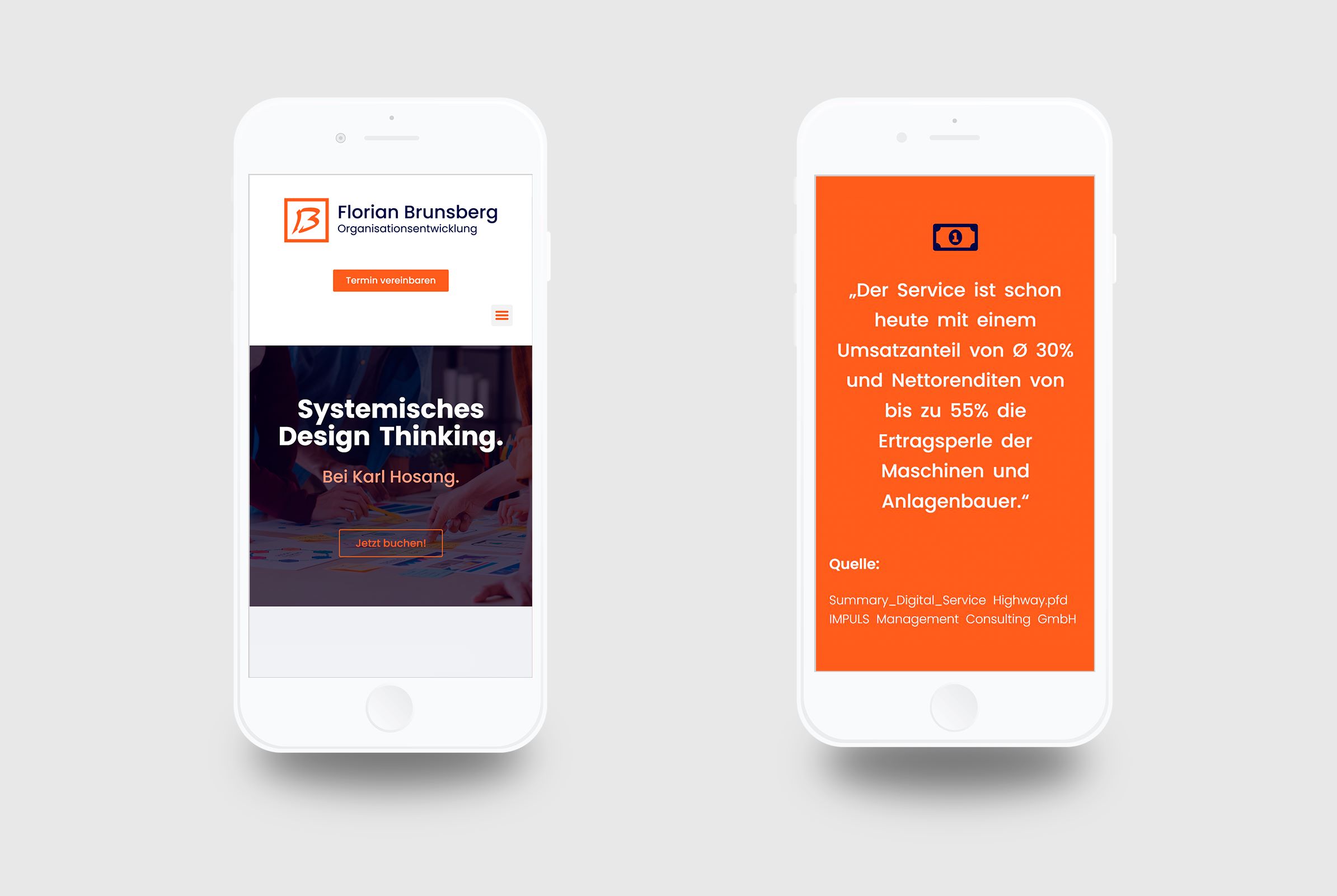
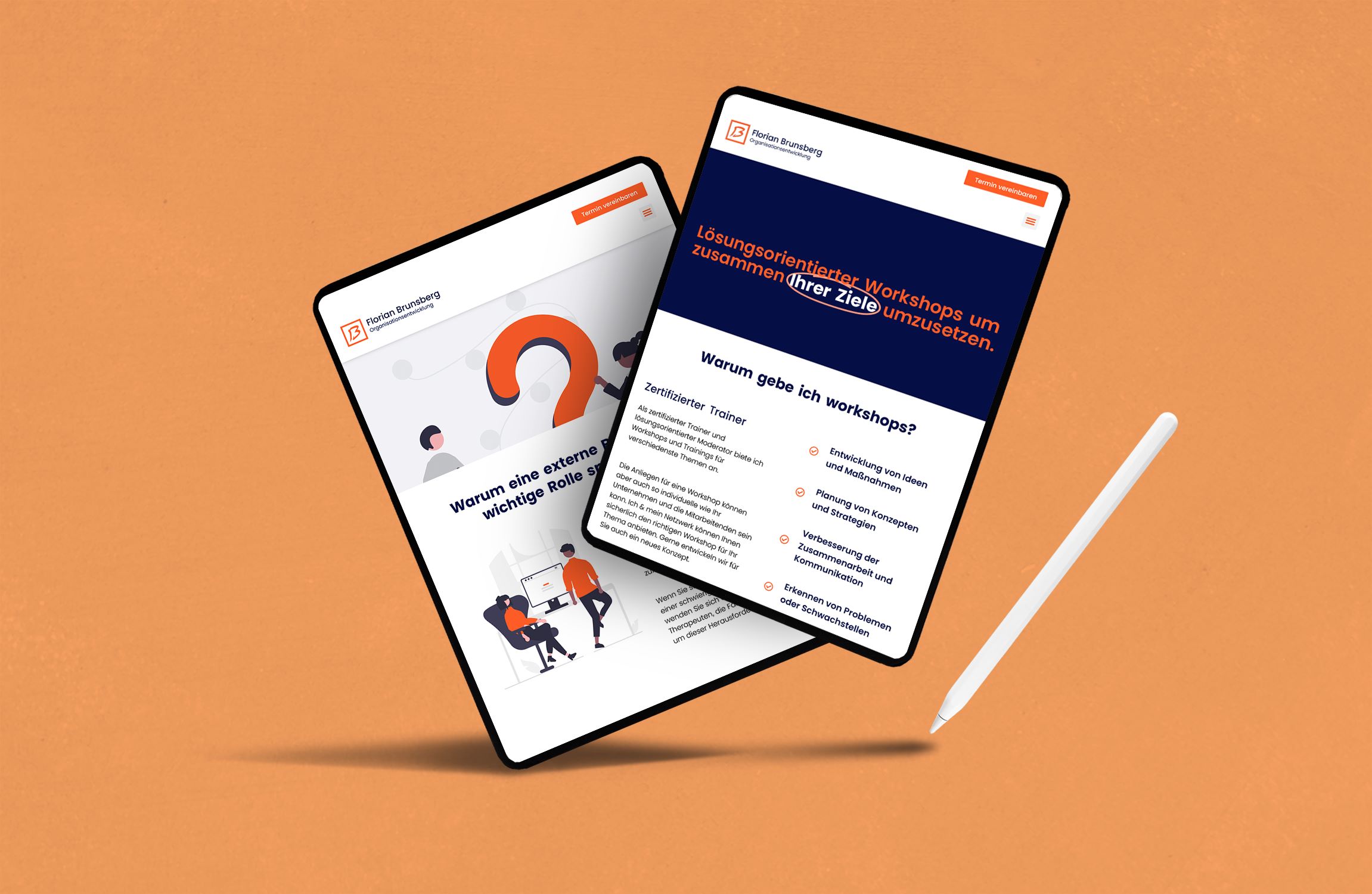
Florian is a service & after-sales expert and systemic organizational developer. He supports the internal processes of small and medium-sized companies whose goal is to further develop their organization.
"I worked with Alexa to create my website and I am delighted with the result. She executed my ideas perfectly and was a great support throughout the process. I highly recommend her work and professionalism."
"Ich habe mit Alexa zusammengearbeitet, um meine Homepage zu erstellen und bin begeistert von dem Ergebnis. Sie hat meine Vorstellungen perfekt umgesetzt und war im gesamten Prozess eine großartige Unterstützung. Ich kann ihre Arbeit und ihre Professionalität nur wärmstens empfehlen."
Challenges
No structure for website content
Florian didn’t know how to communicate everything he wanted without being too much content and overwhelming his audience.
Website wasn't alligned with branding
Florian had already an existing branding (logo, color palette, etc), yet it wasn’t reflected in his website.
Complicated navigation/ UX
The current website was very hard to navigate since there wasn’t a clear content structure. Therefore people often didn’t find what they were looking for.
Strategy
Analyse the already existing content and branding.
Restructure the website content with a clear sitemap.
Create a clear and easy to navigate website to attract more clients.
Support Florian to structure the new website’s content in a clear way and present it with high-end design.
Solution
We worked together for a couple of months, and after a web design workshop, some look & feel proposals, a wireframe and some rounds of corrections here is the final product .
Services provided:
• Web Design Workshop • Sitemap & Content Structure Guidance • Wireframes & Low-Fidelity Prototypes • WordPress Site Building (Tablet + Mobile Adaptation) • Basic SEO Optimization for Google
Benefits
Clear structure of the content
User experience is much more intuitive & makes it way easier to navigate
Scheduling appointments is a no-brainer now
Basic SEO for appearing in google is now optimized
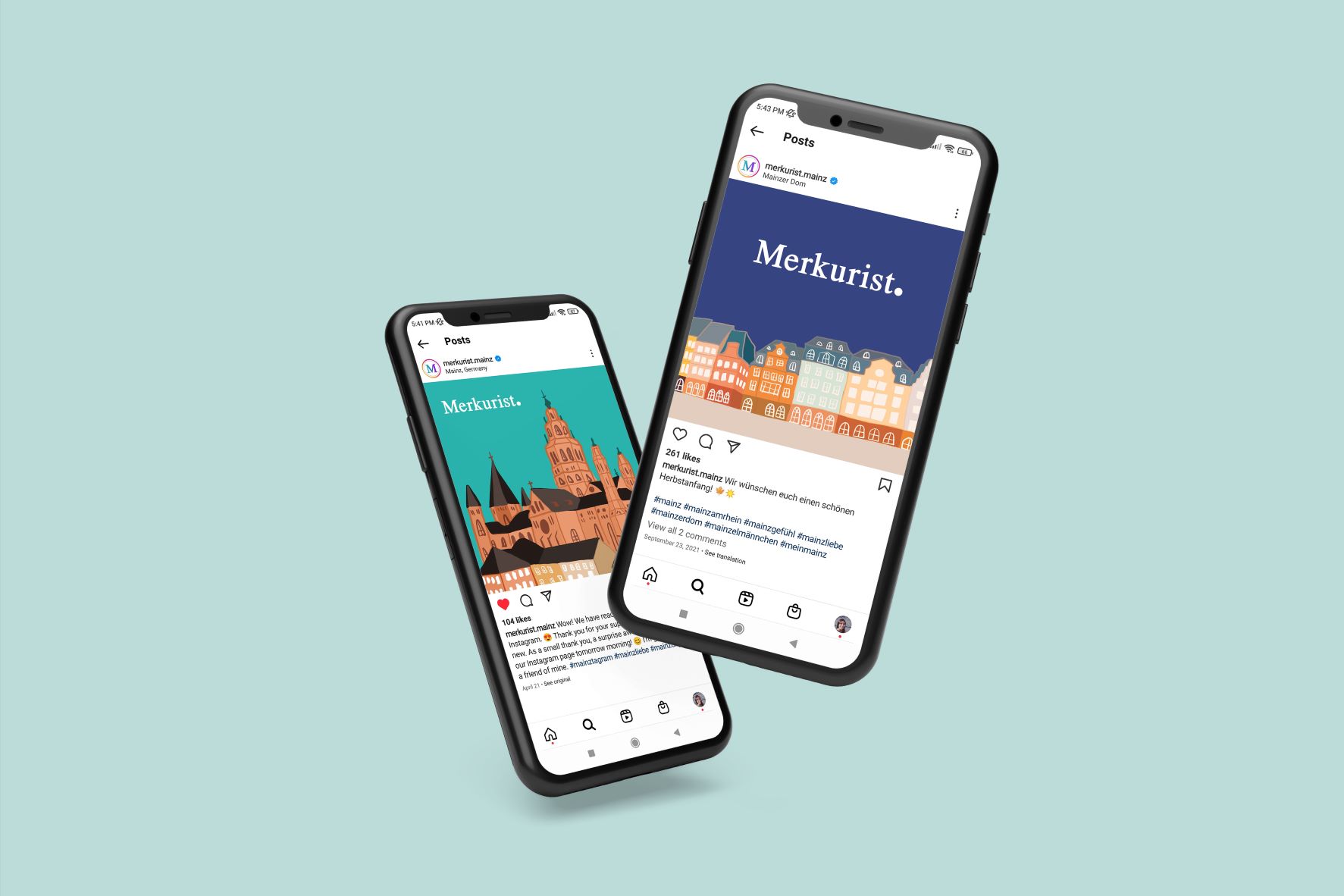
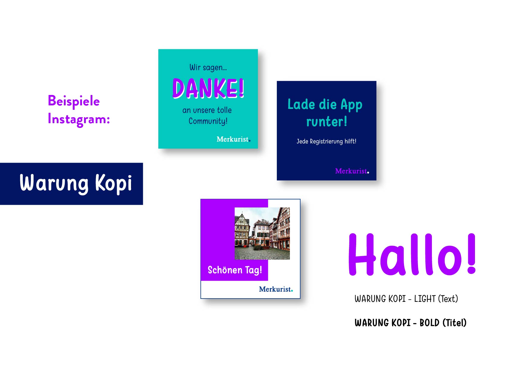
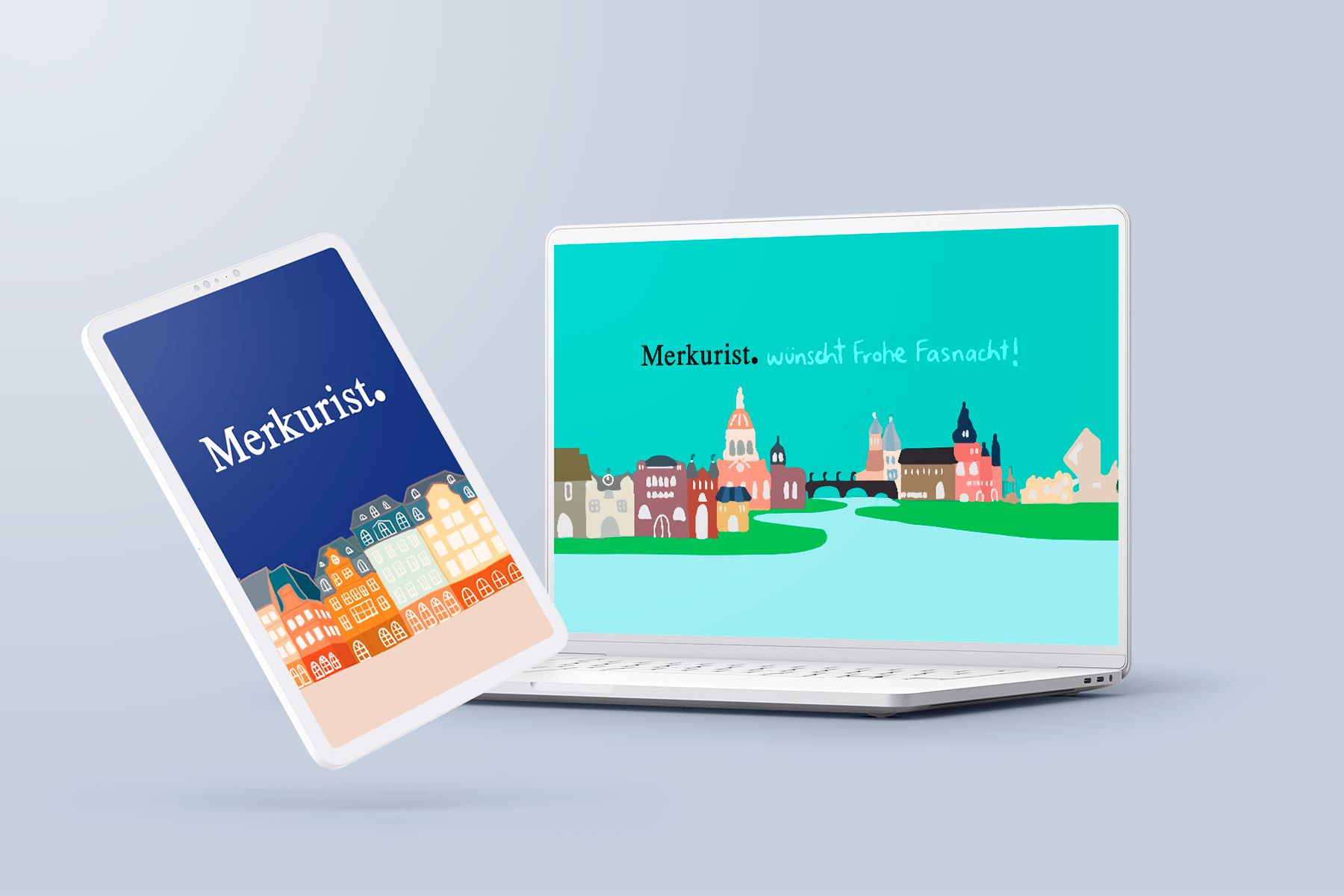
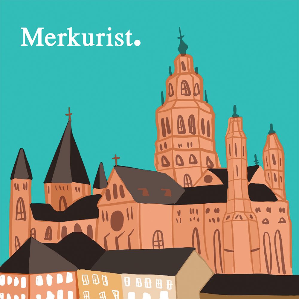
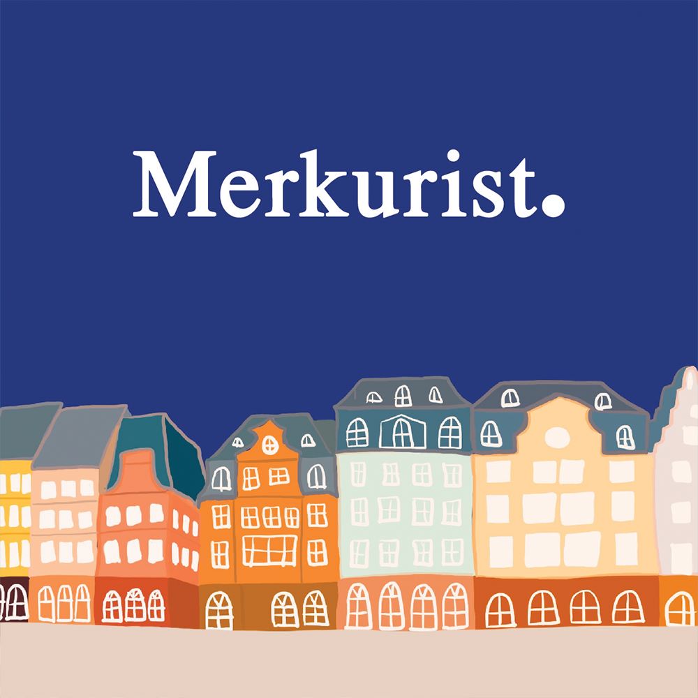
Merkurist is an online regional newspaper focused on news from Mainz and Wiesbaden (two cities in the southwest of Germany.) Whether it’s local, politics, sports or the blue light: the local readers decide what merkurist.de reports on.
“Alexa helped us to rebuild our corporate design. She designs banners and graphics for our online news portal as well as for our social media channels that suit us and give us a recognition value. Above all, we appreciate the uncomplicated cooperation - no matter how specific or vague our wishes are, Alexa always implements them very creatively and, above all, quickly!"
„Alexa hat uns dabei geholfen, unser Corporate Design neu aufzubauen. Sie entwirft sowohl für unser Onlinenachrichtenportal als auch für unsere Social-Media-Kanäle Banner und Grafiken, die zu uns passen und uns einen Wiedererkennungswert geben. Wir schätzen vor allem die unkomplizierte Zusammenarbeit - egal wie konkret oder unkonkret unsere Wünsche sind, Alexa setzt sie immer sehr kreativ und vor allem schnell um!“
Challenges
Company got sold and has now a new owner
The new owner of Merkurist has some different views about how the company’s direction should be. These new values should be communicated through the new design.
Lost their online community
Due to legal settlements their social media channels got erased and they lost all their followers. They had around 15K followers and had been innactive for around 3 months due to the company selling.
Need of a modern look to attract younger readers
Since Merkurist is starting a new chapter they want to have a renewed look to make a great comback, yet somehow mantain their old image so that loyal readers can still recognize its them.
Strategy
Analyse the former image and online community Merkurist had.
Rebuild their new image for a great comeback.
Create a new color palette which attracts attention for new readers and make a comeback in their social media channels.
Help Merkurist get back on their feet and make a great comeback.
Solution
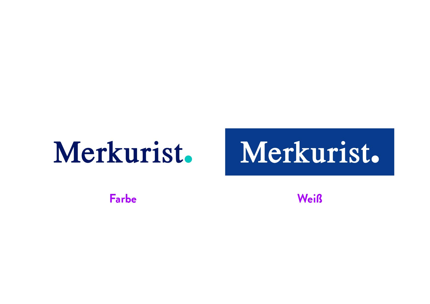
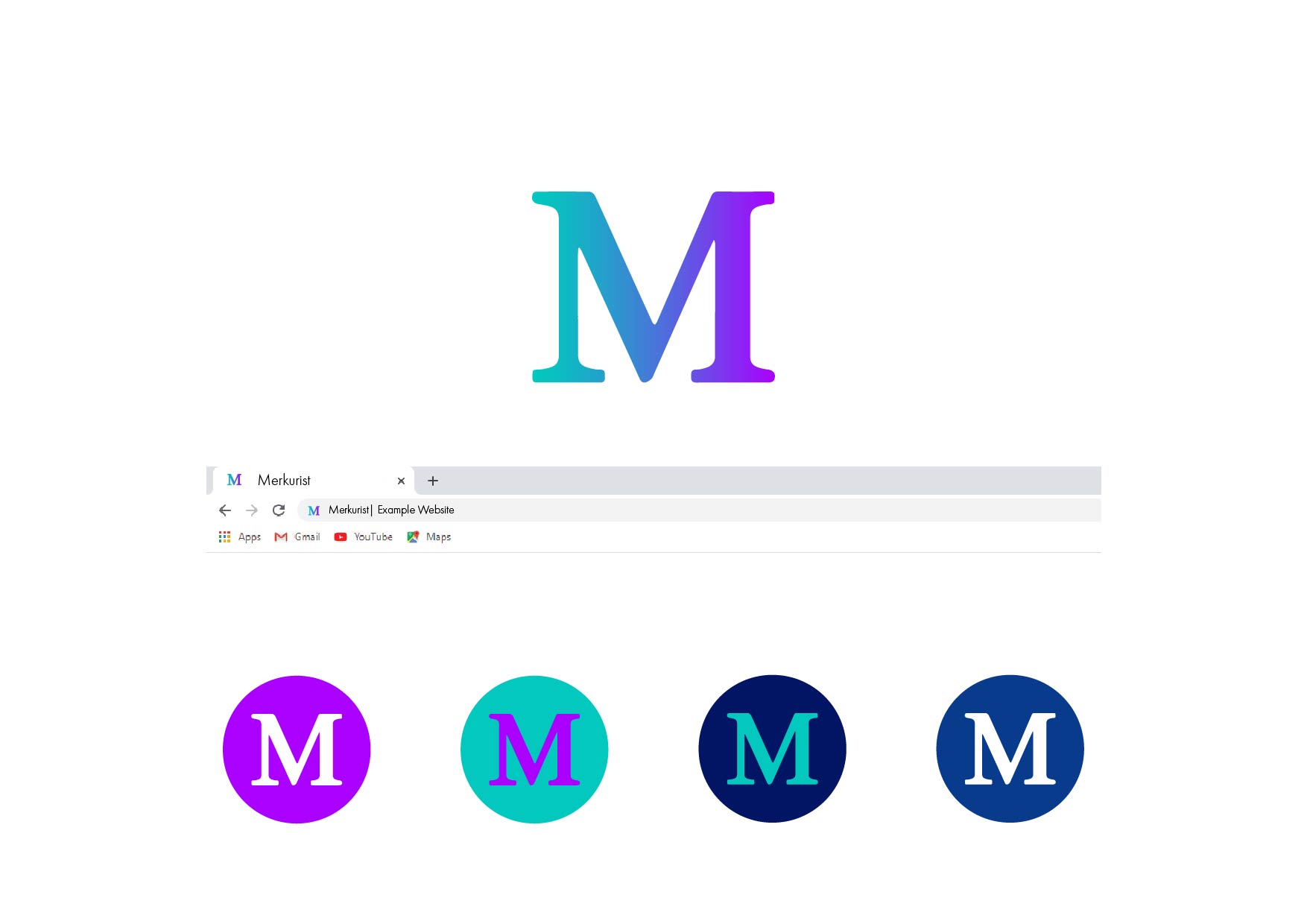
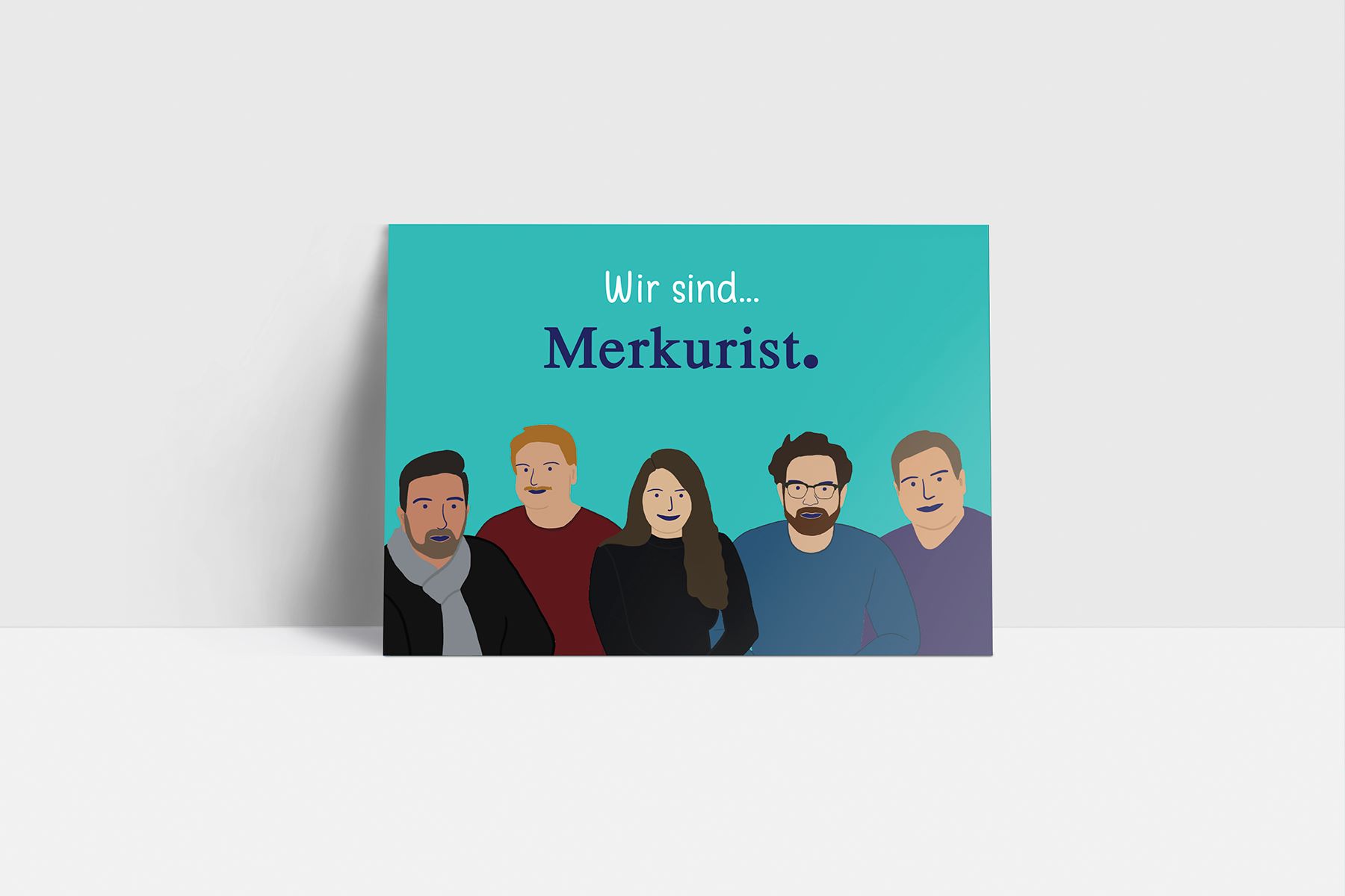
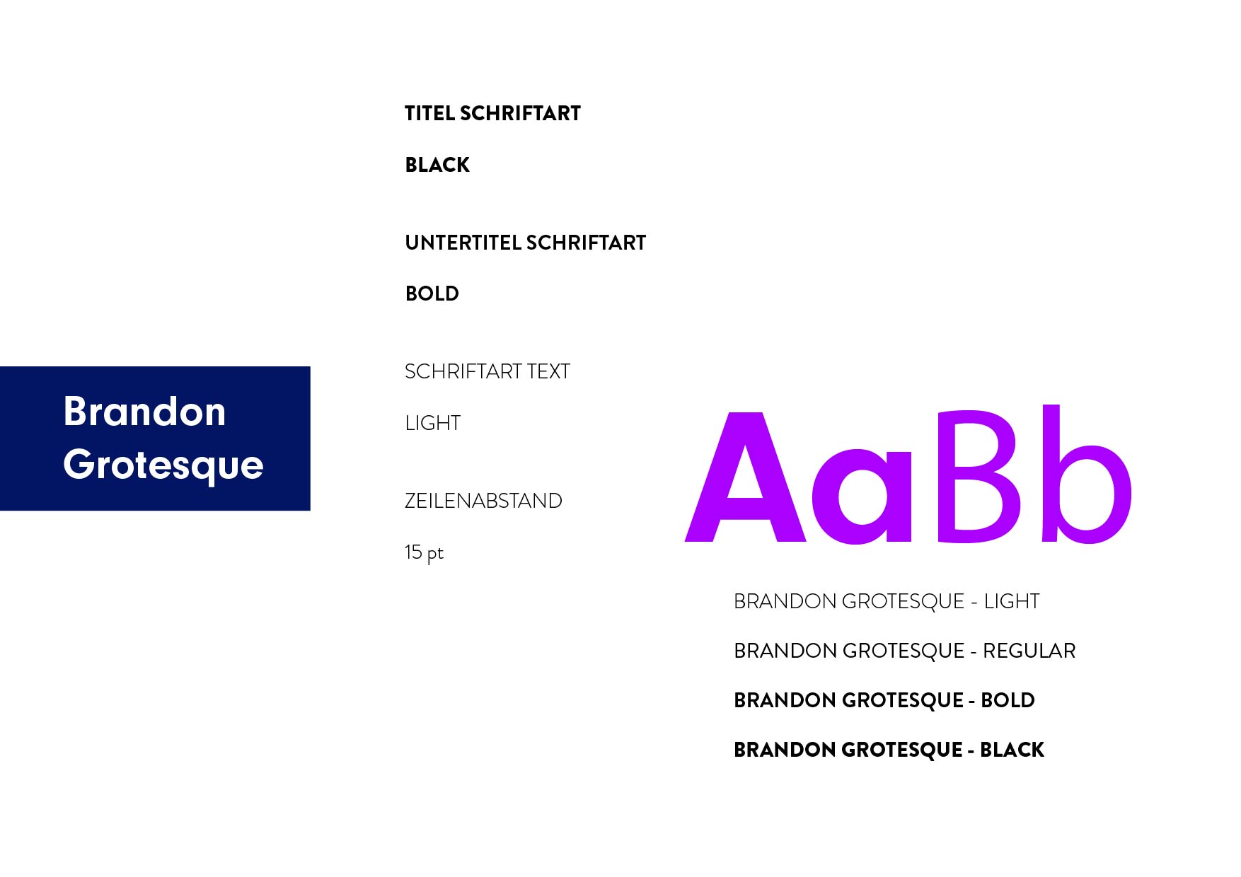
I added some new shiny colors to their former color palette and decided to mantain their old logo since many people recognized the Merkurist team thanks to this. I supported them to create a marketing campaign which involved the creation of print and digital media, creating content for their social media channels and making a promotion video.
Services provided:
• Corporate Identity (Color Palette, CI Guide, etc) • Social Media Content Creation • Marketing Campaign Support
Benefits
Successful marketing campaign
The “Merkuretter” Campaign was live for about 4 weeks and it accomplish the money goal they were expecting. This success was of course not only thanks to the design actions, but it contributed in a big way.
Former clients returned and new clients were gained
Many clients that used to support Merkurist knew that they were back thanks to all the social media presence and decided to support them again. New clients were also acquired during this process.
Slowly regained their online community & still growing
Merkurist has gained back their only community day-by-day. Today they already have above 10K followers in their Instagram and keep on growing everyday. They have a wide resonance and their new brand is starting to get well-known.
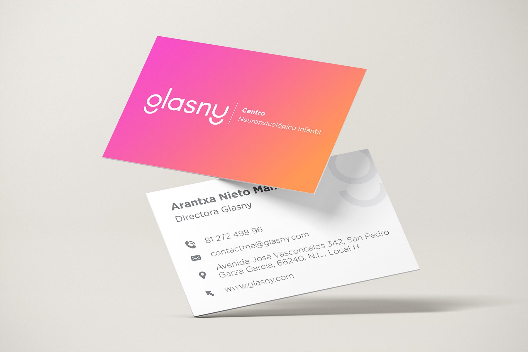
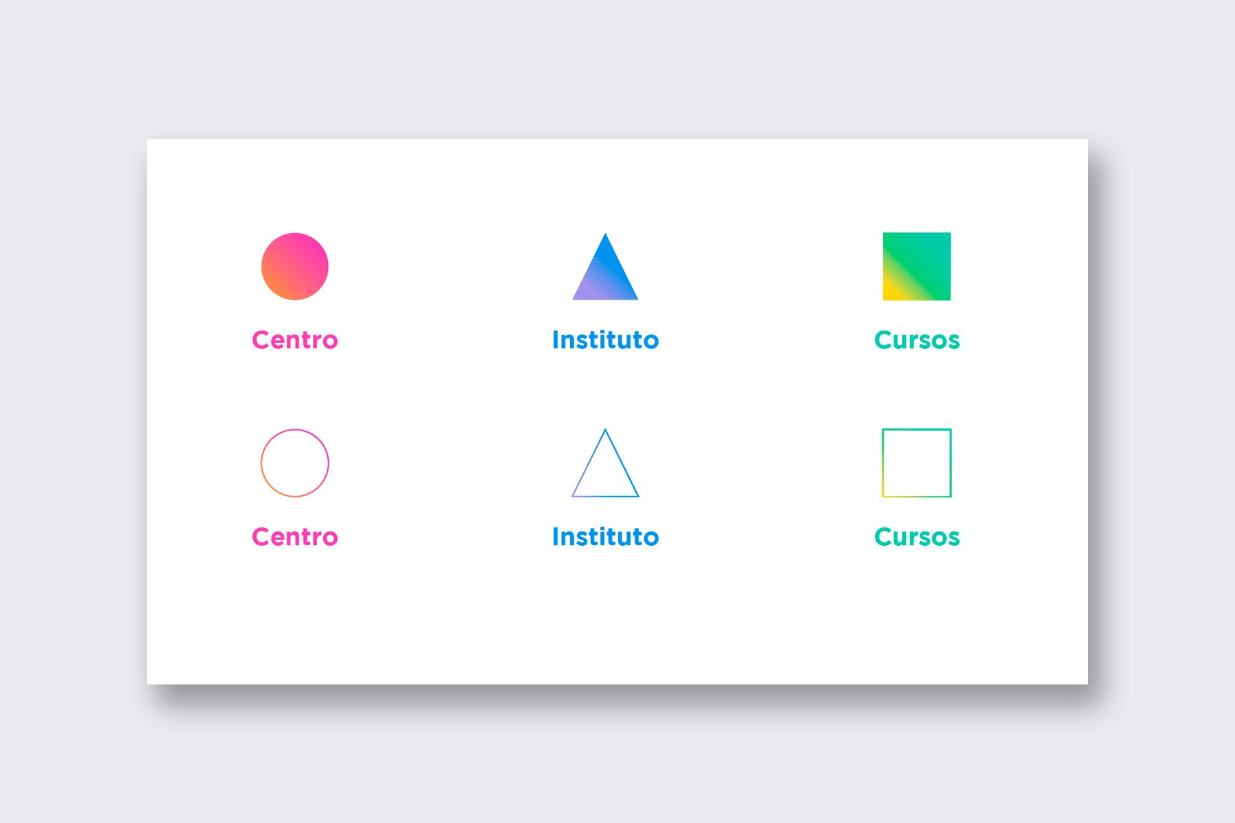
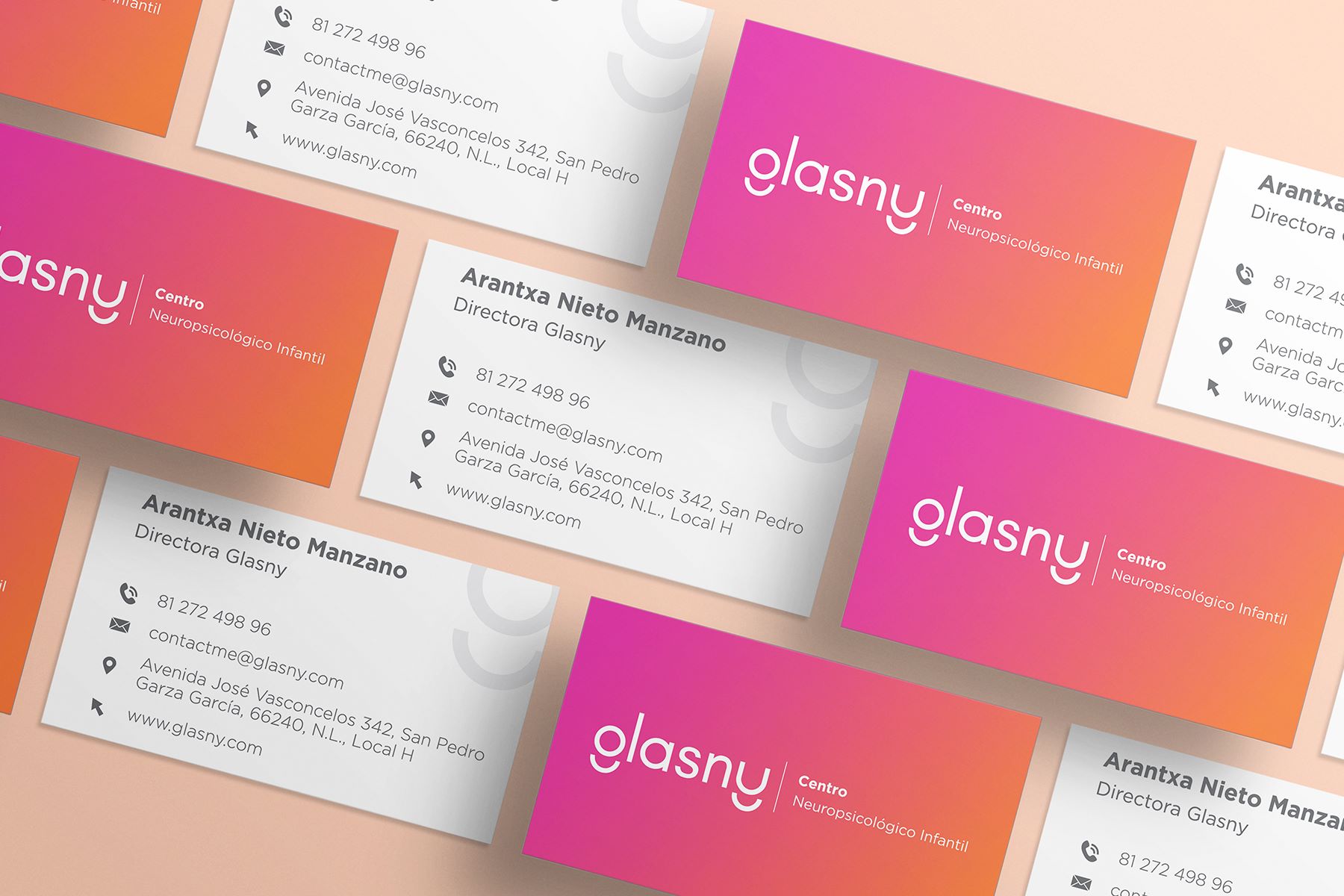
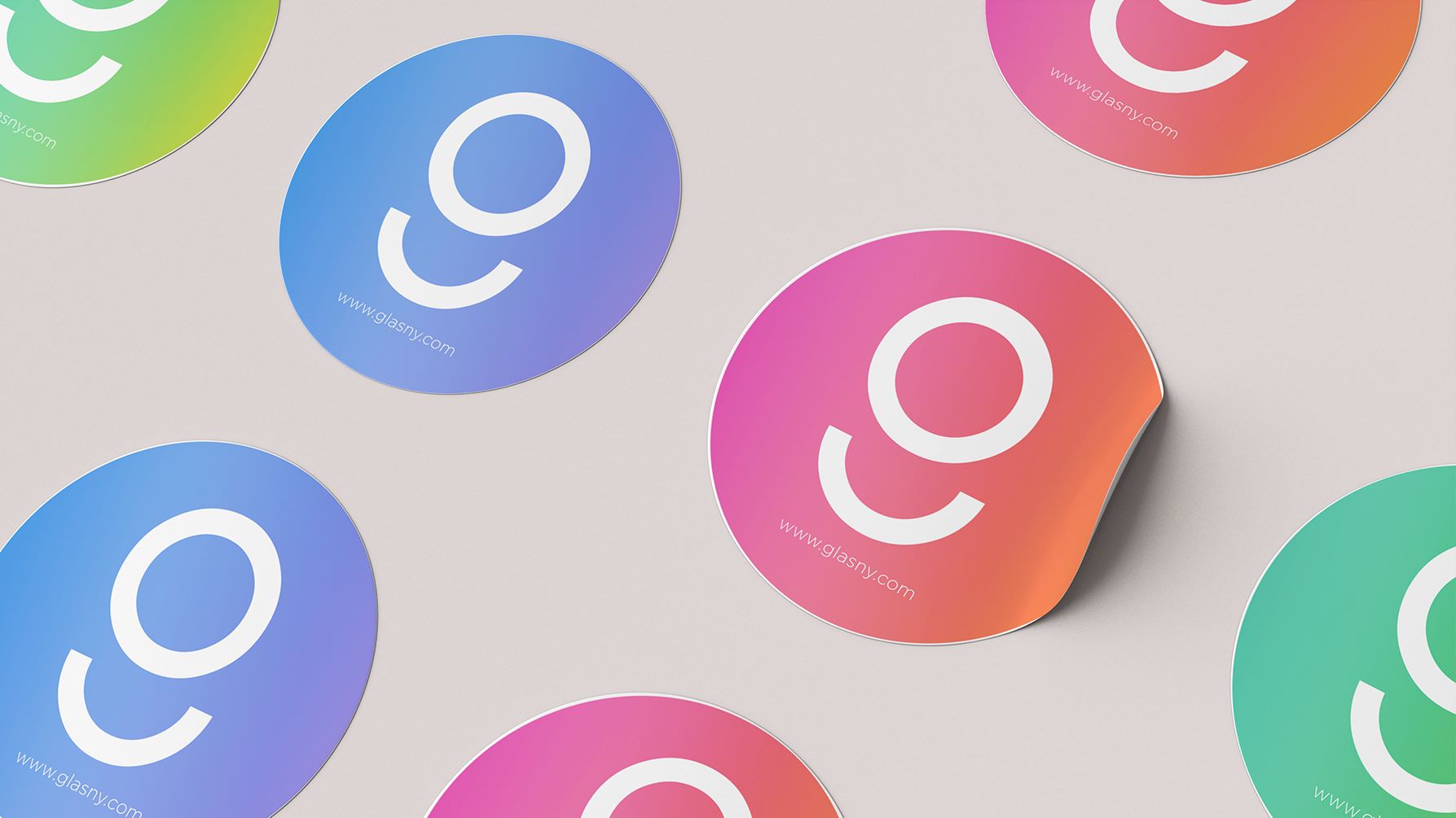
Glasny is a Children’s Neuropsychological Center that specializes in the diagnosis and monitoring of cognitive abilities in children. They focus on children ages 2 – 6 in their morning Institute and from 6 – 10 in their Center.
"My team and I were really happy with the final result and the communication with Alexa was always easy and effective, even with the time difference with Mexico. Our clients have already noticed the new design of our social networks and presentations and have congratulated us constantly. You can trust Alexa's creativity!."
"Mi equipo y yo quedamos realmente contentos con el resultado y la comunicación con Alexa siempre fue fácil y eficaz, aún con la diferencia de horario con México. Nuestros clientes ya han notado el nuevo diseño de nuestras redes sociales y presentaciones y no han hecho más que felicitarnos. Pueden confiar en la creatividad de Alexa."
Challenges
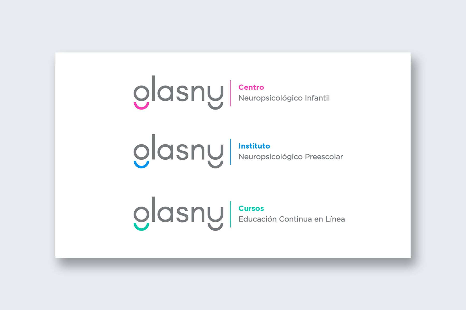
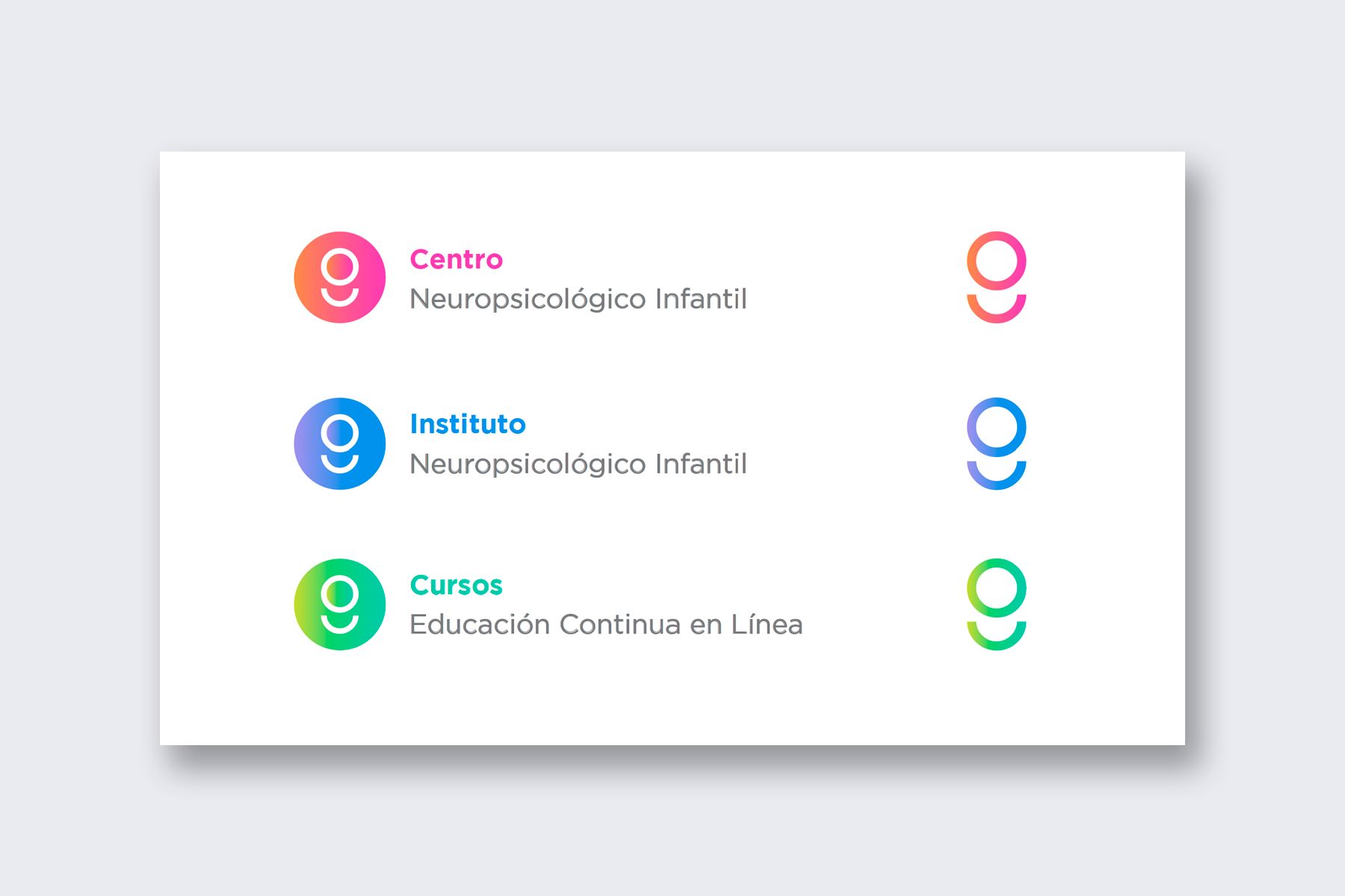
Company expanded to 3 new areas
Glasny expanded their services and now they had not just one area but three different ones.
Reesctructure and name change
Glasny gave a new name to each new area and didn’t know how to communicate this to their clients without confusing them.
Company's initial branding was almost 5 years old
Glasny already had a branding, but this was the very first image created back then when the company was just starting. Many things had changed.
Strategy
Analyse the biggest changes in the company restructure and how to communicate these properly.
Redefine which platforms are the most important where Glasny's branding will be present on.
Create a new design for Glasny as a whole and the other Glasny areas that adapts better to the current company's mission and vision.
Give Glasny’s new areas a unique personality but maintain Glasny’s look as the main brand.
Solution
I used the already existing color palette, though I changed the brightness of some colors to give them more power. I mixed the colors in pairs and created that way 3 different areas with a very clear distinction.
Services provided:
• Brand Strategy Workshop
• Corporate Identity (Logo, Color Palette, CI Guide, etc)
Benefits
Instant brand recognition among competition
Glasny has a very unique design among the children psychology centers in Monterrey, MX. It is easy to recognize among all others.
Clear communication to their clients
Clients of glasny understand that there is a company restructure and know in which direction it’s going. They’re not lost and confusion is unusual.
Up-to-date image with current company's values
After many years of constant growth, it’s just normal that the initial branding doesn’t apply anymore to the current company’s state. This redesigned identity communicates better Glasny’s vision and mission!
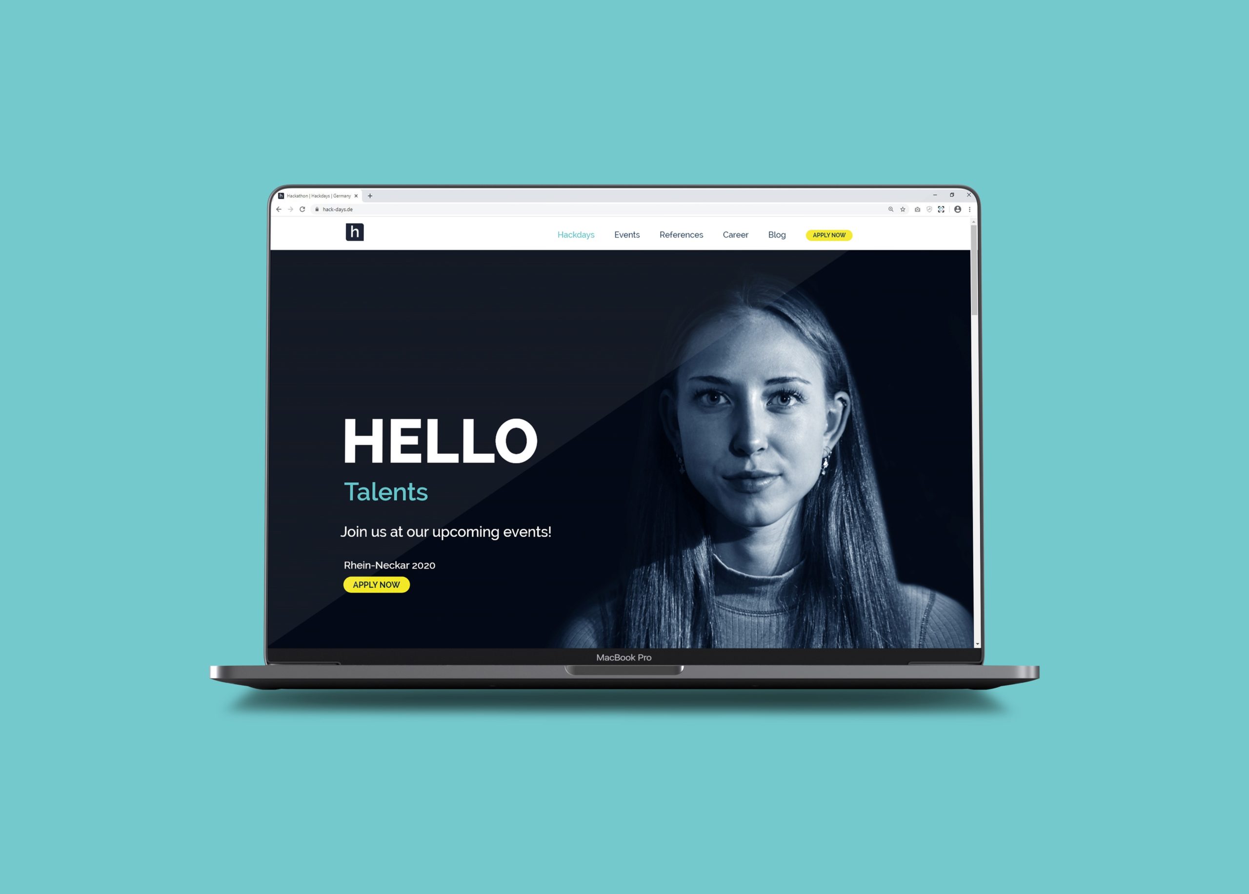
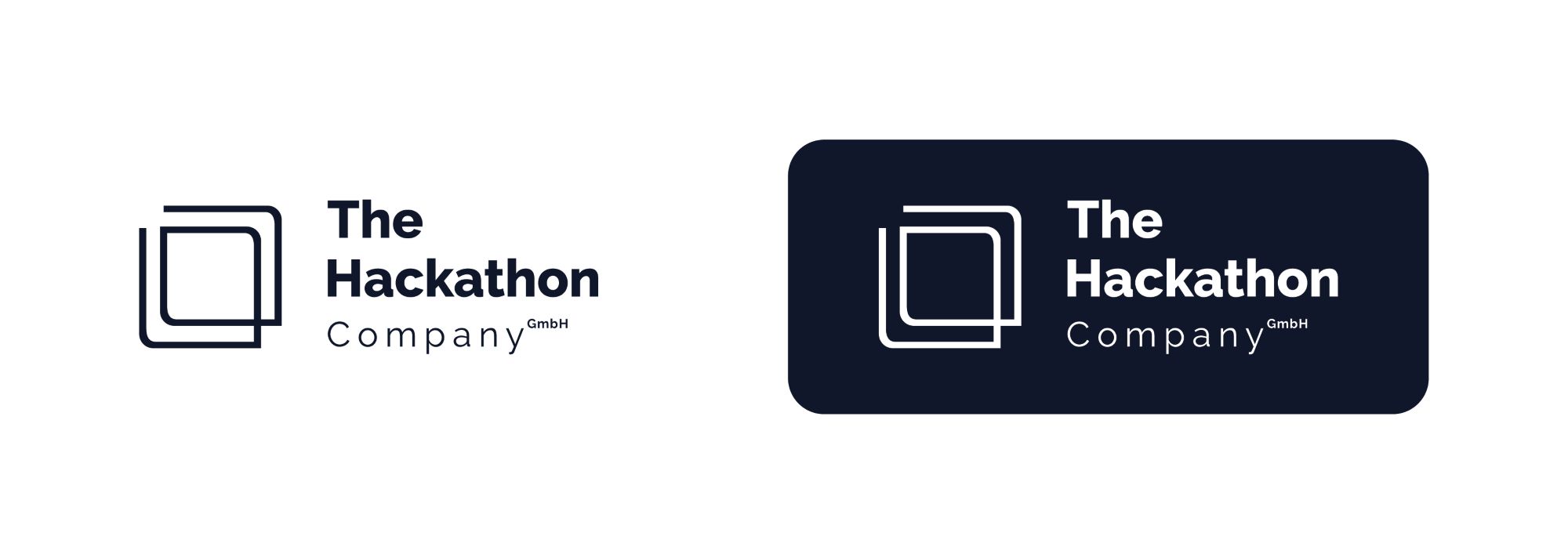
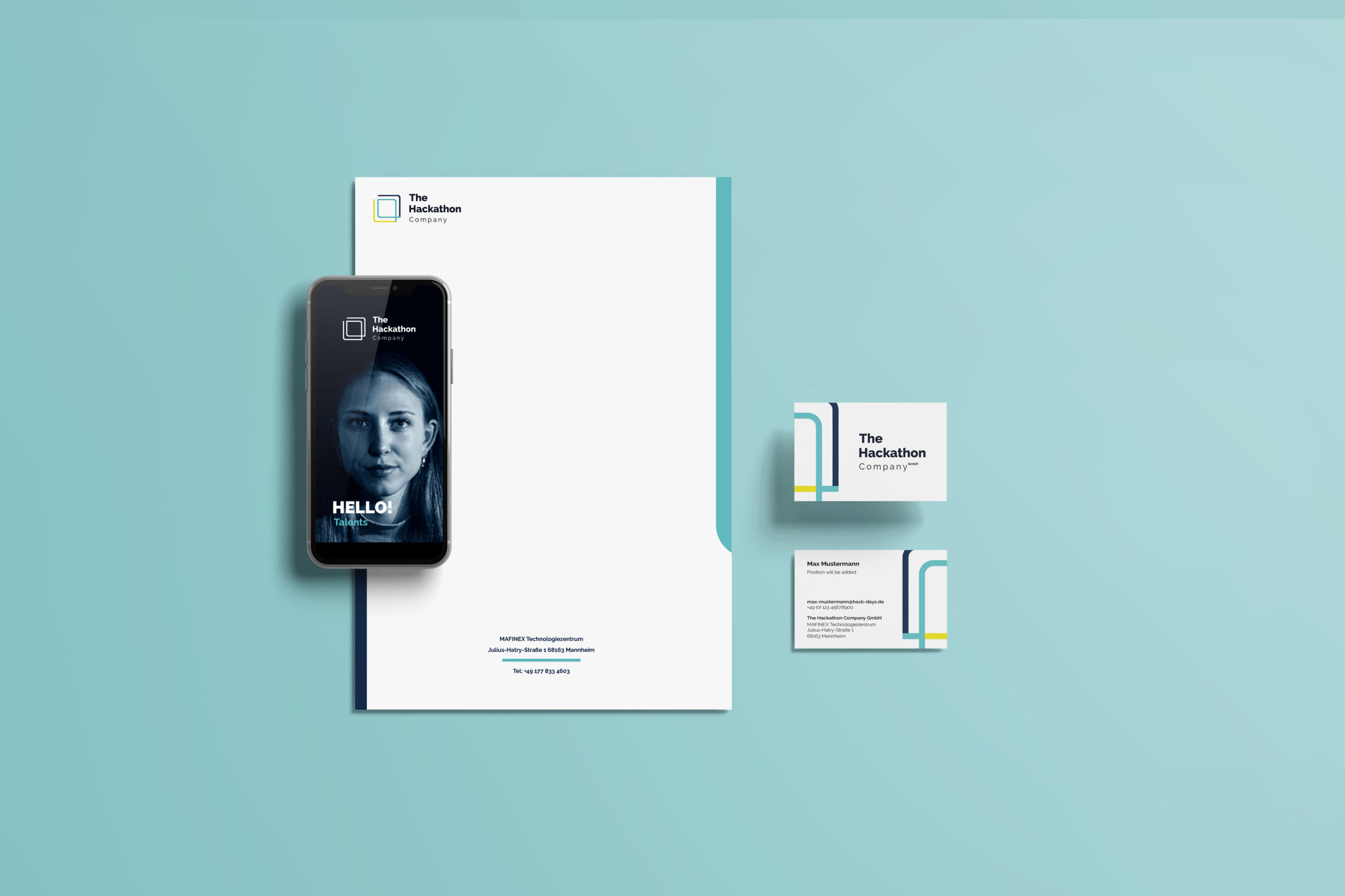
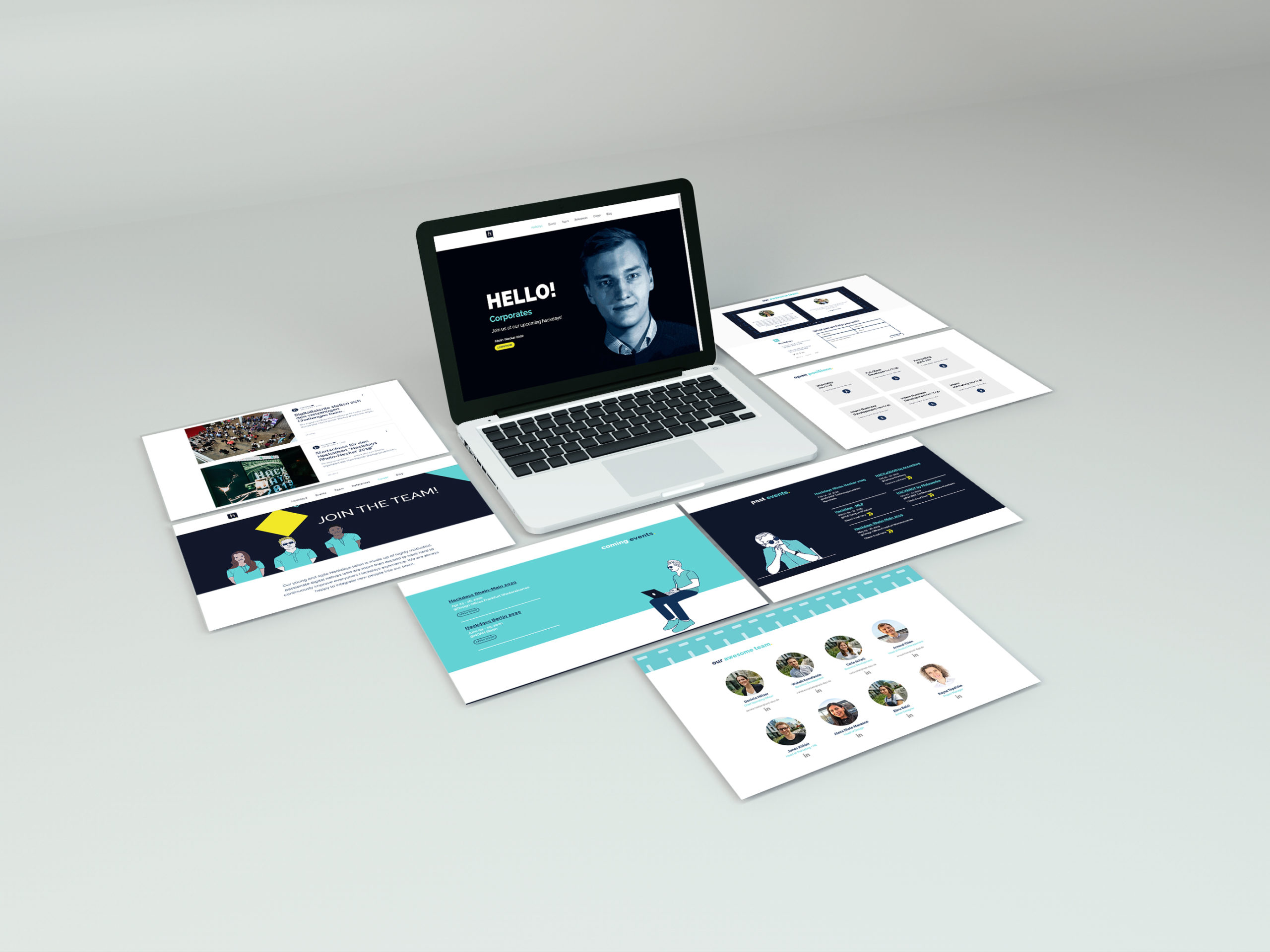
The Hackathon Company offers hackathon events & recruiting services for big corporates of different regions in Germany. They focus on recruiting people from the IT sector, since companies struggle currently to find programmers.
“Working with Alexa in this project as a Brand Expert was a very pleasant experience. We put our minds together and with very different design-perspectives, we created the best result possible for The Hackathon Company's new branding.”
Challenges
No consistency/ No brand recognition
Since there was not a specific design-line followed, clients didn’t recognize nor remembered the company’s name nor the brand in general.
Aiming the wrong target group
This company has two different target groups: 1. Managing Directors of big companies, 2. Students/ Under-grads. Their image was not speaking to both these groups but just one.
Services not clear
They were struggling to define which services they offered and define if “sub-brands” were needed or everything would be part of the “mother-brand”.
Strategy
Analyse the current state of the brand and try to find the pain points where there's no consistency/ harmony.
Redefine the values and emotions the company wants to communicate.
Create a new brand identity that covers all services and sub-brands and that shows a consistency on all platforms and media.
Establish a brand consistency and harmony across all platforms.
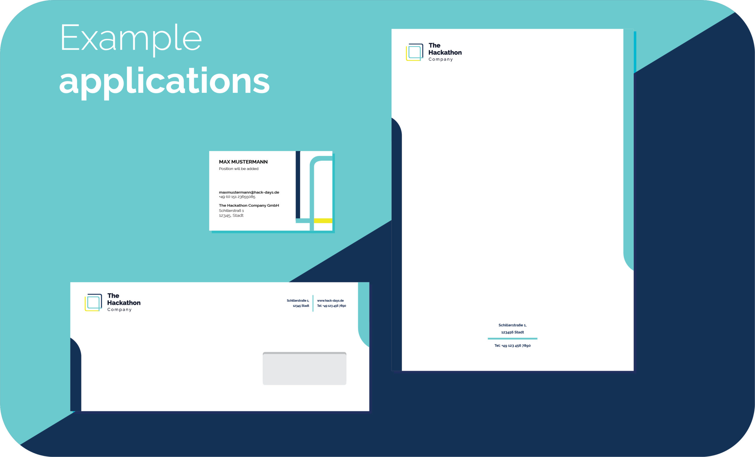
Solution
I created a short but powerful color palette that communicates the company’s values. Redefined the order and hierarchy of the services, and created a mother brand and sub-brands accordingly.
Services provided:
• Corporate Identity Creation (Logo, Color Palette, CI Guide, etc)
• Website Design
Benefits
A clear design-line
The new branding was succesfully applied to their website and all their other social media. There’s a clear harmony and recognition now.
More applicants for their recruiting events
The new website and social media attracted more applicants to be part of their hackathons. The applicants are a key piece in their business modell.
Gaining more leads
Having many applications of IT-personal is proof of success and this fact attracted therefore more companies as clients as well.
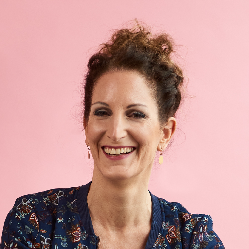
Daniela Hölzer is an independent coach and consultant. She supports private in their day-to-day life, as well as business owners who need a strategic and targeted support with communication inside their companies.
„Die Zusammenarbeit mit Alexa funktionierte reibungslos und sehr professionell. Sie hat für mein Business ganz nach meiner Vorstellung eine starke Brand entwickelt und die Website dazu in einem ansprechenden Design gestaltet.“
“The cooperation with Alexa worked smoothly and very professionally. She developed a strong brand for my business according to my ideas and designed the website with an appealing design.”
Challenges
Not taken seriously
Clients often didn’t take her services seriously or didn’t fully trust them. Her digital prescence lacked professionalism.
Esoteric image
People had a strong esoteric/ guru perception of Daniela, eventhough she is a highly specialized consultant.
Current color palette doesn't reflect her personality
As many other solopreneurs, the colors she had didn’t reflect the services and values she actually offered.
Strategy
Analyse the current pain points of her website, and everything that has to do with her branding.
Rediscover which emotions she wants her business to communicate and to whom exactly.
Create a new brand identity that represents her and that her customers can trust since day one.
Create a solopreneur consulting brand that communicates professionalism and trust.
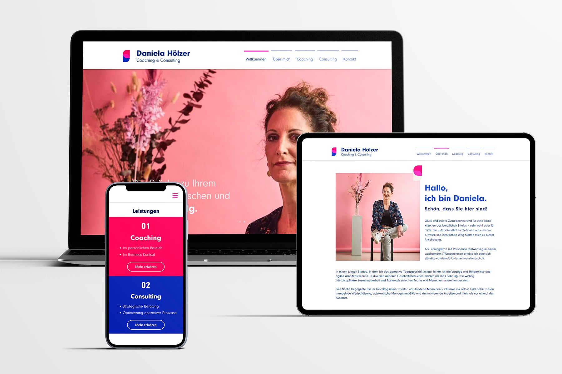
Solution
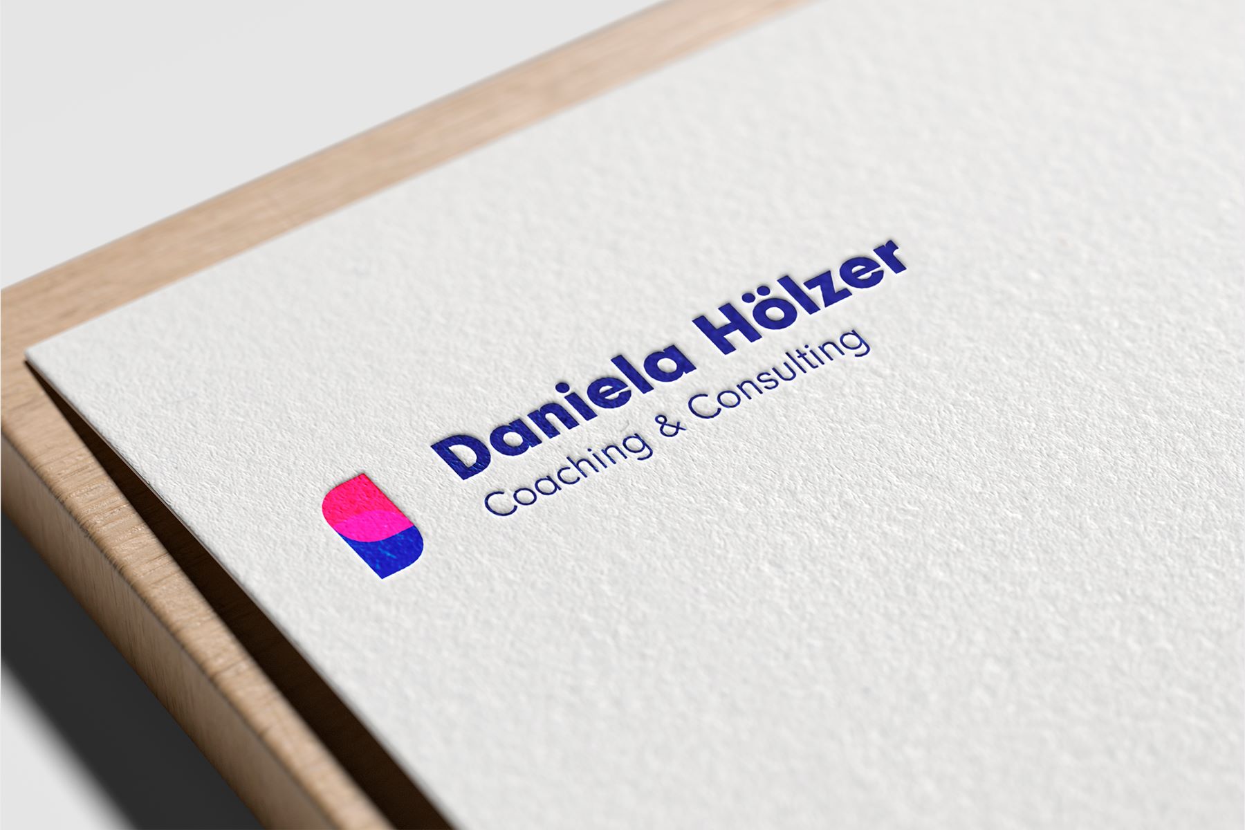
I created a vibrant color palette that represented Daniela’s energetic personality, keeping in mind the professionalism. The logo’s intention was a very minimalistic shape to be taken seriously by big concerns, and at the same time could be placed anywhere and get a direct brand recognition with the pass of time.
Services provided:
• Brand Strategy Workshop
• Corporate Identity (Logo, Color Palette, CI Guide, etc)
• Website Design
Benefits
Faster appointment scheduling
With the new website design, it is now easier for clients to make an appointment with Daniela without so much searching and trying.
More potential leads through the right key words
Having the right key words in addition to the new design at her homepage is a crucial thing. She now can be found much easier through google and get seen by more potential clients!
Earn clients trust
Making a good first impression with potential clients is much easier now for Daniela having a professional well-designed brand and website. No more esoteric confusion 😉
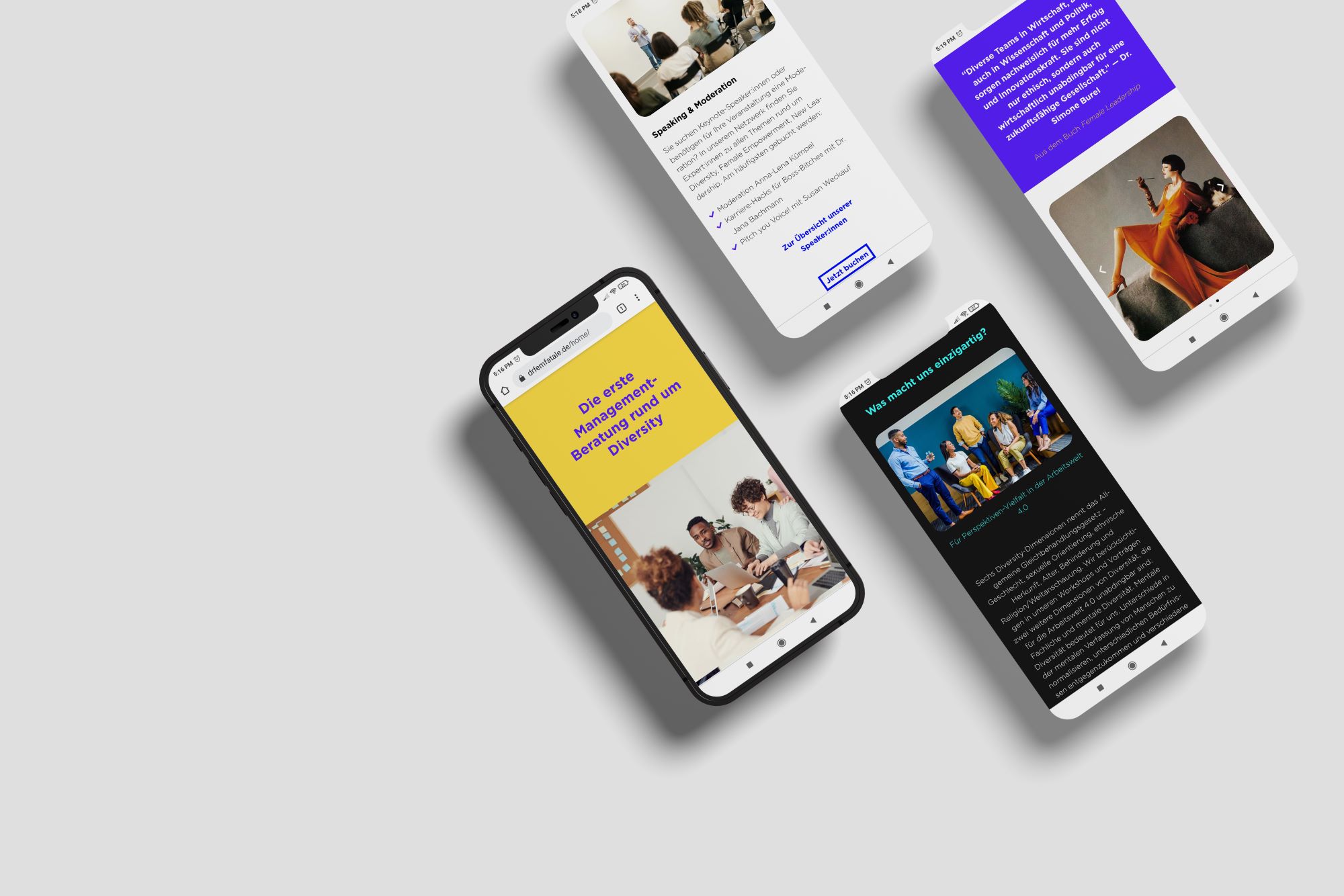
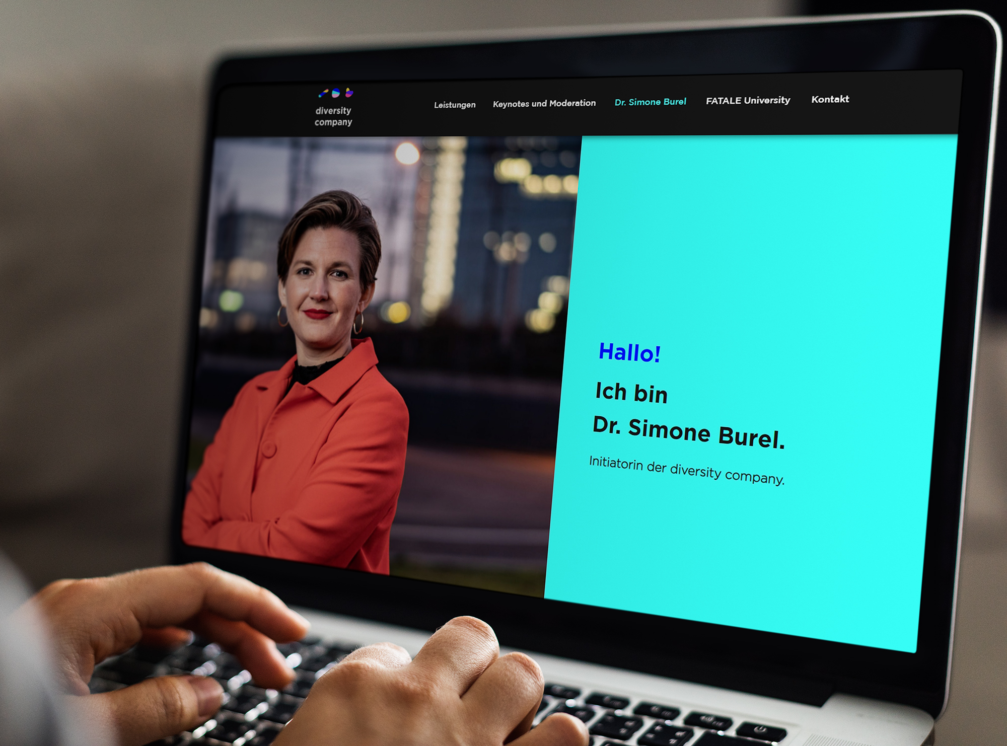
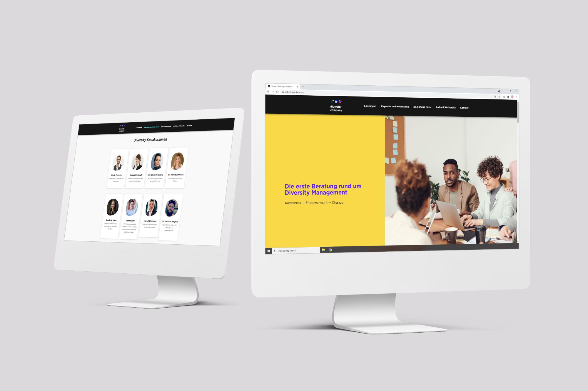
The Diversity Company is a business consultant company specialized in diversity. They advise and support companies, universities and institutions that want to make a change to a more diverse future.
„Alexas tolle Designs haben unsere Marke dr.fem.FATALE in ein modernes Licht gerückt und uns nicht nur auf unserer Website, sondern auch auf unseren Social Media Kanälen sehr weitergebracht. Als effizient arbeitendes Unternehmen lieben wir unkomplizierte Kommunikation und die direkte Umsetzung unserer Wünsche – genau das haben wir bei Alexa gefunden."
"Alexa's great designs have brought a modern light to our brand and not only helped us a lot on our website, but also on our social media channels. As an efficient company, we love uncomplicated communication and the direct implementation of our wishes - that's exactly what we found with Alexa."
Challenges
Confusion about company's mission and services
People were often confused about:
• What is the company about? • What services do they offer? • What are customers paying for? • Is it just for women?
Wrong perception of the company's image
The brand was perceived as a radical feminist asociation from and strictly for women. This in fact was a very wrong perception of what they intended to communicate in the first place.
Logo, colors & aesthetics are not consistent and don't match their values
The Diversity Company had a different name and the old color palette was very “woman-focused”. Besides, they didn’t stick to one consistent image through all their marketing platforms.
Strategy
Analyse the company's values, core message and target audience
Redefine the company's mission and services together with the team
Create a new corporate identity together with strong a digital presence that communicates better their values
Design a gender neutral brand which welcomes any person no matter what cultural background or color, and transmits a fresh and open-minded mentality.
Solution
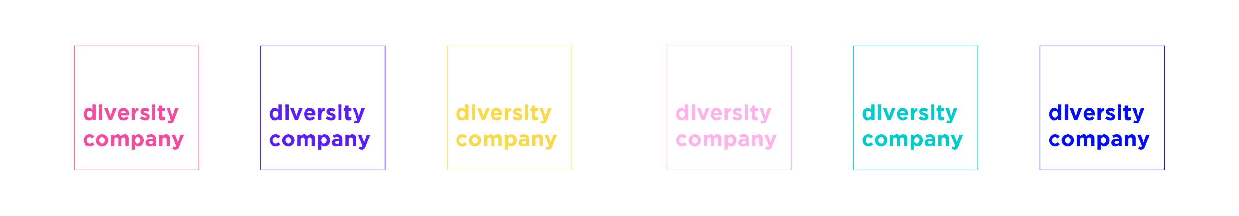
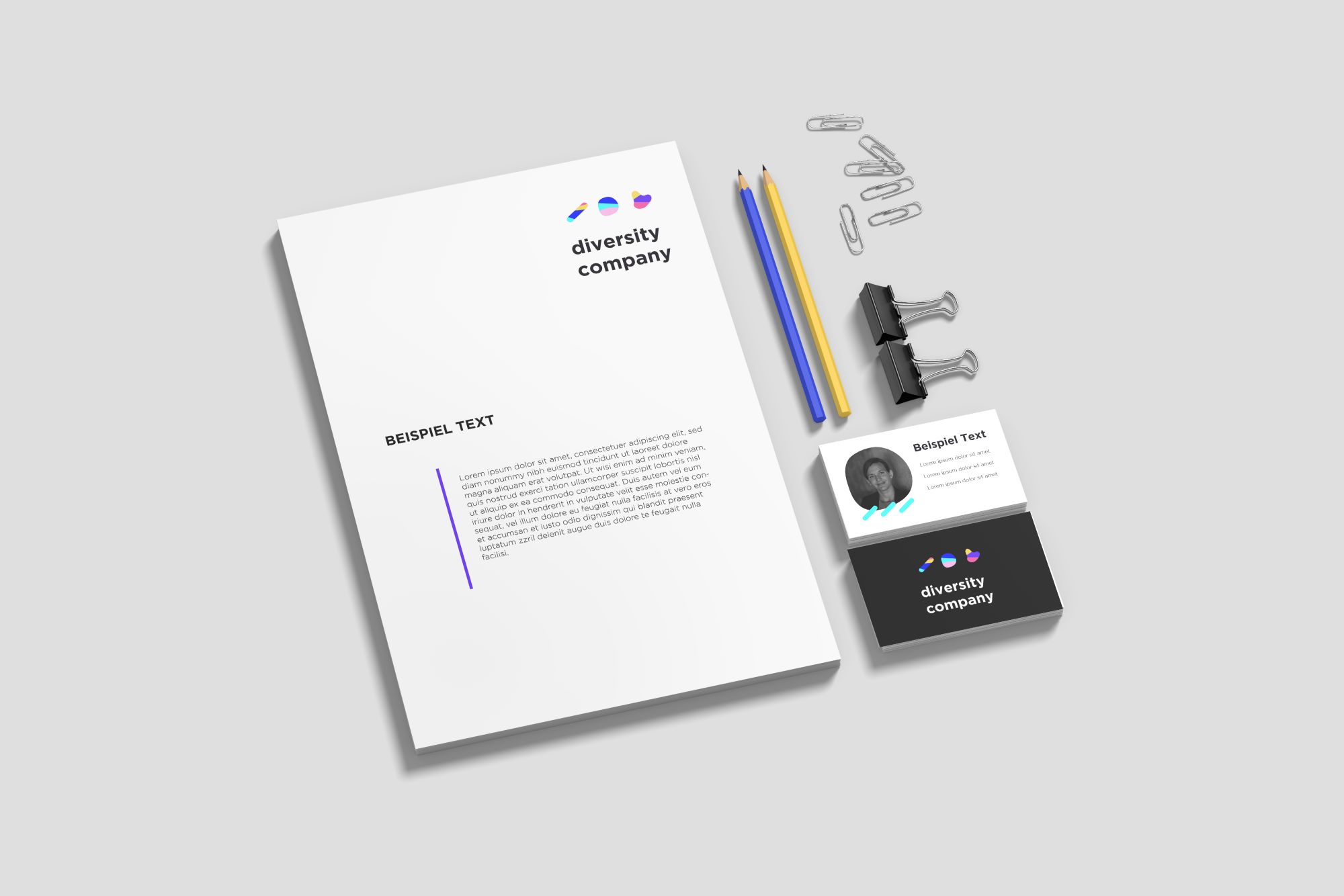
I extended the color palette and chose carefully a wide variety of colors full of energy. Also I created three amorphous forms that should represent the diversity in our society.
Services provided:
• Brand Strategy Workshop
• Corporate Identity (Logo, Color Palette, CI Guide, etc)
• Website Design
• Social Media Content
Benefits
More potential leads
The new website attracts more companies and institutions that didn’t seem to quite understand their services before. The new website has more CTAs and a higher retention rate than the previous one.
Wider community on social media
Since the new image is gender-neutral it invites men, as well as females to support their cause and share their message.
Stable and consistent digital presence
The Diversity Company now has an own personality and identity. This helps their brand to stand out and it sets the tone in all their digital channels. This is a crucial component to make people recognize their brand over time.