Glasny is a Children’s Neuropsychological Center that specializes in the diagnosis and monitoring of cognitive abilities in children. They focus on children ages 2 – 6 in their morning Institute and from 6 – 10 in their Center.
"My team and I were really happy with the final result and the communication with Alexa was always easy and effective, even with the time difference with Mexico. Our clients have already noticed the new design of our social networks and presentations and have congratulated us constantly. You can trust Alexa's creativity!."
"Mi equipo y yo quedamos realmente contentos con el resultado y la comunicación con Alexa siempre fue fácil y eficaz, aún con la diferencia de horario con México. Nuestros clientes ya han notado el nuevo diseño de nuestras redes sociales y presentaciones y no han hecho más que felicitarnos. Pueden confiar en la creatividad de Alexa."
Previous
Next
Challenges
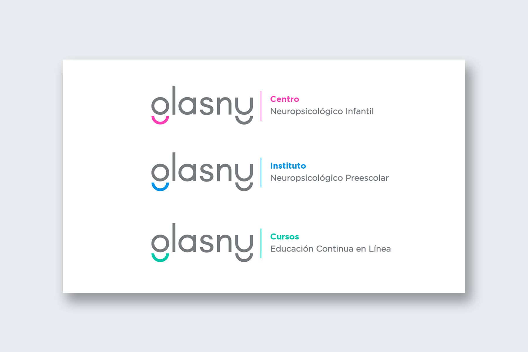
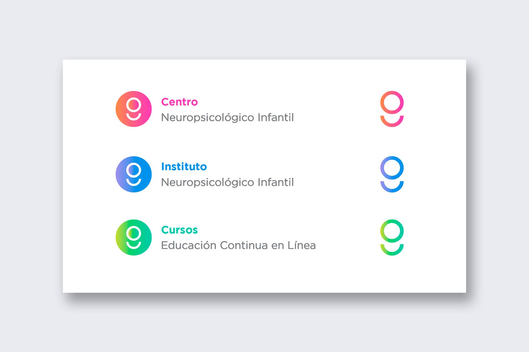
Company expanded to 3 new areas
Glasny expanded their services and now they had not just one area but three different ones.
Reesctructure and name change
Glasny gave a new name to each new area and didn’t know how to communicate this to their clients without confusing them.
Company's initial branding was almost 5 years old
Glasny already had a branding, but this was the very first image created back then when the company was just starting. Many things had changed.
Strategy
Analyse the biggest changes in the company restructure and how to communicate these properly.
Redefine which platforms are the most important where Glasny's branding will be present on.
Create a new design for Glasny as a whole and the other Glasny areas that adapts better to the current company's mission and vision.
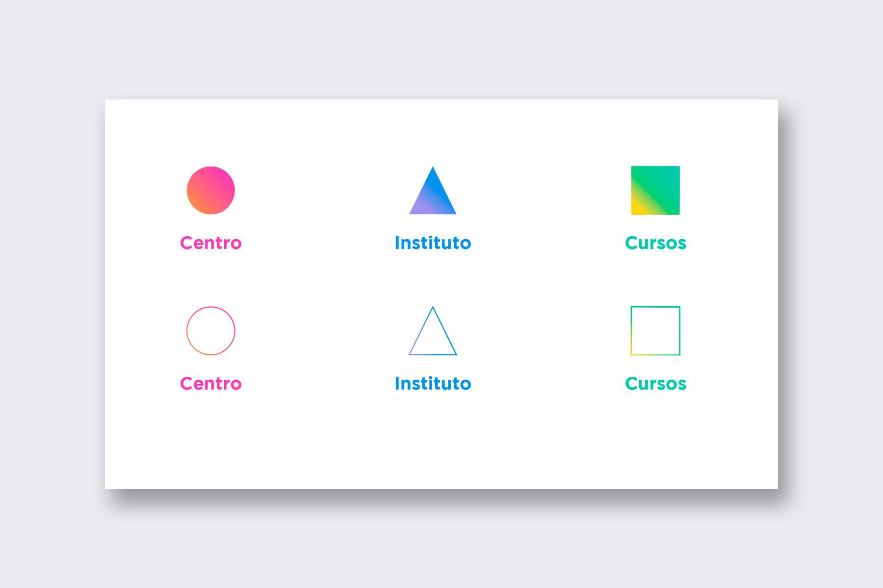
Give Glasny’s new areas a unique personality but maintain Glasny’s look as the main brand.
Solution
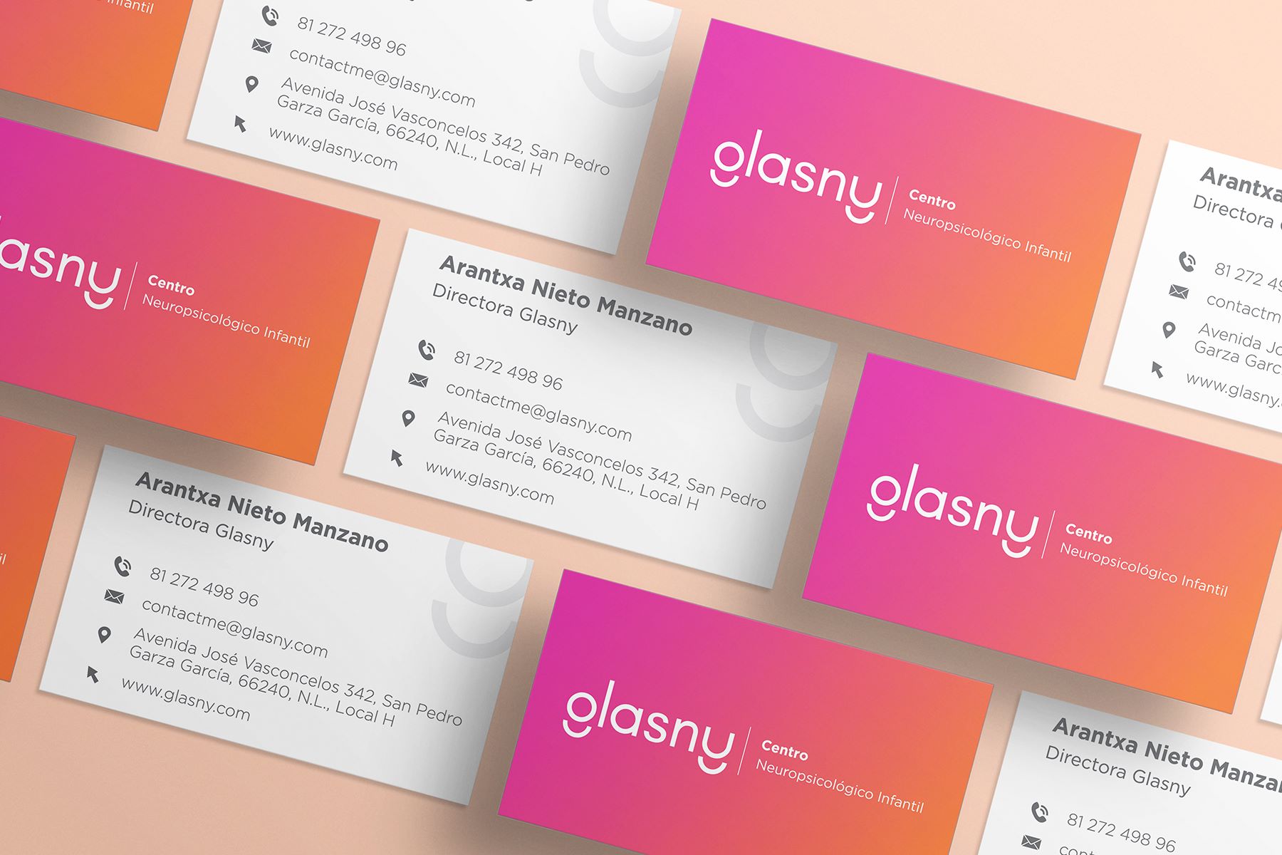
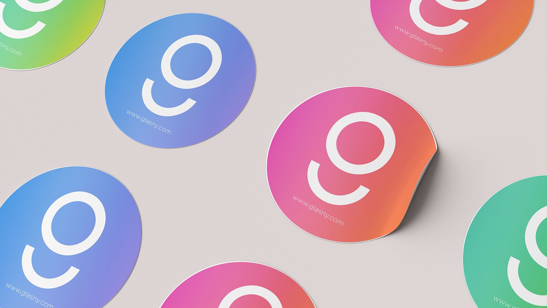
I used the already existing color palette, though I changed the brightness of some colors to give them more power. I mixed the colors in pairs and created that way 3 different areas with a very clear distinction.
Services provided:
• Brand Strategy Workshop
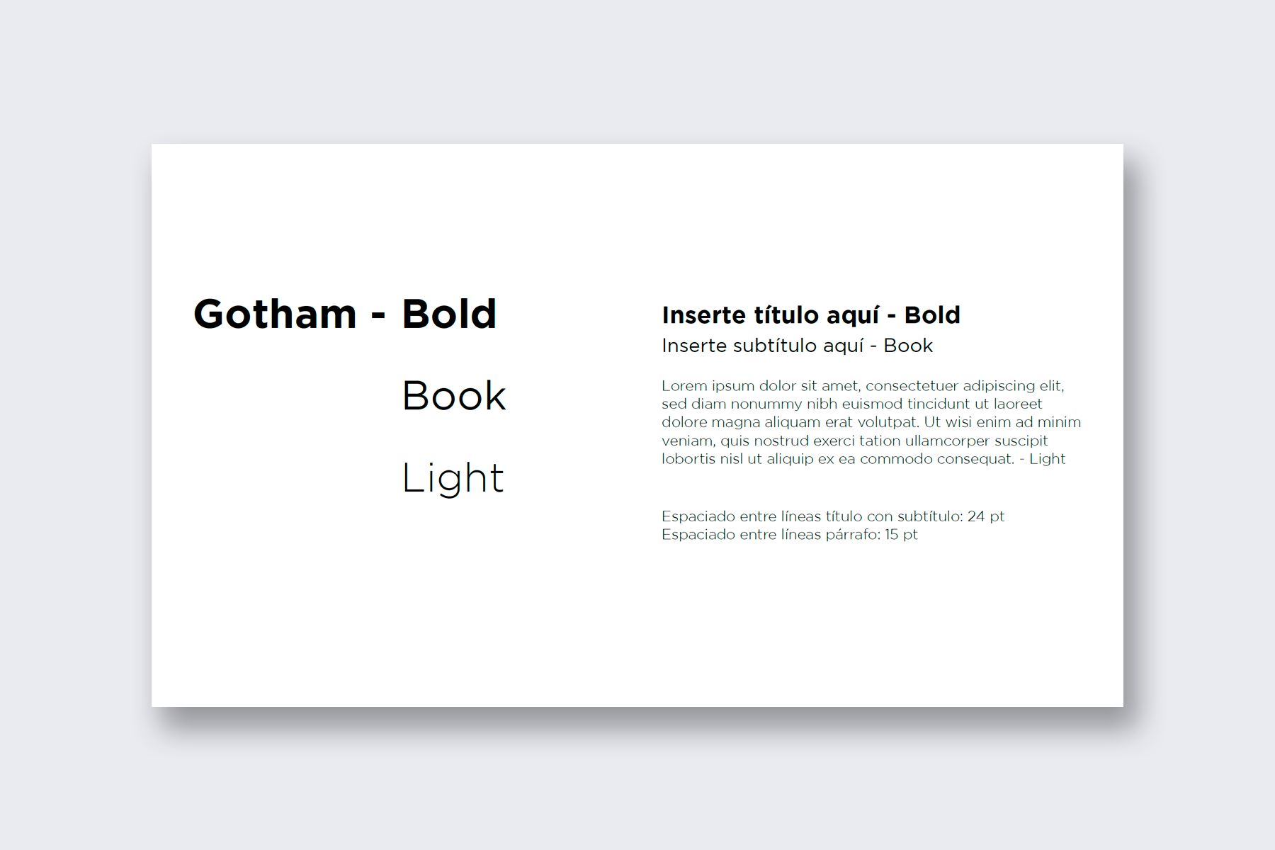
• Corporate Identity (Logo, Color Palette, CI Guide, etc)
Benefits
Instant brand recognition among competition
Glasny has a very unique design among the children psychology centers in Monterrey, MX. It is easy to recognize among all others.
Clear communication to their clients
Clients of glasny understand that there is a company restructure and know in which direction it’s going. They’re not lost and confusion is unusual.
Up-to-date image with current company's values
After many years of constant growth, it’s just normal that the initial branding doesn’t apply anymore to the current company’s state. This redesigned identity communicates better Glasny’s vision and mission!