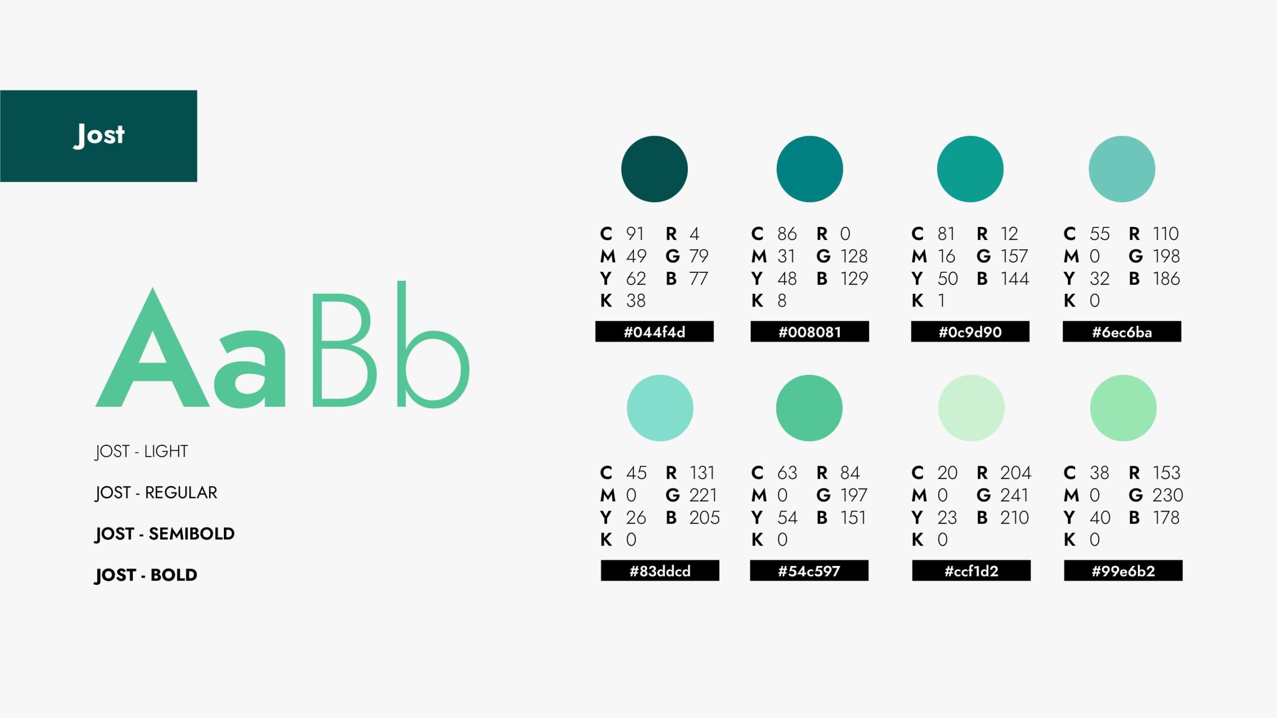
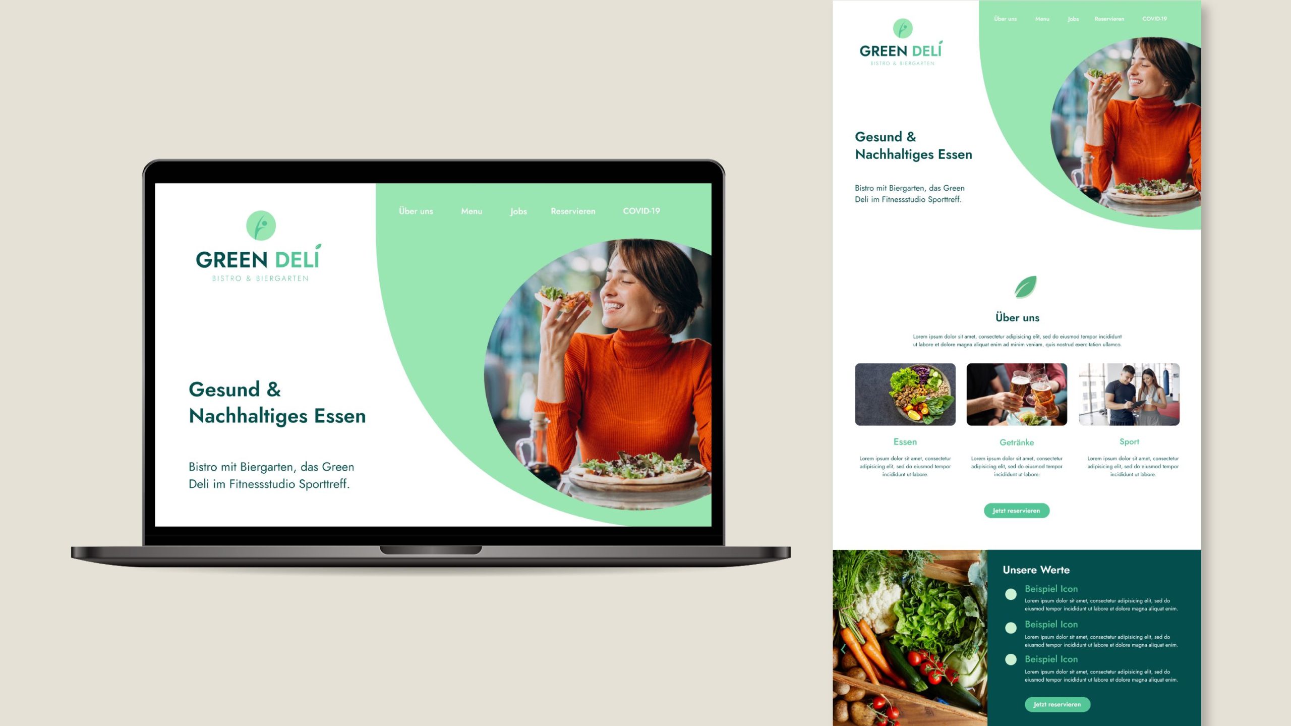
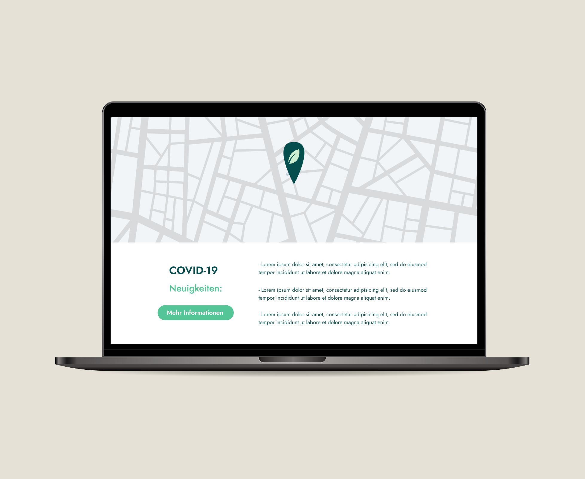
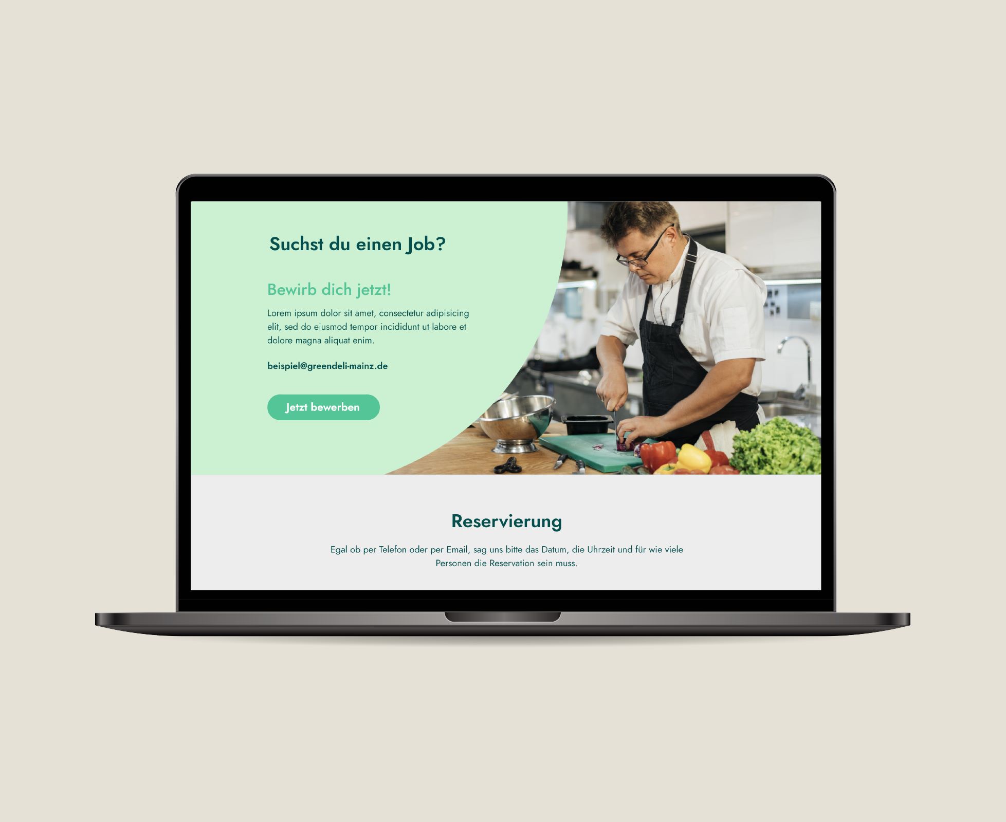
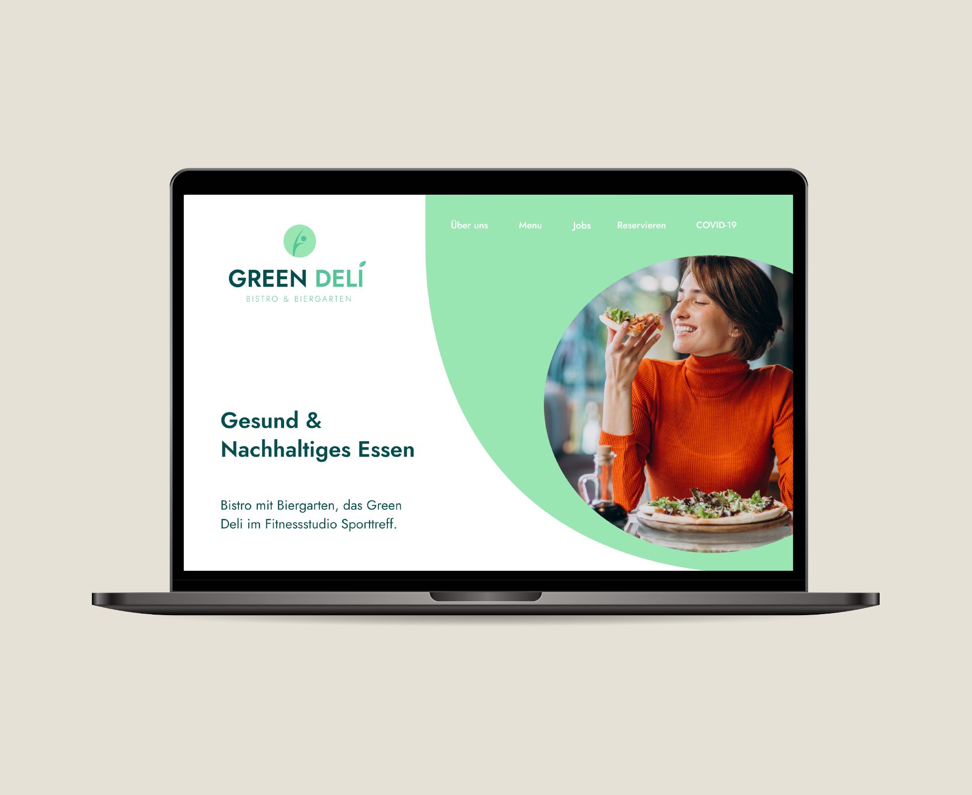
Posted on

Healthy Restaurant – Branding & Website Design

Green Deli, Green Fit

Corporate Identity Design & Website Design

About the client:

Green Fit is a Fitness Studio located in Mainz, Germany before known as “Sporttreff”. Right next to it is Green Deli, a restaurant that offers high-quality, regional cuisine with a large selection of modern and vegetarian dishes. They both are a subsidiary company and are own by the same person.

Healthy Restaurant Brand

Challenges

Company's named changed

The company used to be called “Sporttreff” and now they wanted to turn that into “Green Deli” and “Green Fit”.

2 Different Companies yet still belong together

Although Green Fit and Green Deli offer different services, they still are right next to one another and people should understand that both concepts belong together

Attract younger generations/ Modern Look

“Sporttreff” was thought for an older audience. Now Green Deli and Green Fit should attract younger generations without losing their current loyal clients.

Strategy

Bring Green Deli and Green Fit to life and let people know despite their different services, they still belong together.

Solution

Services provided:

• Corporate Identity (Color Palette, CI Guide, etc)
• Social Media Content Creation
• Landing Page Design (High-Fidely Mockup)

Benefits

Modern & Fresh Look

Green Deli & Green Fit image was taken in a good way by their audience and with the new more modern branding they could attract younger clients.

Former clients returned and new clients were gained

Many clients that used to support Sporttreff kept on visiting now Green Fit. New clients were also acquired during this process for Green Deli.

Social Media Success

Sporttreff had no Social Media presence. With the new Banners and other Social Media Templates, Green Deli & Green Fit could slowly build an online community.

Posted on

Merkurist – Corporate Identity

Merkurist Content Creation

Merkurist

Corporate Identity Design

About the client:

Merkurist is an online regional newspaper focused on news from Mainz and Wiesbaden (two cities in the southwest of Germany.) Whether it’s local, politics, sports or the blue light: the local readers decide what merkurist.de reports on.

Merkurist Content Creation

Challenges

Company got sold and has now a new owner

The new owner of Merkurist has some different views about how the company’s direction should be. These new values should be communicated through the new design.

Lost their online community

Due to legal settlements their social media channels got erased and they lost all their followers. They had around 15K followers and had been innactive for around 3 months due to the company selling.

Need of a modern look to attract younger readers

Since Merkurist is starting a new chapter they want to have a renewed look to make a great comback, yet somehow mantain their old image so that loyal readers can still recognize its them.

Strategy

Help Merkurist get back on their feet and make a great comeback.

Solution

I added some new shiny colors to their former color palette and decided to mantain their old logo since many people recognized the Merkurist team thanks to this. I supported them to create a marketing campaign which involved the creation of print and digital media, creating content for their social media channels and making a promotion video. 

Services provided:

• Corporate Identity (Color Palette, CI Guide, etc)
• Social Media Content Creation
• Marketing Campaign Support

Benefits

Successful marketing campaign

The “Merkuretter” Campaign was live for about 4 weeks and it accomplish the money goal they were expecting. This success was of course not only thanks to the design actions, but it contributed in a big way.

Former clients returned and new clients were gained

Many clients that used to support Merkurist knew that they were back thanks to all the social media presence and decided to support them again. New clients were also acquired during this process.

Slowly regained their online community & still growing

Merkurist has gained back their only community day-by-day. Today they already have above 10K followers in their Instagram and keep on growing everyday. They have a wide resonance and their new brand is starting to get well-known.

Posted on

Glasny

Glasny Corporate Identity Business Cards

Glasny

Corporate Identity Redesign

About the client:

Glasny is a Children’s Neuropsychological Center that specializes in the diagnosis and monitoring of cognitive abilities in children. They focus on children ages 2 – 6 in their morning Institute and from 6 – 10 in their Center.

Glasny Corporate Identity Business Cards

Challenges

Company expanded to 3 new areas

Glasny expanded their services and now they had not just one area but three different ones.

Reesctructure and name change

Glasny gave a new name to each new area and didn’t know how to communicate this to their clients without confusing them.

Company's initial branding was almost 5 years old

Glasny already had a branding, but this was the very first image created back then when the company was just starting. Many things had changed.

Strategy

Give Glasny’s new areas a unique personality but maintain Glasny’s look as the main brand.

Solution

I used the already existing color palette, though I changed the brightness of some colors to give them more power. I mixed the colors in pairs and created that way 3 different areas with a very clear distinction.

Services provided:

• Brand Strategy Workshop

• Corporate Identity (Logo, Color Palette, CI Guide, etc)

Benefits

Instant brand recognition among competition

Glasny has a very unique design among the children psychology centers in Monterrey, MX. It is easy to recognize among all others.

Clear communication to their clients

Clients of glasny understand that there is a company restructure and know in which direction it’s going. They’re not lost and confusion is unusual.

Up-to-date image with current company's values

After many years of constant growth, it’s just normal that the initial branding doesn’t apply anymore to the current company’s state. This redesigned identity communicates better Glasny’s vision and mission!

Posted on

The Hackathon Company – Corporate Identity

Corporate Identity The Hackathon Company

The Hackathon Company

Corporate Identity & Website Design

About the client:

The Hackathon Company offers hackathon events & recruiting services for big corporates of different regions in Germany. They focus on recruiting people from the IT sector, since companies struggle currently to find programmers.

Corporate Identity The Hackathon Company

Challenges

No consistency/ No brand recognition

Since there was not a specific design-line followed, clients didn’t recognize nor remembered the company’s name nor the brand in general.

Aiming the wrong target group

This company has two different target groups: 1. Managing Directors of big companies, 2. Students/ Under-grads. Their image was not speaking to both these groups but just one.

Services not clear

They were struggling to define which services they offered and define if “sub-brands” were needed or everything would be part of the “mother-brand”.

Strategy

Establish a brand consistency and harmony across all platforms.

Solution

I created a short but powerful color palette that communicates the company’s values. Redefined the order and hierarchy of the services, and created a mother brand and sub-brands accordingly.

Services provided:

• Corporate Identity Creation (Logo, Color Palette, CI Guide, etc)

• Website Design

Benefits

A clear design-line

The new branding was succesfully applied to their website and all their other social media. There’s a clear harmony and recognition now.

More applicants for their recruiting events

The new website and social media attracted more applicants to be part of their hackathons. The applicants are a key piece in their business modell.

Gaining more leads

Having many applications of IT-personal is proof of success and this fact attracted therefore more companies as clients as well.

Posted on

Daniela Hölzer – Branding &Website Design

Daniela Hölzer Coaching & Consulting

Daniela Hölzer

Branding & Website Design

About the client:

Daniela Hölzer is an independent coach and consultant. She supports private in their day-to-day life, as well as business owners who need a strategic and targeted support with communication inside their companies. 

Daniela Hölzer Coaching & Consulting

Challenges

Not taken seriously

Clients often didn’t take her services seriously or didn’t fully trust them. Her digital prescence lacked professionalism. 

Esoteric image

People had a strong esoteric/ guru perception of Daniela, eventhough she is a highly specialized consultant.

Current color palette doesn't reflect her personality

As many other solopreneurs, the colors she had didn’t reflect the services and values she actually offered.

Strategy

Create a solopreneur consulting brand that communicates professionalism and trust.

Solution

I created a vibrant color palette that represented Daniela’s energetic personality, keeping in mind the professionalism. The logo’s intention was a very minimalistic shape to be taken seriously by big concerns, and at the same time could be placed anywhere and get a direct brand recognition with the pass of time.

Services provided:

• Brand Strategy Workshop

• Corporate Identity (Logo, Color Palette, CI Guide, etc)

• Website Design

Benefits

Faster appointment scheduling

With the new website design, it is now easier for clients to make an appointment with Daniela without so much searching and trying.

More potential leads through the right key words

Having the right key words in addition to the new design at her homepage is a crucial thing. She now can be found much easier through google and get seen by more potential clients!

Earn clients trust

Making a good first impression with potential clients is much easier now for Daniela having a professional well-designed brand and website. No more esoteric confusion 😉