This is a mobile app made for artists and art enthusiasts who want to share their work online and eventually make a living out of it. It’s meant to facilitate the connection and making of community interested in art.
Challenges
It is very expensive to do a physical art exhibition so doing an online one would be more budget friendly for people who are just starting.
Many art fans don’t want to go to a museum because they waste too much time and are bound to the opening hours.
The world is very globalized and many artists don’t specifically have their fan base in their hometown but the place they currently live in.
The Goal
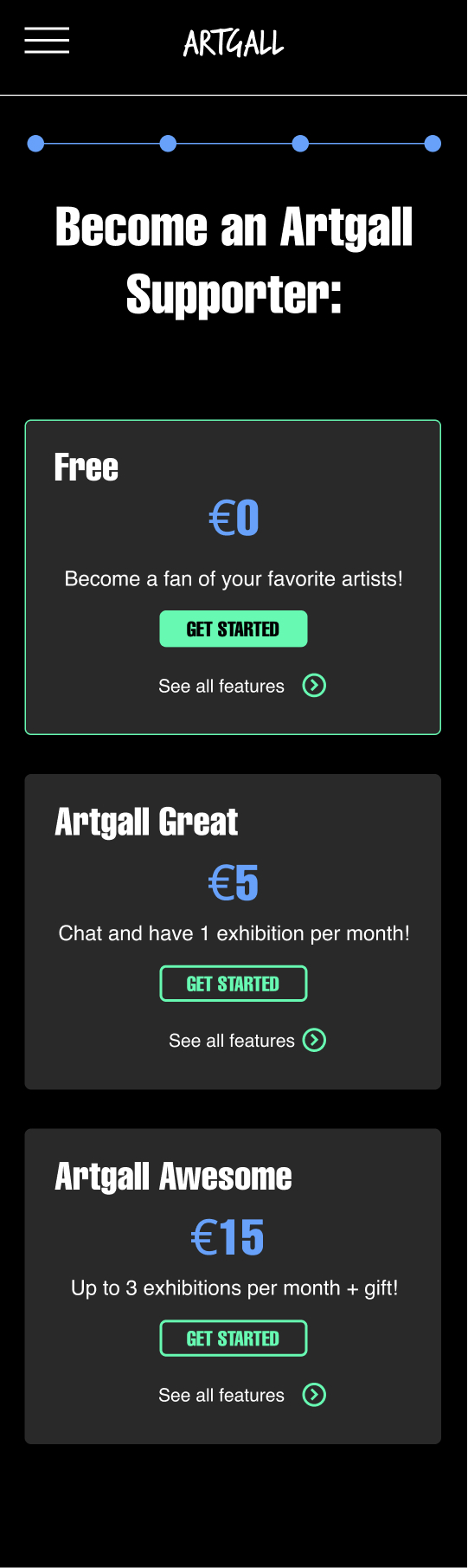
Our art gallery app will let users showcase their art, make online exhibitions, create a fanbase and connect with people which will affect independent artists who want an uncomplicated and fair option to make money from their art by getting financial support on a monthly basis from their fans & keeping 95% commision of the sales they make with from their artwork. We will measure effectiveness by tracking the number of new artist profiles created, monthly fan subscriptions and sales made by each artist.
Understanding The User
I conducted interviews and created empathy maps to understand the users I’m designing for and their needs. I identified through research that people interested in art don’t often visit museums because they find it inconvenient, boring and expensive.
Also there are many artists who want to sell their art or want to make an exhibition, but they don’t have a huge budget to make it at the beginning. According to research, an online platform would make things easier for them and could support them by giving them visibility and helping them sell their work.
Meet the Users
Primary
Sendaya López, 28, Digital Illustrator
Sendaya is a digital illustrator living in a foreign country who needs an easy, language accessible and cheap way to present her art & make money out of it because normal exhibitions are expensive to do and doing it alone in a tight budget is too complicated.
Secondary
Matt Noori, 31, Developer
Matt is a developer & art enthusiast who needs a convenient way to contemplate art without visiting a museum exhibition because museums are too expensive & time consuming, besides one can’t interact directly with the artists.
User Journey Map
Sendaya
Matt
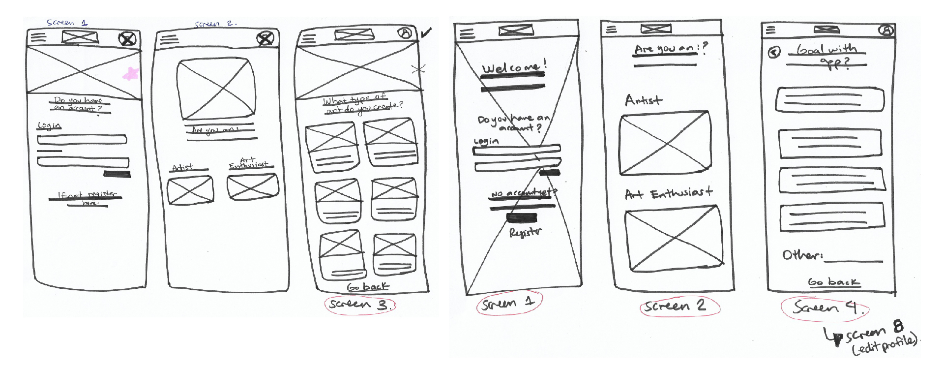
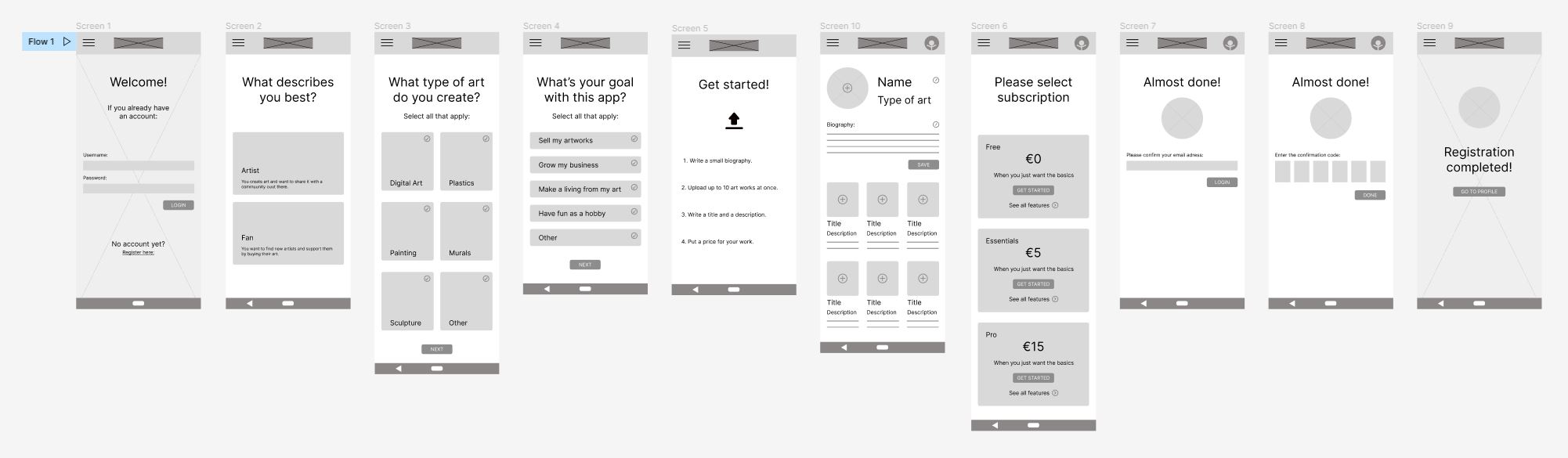
Paper Wireframes
Before moving onto high fidelity wireframes and mocks, I wanted to get a feel for what the core of the app would look like when put in front of me. Paper Wireframes can be a bit messy because it’s the perfect way to put your ideas into life and make quick iterations 😉
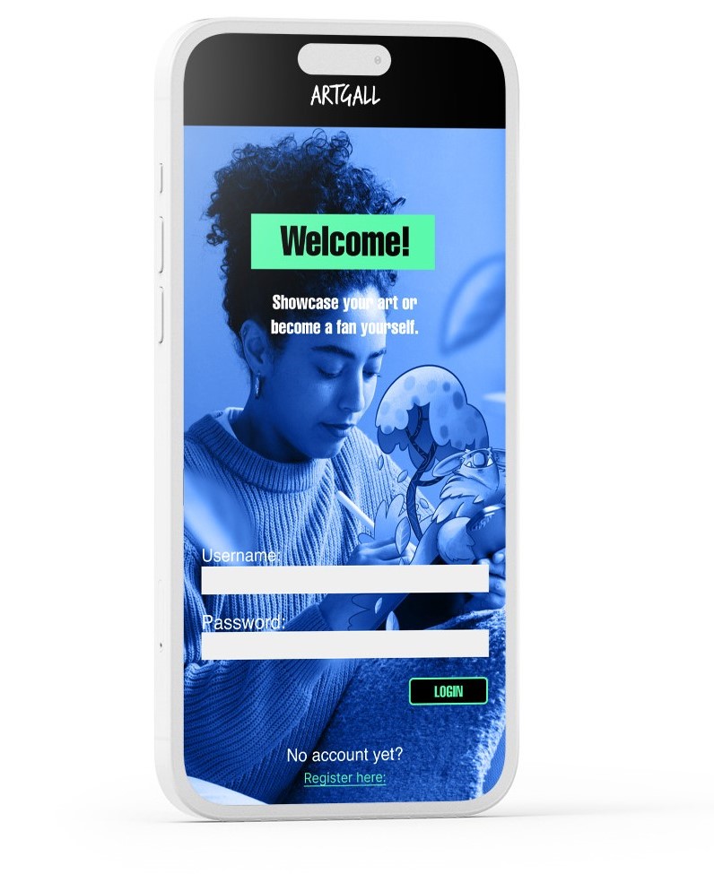
Low-Fidelity Wireframes
Lorem ipsum dolor sit amet, consectetur adipiscing elit. Ut elit tellus, luctus nec ullamcorper mattis, pulvinar dapibus leo.
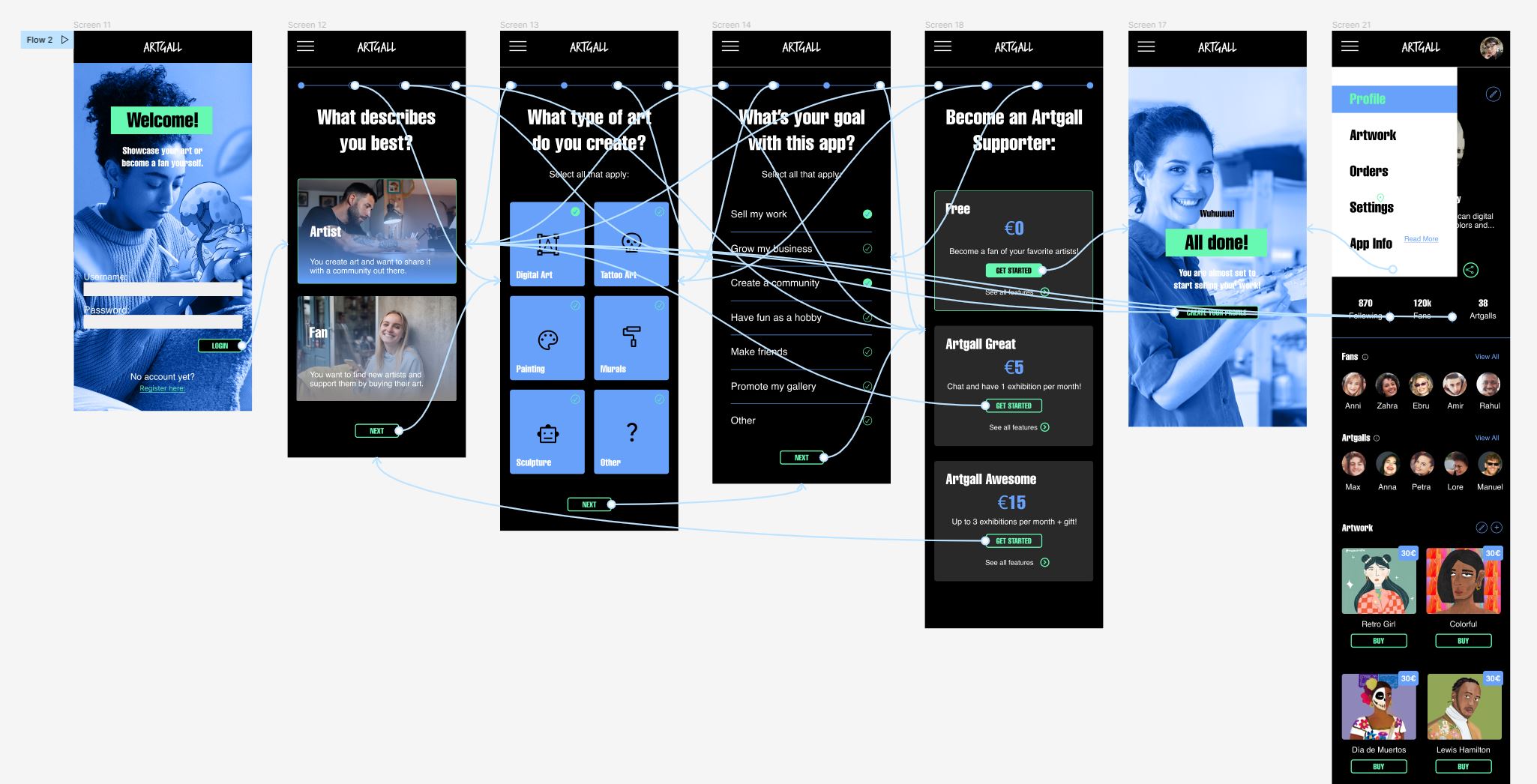
Wireflow
Lorem ipsum dolor sit amet, consectetur adipiscing elit. Ut elit tellus, luctus nec ullamcorper mattis, pulvinar dapibus leo.
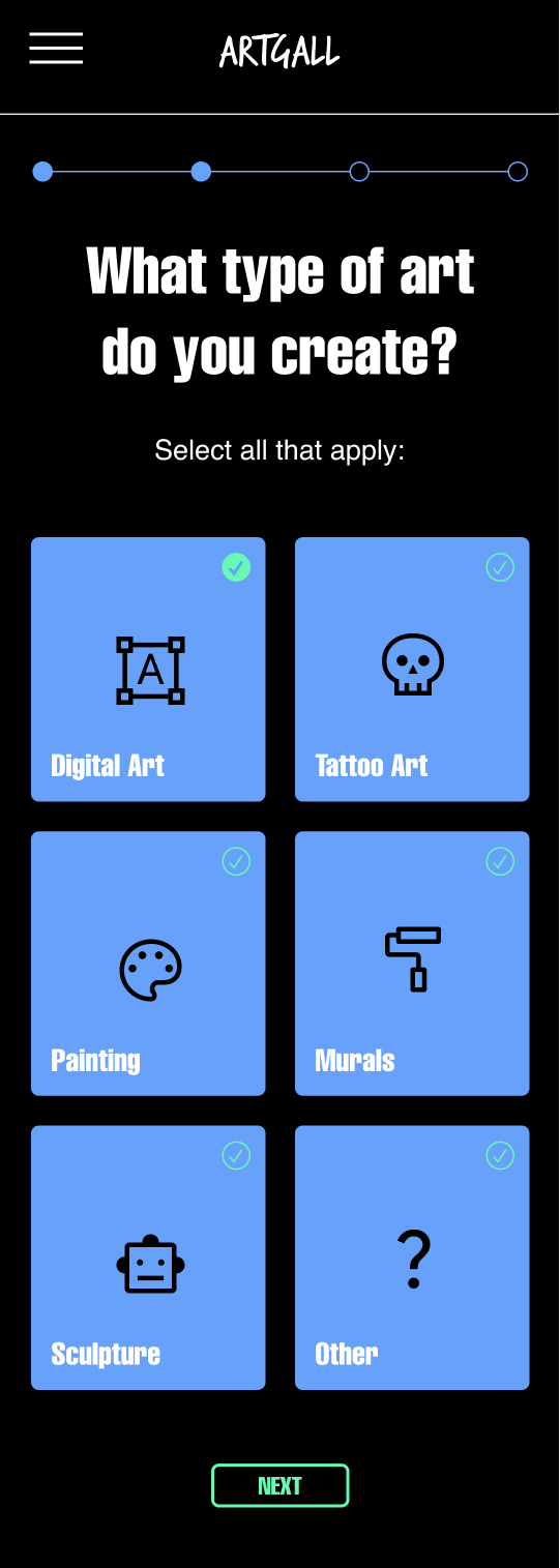
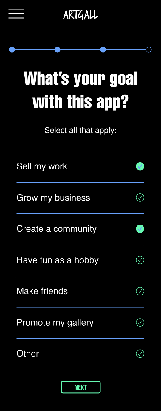
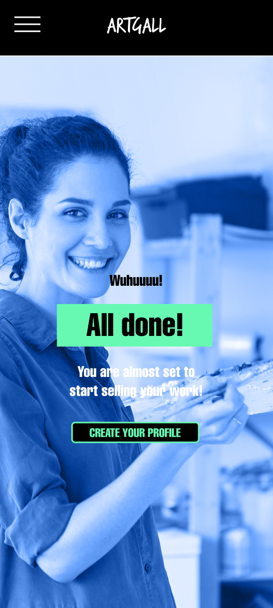
Results
Accesibility Considerations
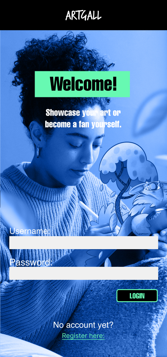
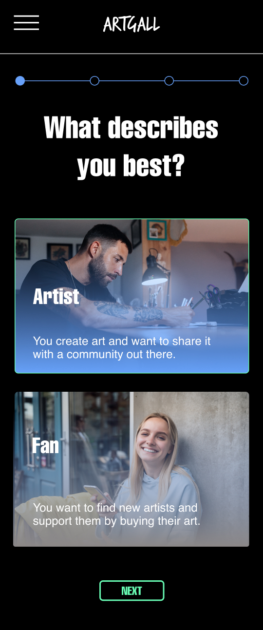
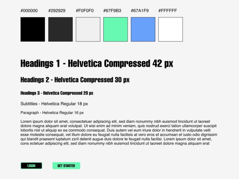
I used a lot of contrast in the color palette I chose. It is very easy to read the info with the dark mode app design. Also the brighter green attracts the user’s attention for example of the buttons.
The typefont I used is very legible and also the size I used for the titles and main info is also very readable.
The user flow is very clear and straightforward. There isn’t much that the user can do wrong and the user can navigate from step to step backwards and forwards thanks to the navigation bar.
Small Style Guide
I defined a color palette together with the right font to give a singular personality to Artgall. This colors are vibrant, modern and full of energy, just how the app is too.
Takeaways
Testimonial
The App is a great opportunity to get to discover new art and at the same time give the artists the recognition and compensation they should get in “The age of mechanical reproduction”. – Maximilian Grunwald
What I learned:
I learned so much about the user research process at the beginning and how much time you need to invest on the iterations for your high-fidelity prototypes. The design is very important but it’s just based on the previews insights found by the research.