Posted on

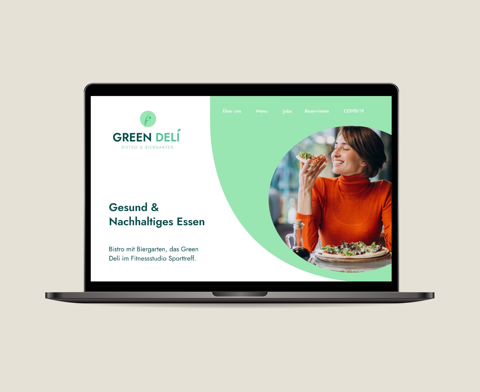
Healthy Restaurant – Branding & Website Design

Green Deli, Green Fit

Corporate Identity Design & Website Design

About the client:

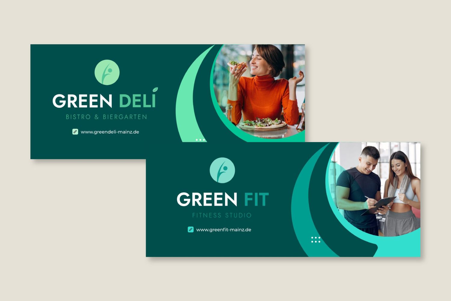
Green Fit is a Fitness Studio located in Mainz, Germany before known as “Sporttreff”. Right next to it is Green Deli, a restaurant that offers high-quality, regional cuisine with a large selection of modern and vegetarian dishes. They both are a subsidiary company and are own by the same person.
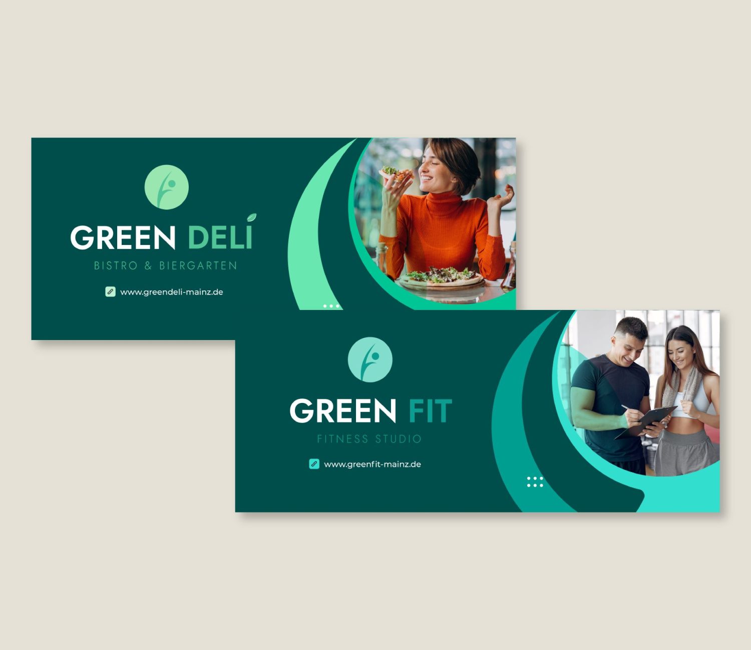
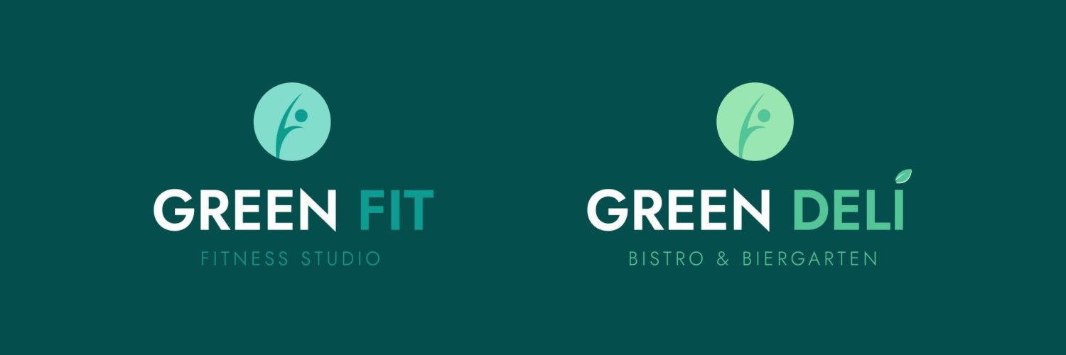
Healthy Restaurant Brand

Challenges

Company's named changed

The company used to be called “Sporttreff” and now they wanted to turn that into “Green Deli” and “Green Fit”.

2 Different Companies yet still belong together

Although Green Fit and Green Deli offer different services, they still are right next to one another and people should understand that both concepts belong together

Attract younger generations/ Modern Look

“Sporttreff” was thought for an older audience. Now Green Deli and Green Fit should attract younger generations without losing their current loyal clients.

Strategy

Bring Green Deli and Green Fit to life and let people know despite their different services, they still belong together.

Solution

Services provided:

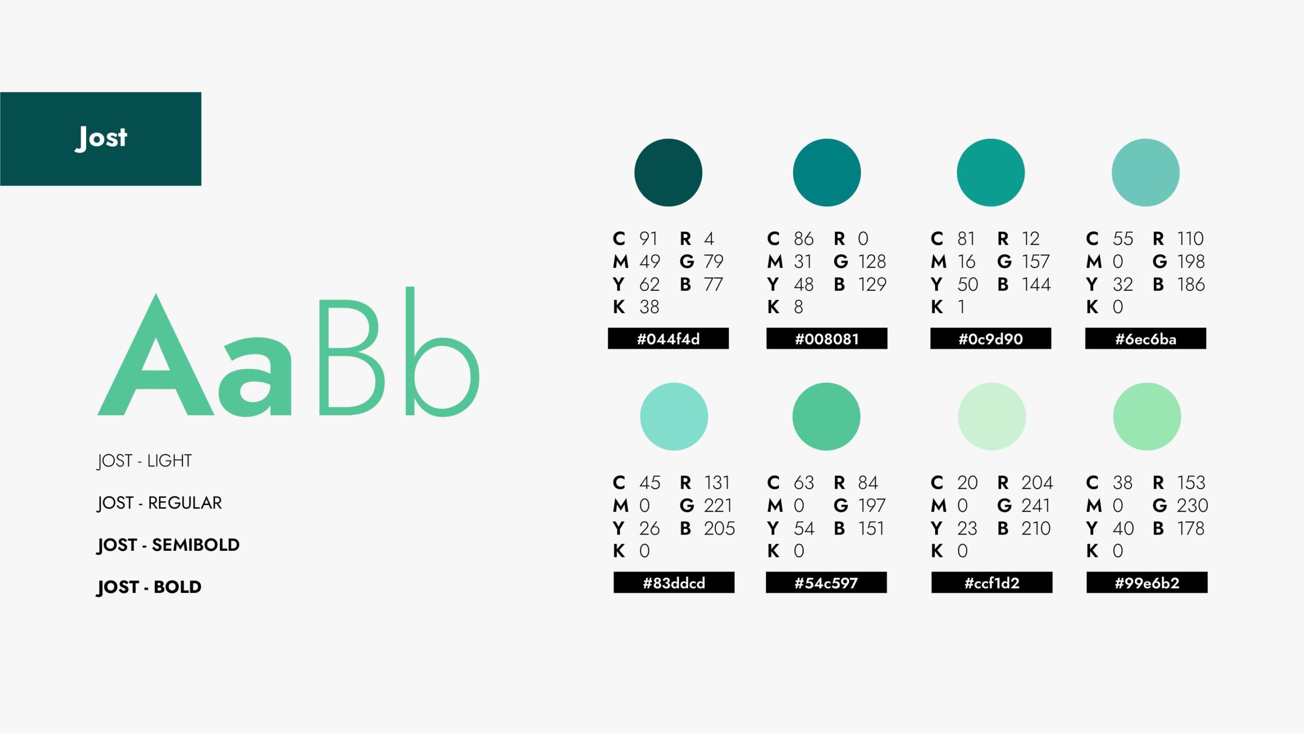
• Corporate Identity (Color Palette, CI Guide, etc)
• Social Media Content Creation
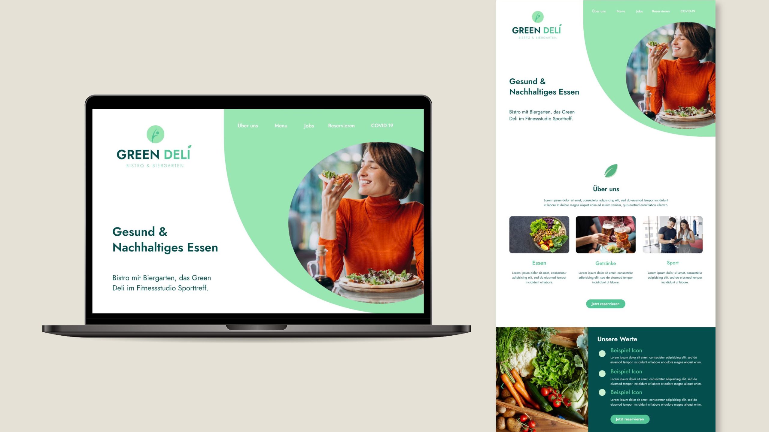
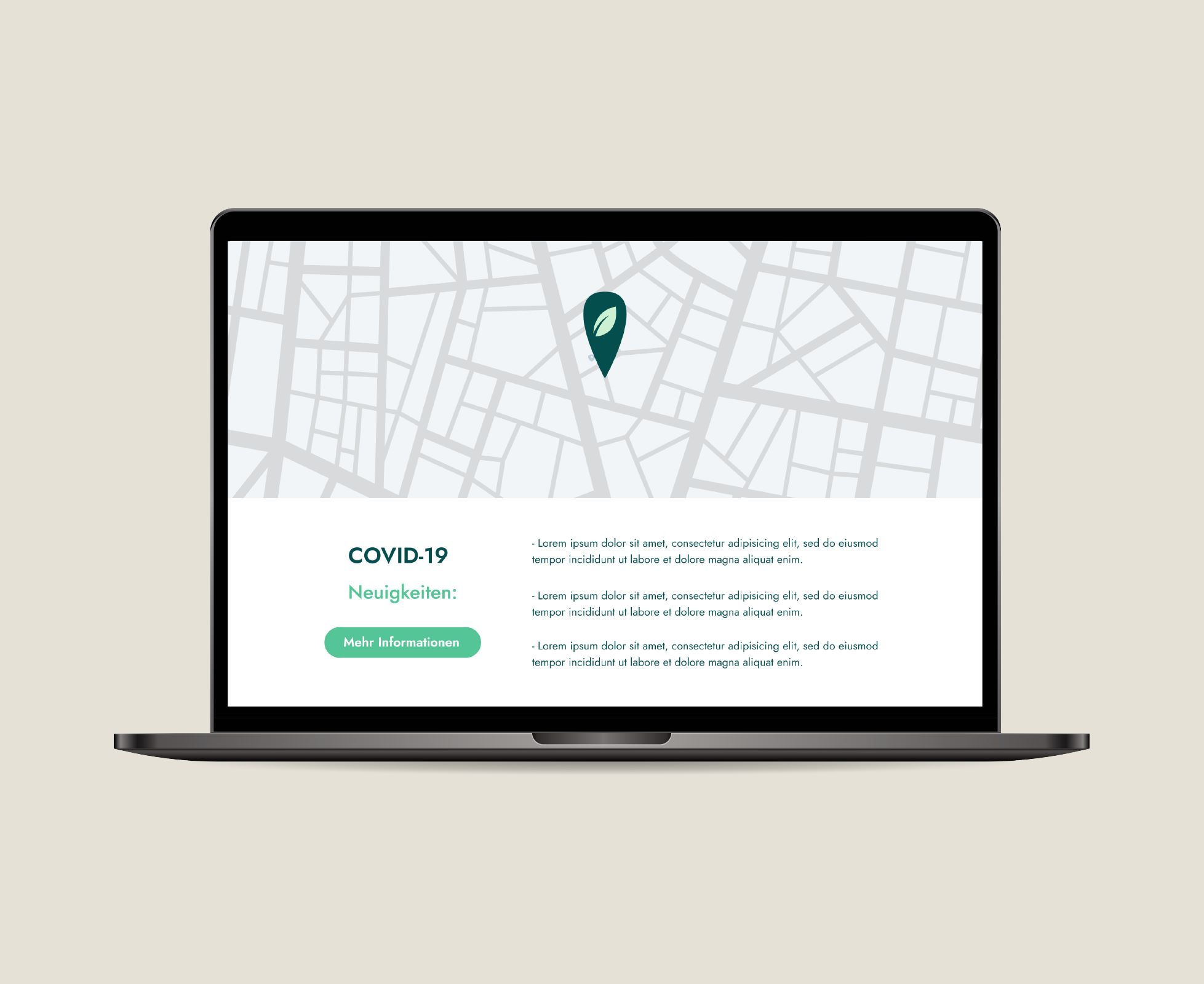
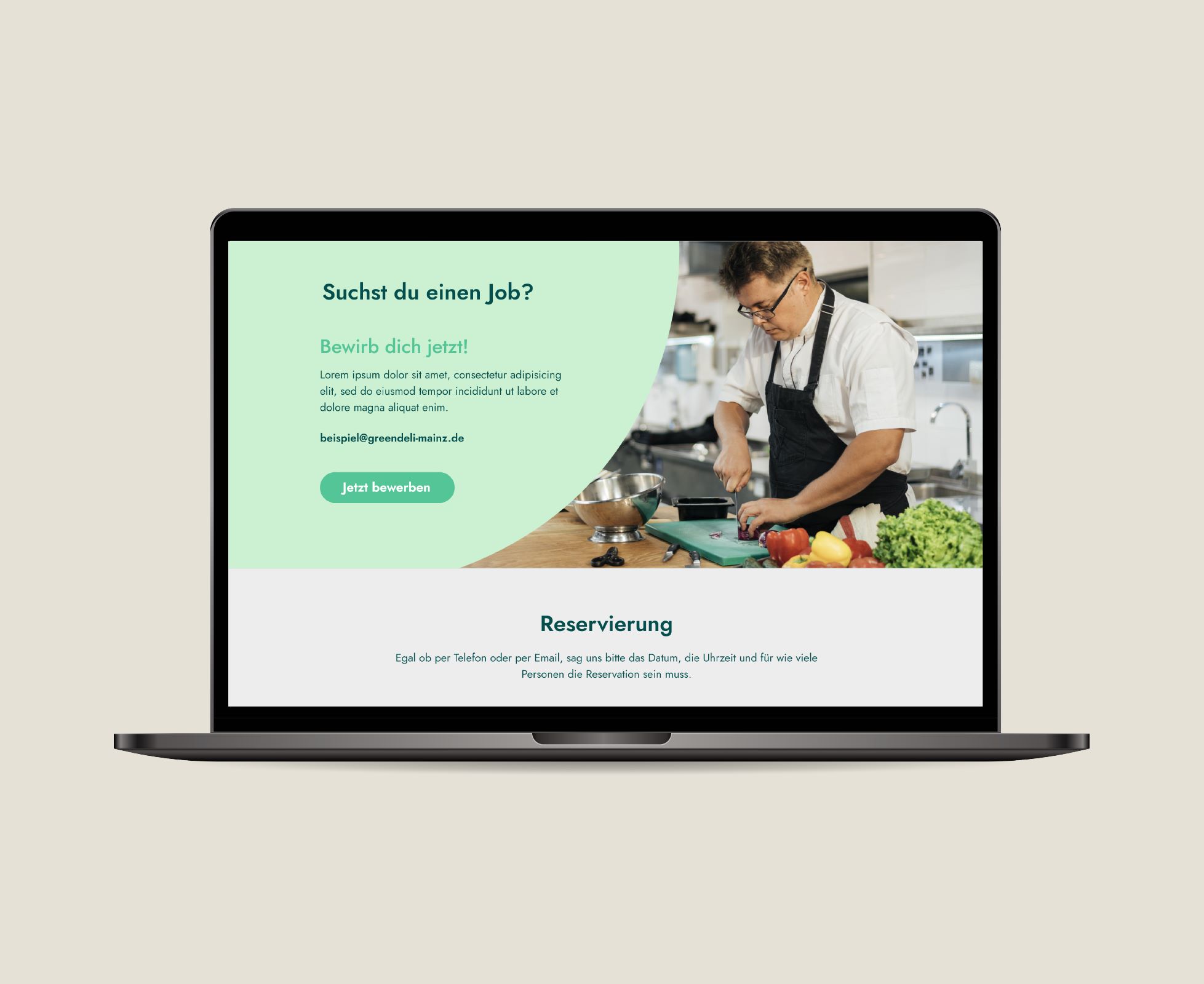
• Landing Page Design (High-Fidely Mockup)

Benefits

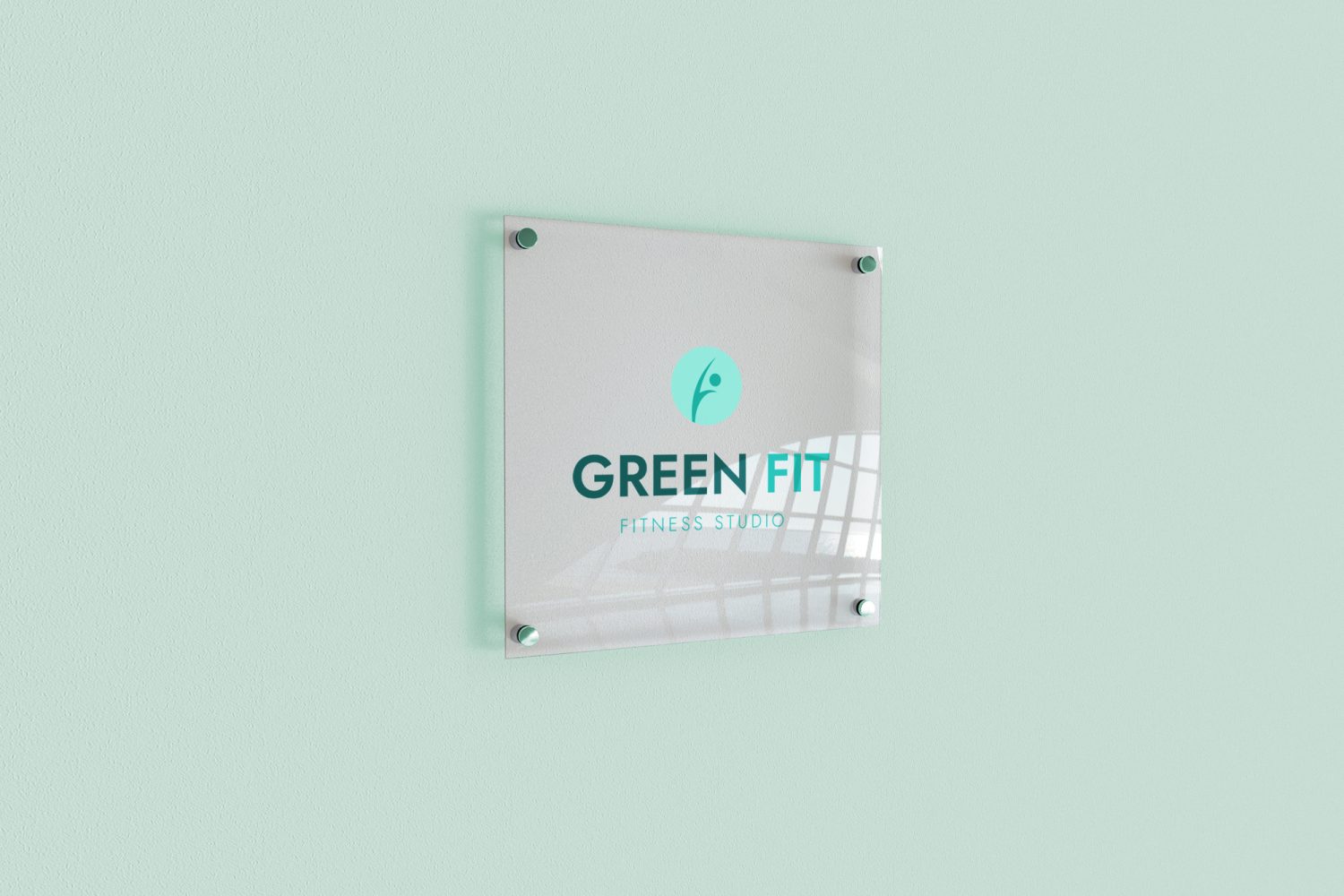
Modern & Fresh Look

Green Deli & Green Fit image was taken in a good way by their audience and with the new more modern branding they could attract younger clients.

Former clients returned and new clients were gained

Many clients that used to support Sporttreff kept on visiting now Green Fit. New clients were also acquired during this process for Green Deli.

Social Media Success

Sporttreff had no Social Media presence. With the new Banners and other Social Media Templates, Green Deli & Green Fit could slowly build an online community.

Posted on

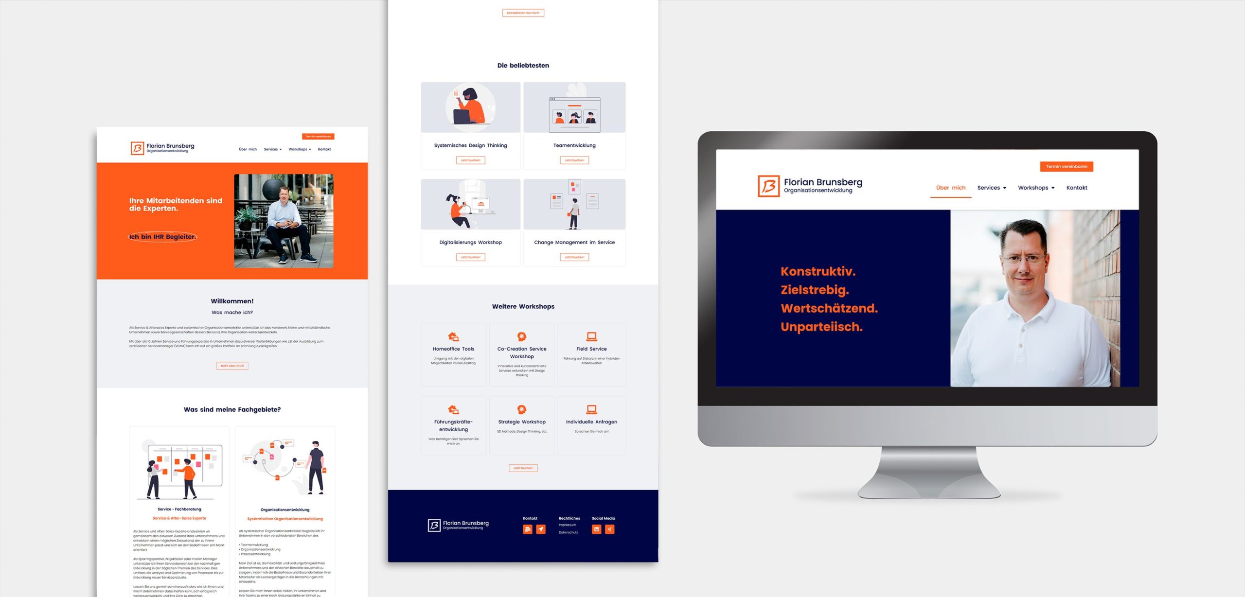
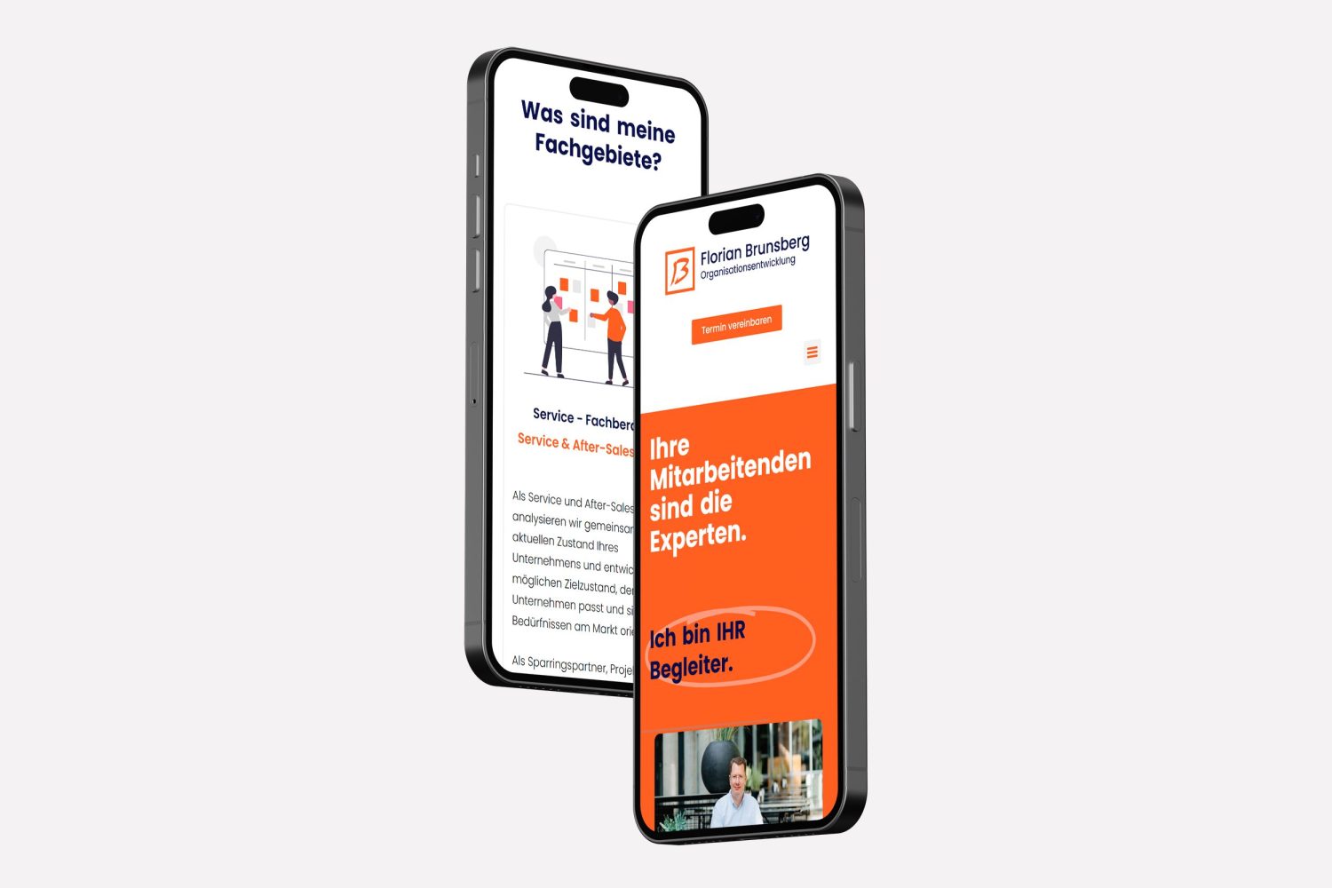
Florian Brunsberg – Website Design

Florian Brunsberg Consultant

Florian Brunsberg

Website Design

About the client:

Florian is a service & after-sales expert and systemic organizational developer. He supports the internal processes of small and medium-sized companies whose goal is to further develop their organization.

Florian Brunsberg Consultant

Challenges

No structure for website content

Florian didn’t know how to communicate everything he wanted without being too much content and overwhelming his audience.

Website wasn't alligned with branding

Florian had already an existing branding (logo, color palette, etc), yet it wasn’t reflected in his website. 

Complicated navigation/ UX

The current website was very hard to navigate since there wasn’t a clear content structure. Therefore people often didn’t find what they were looking for.

Strategy

Support Florian to structure the new website’s content in a clear way and present it with high-end design.

Solution

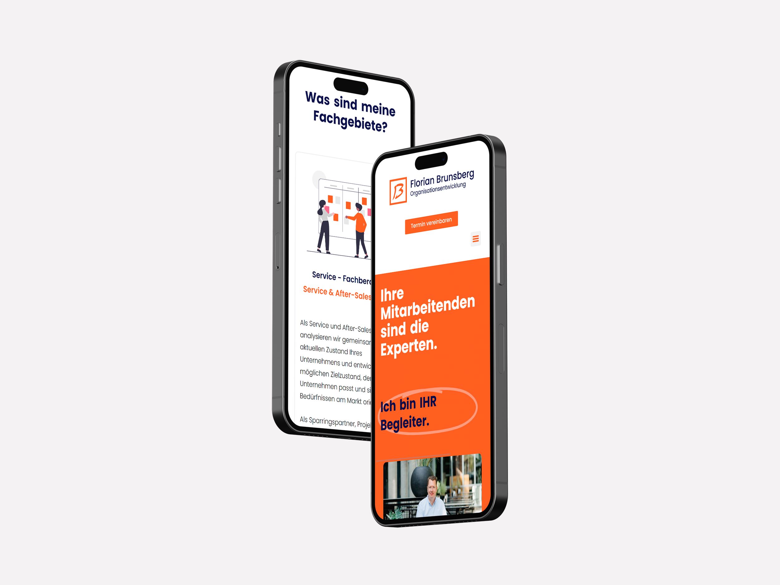
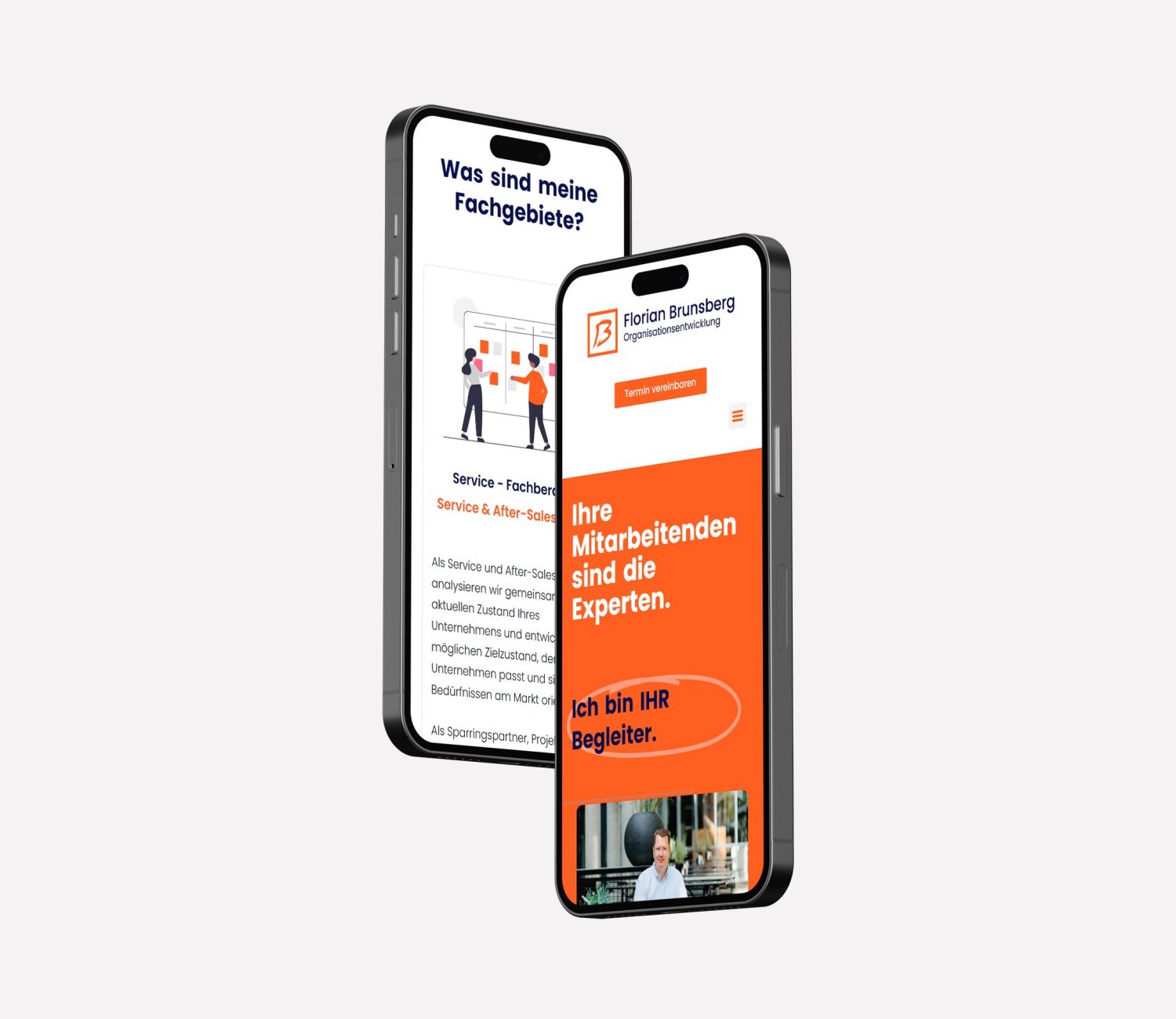
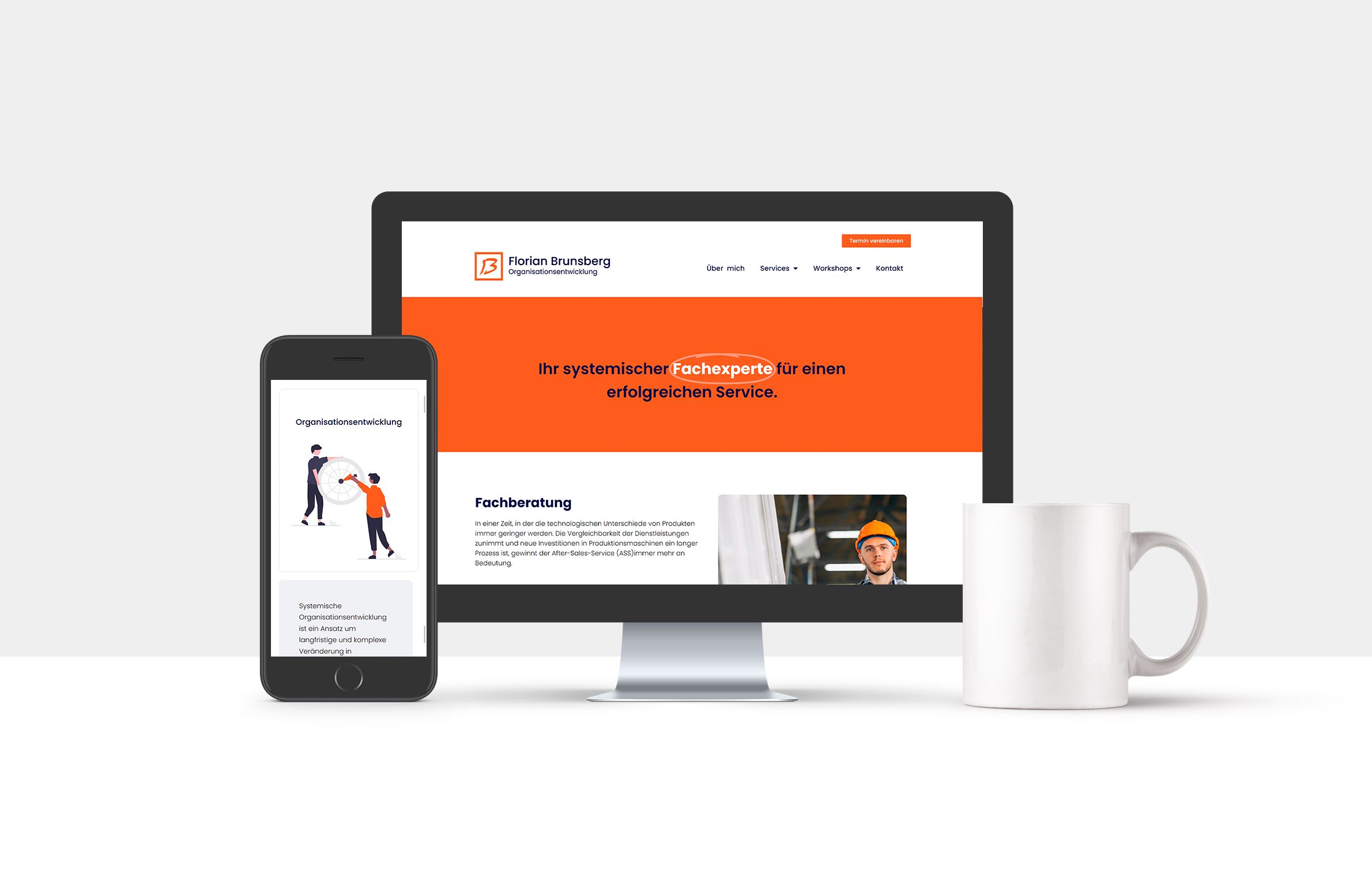
We worked together for a couple of months, and after a web design workshop, some look & feel proposals, a wireframe and some rounds of corrections here is the final product .

Services provided:

• Web Design Workshop
• Sitemap & Content Structure Guidance
• Wireframes & Low-Fidelity Prototypes
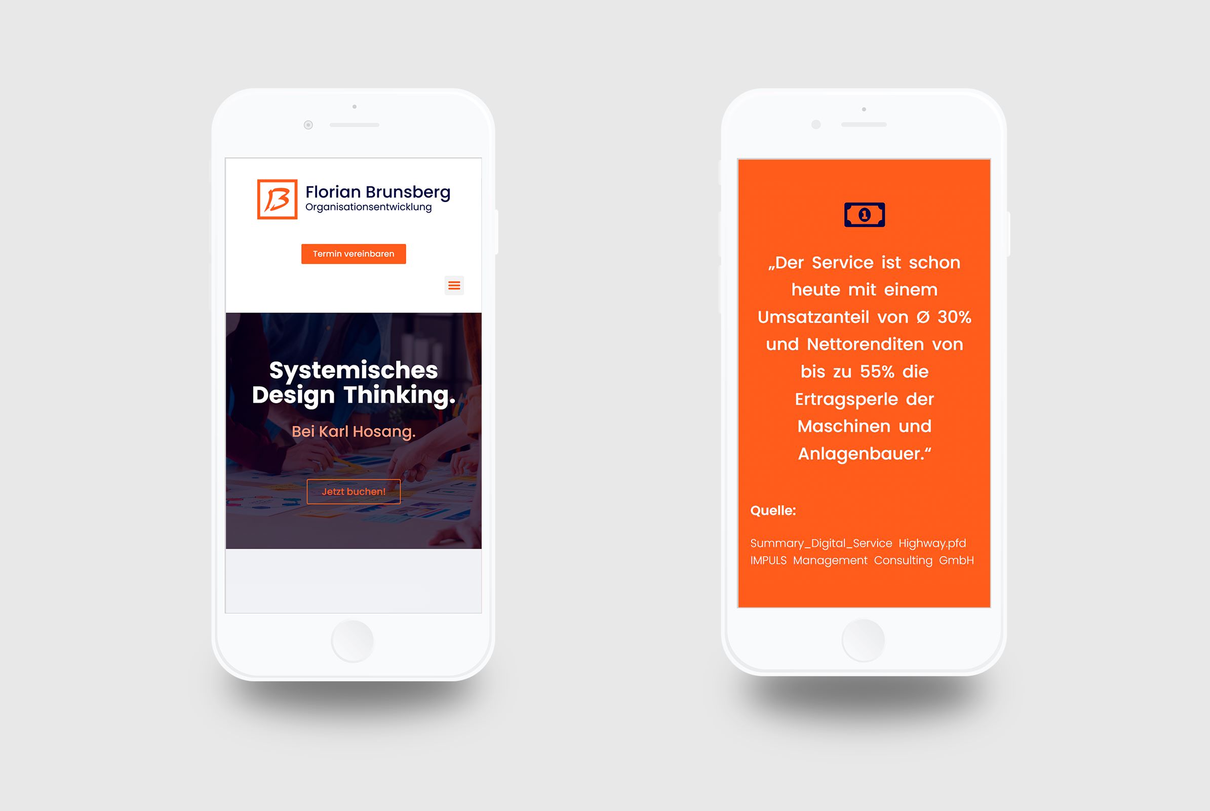
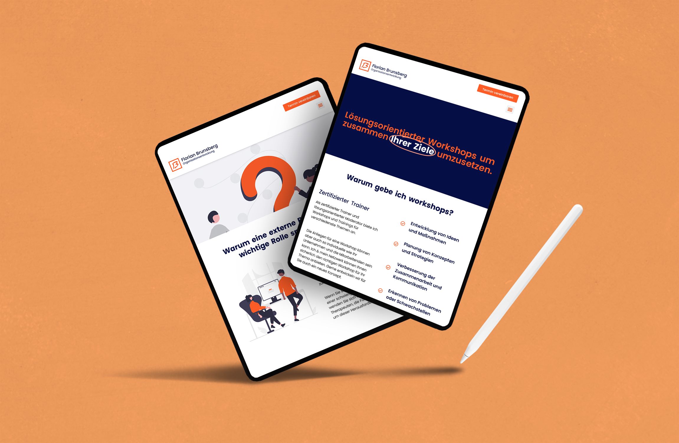
• WordPress Site Building (Tablet + Mobile Adaptation)
• Basic SEO Optimization for Google

Benefits

Clear structure of the content

User experience is much more intuitive & makes it way easier to navigate

Scheduling appointments is a no-brainer now

Basic SEO for appearing in google is now optimized

More visibility and leads

Posted on

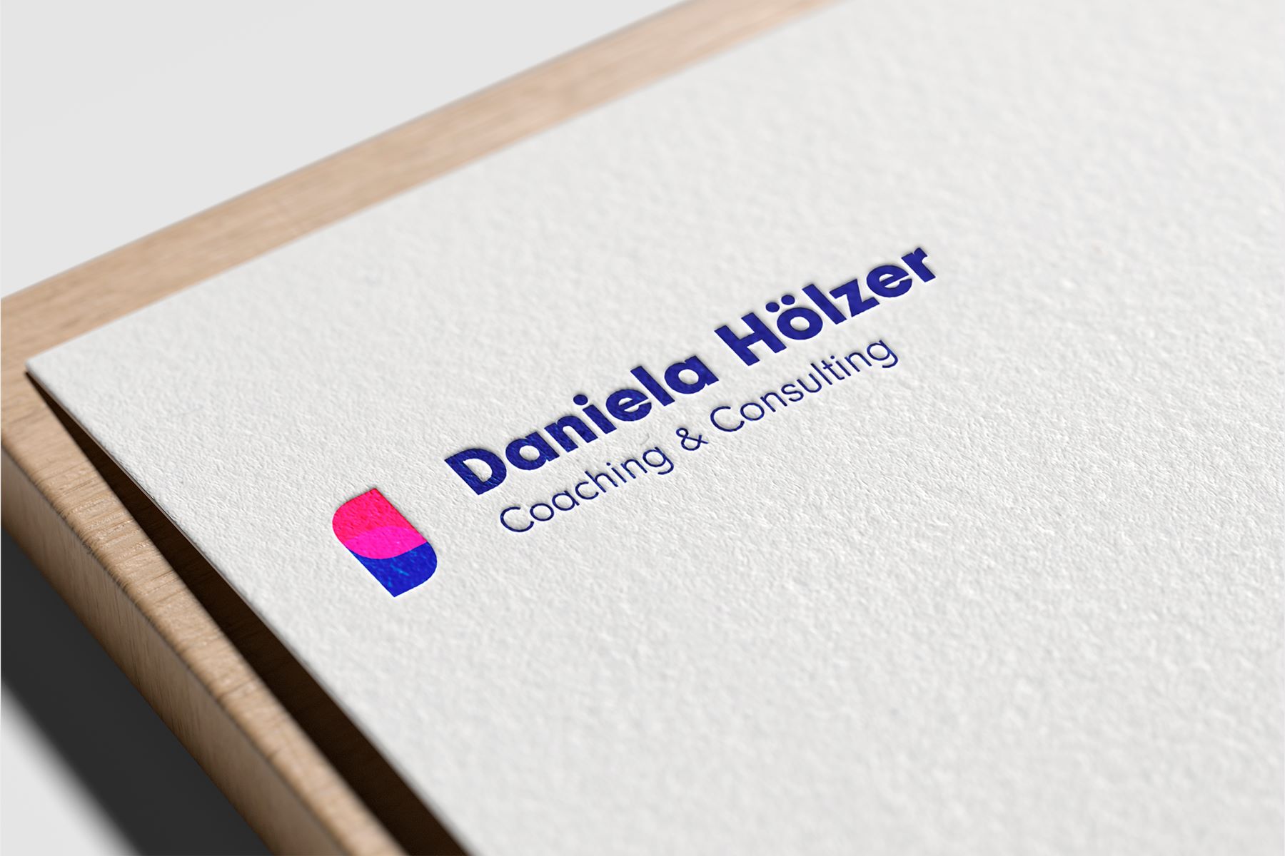
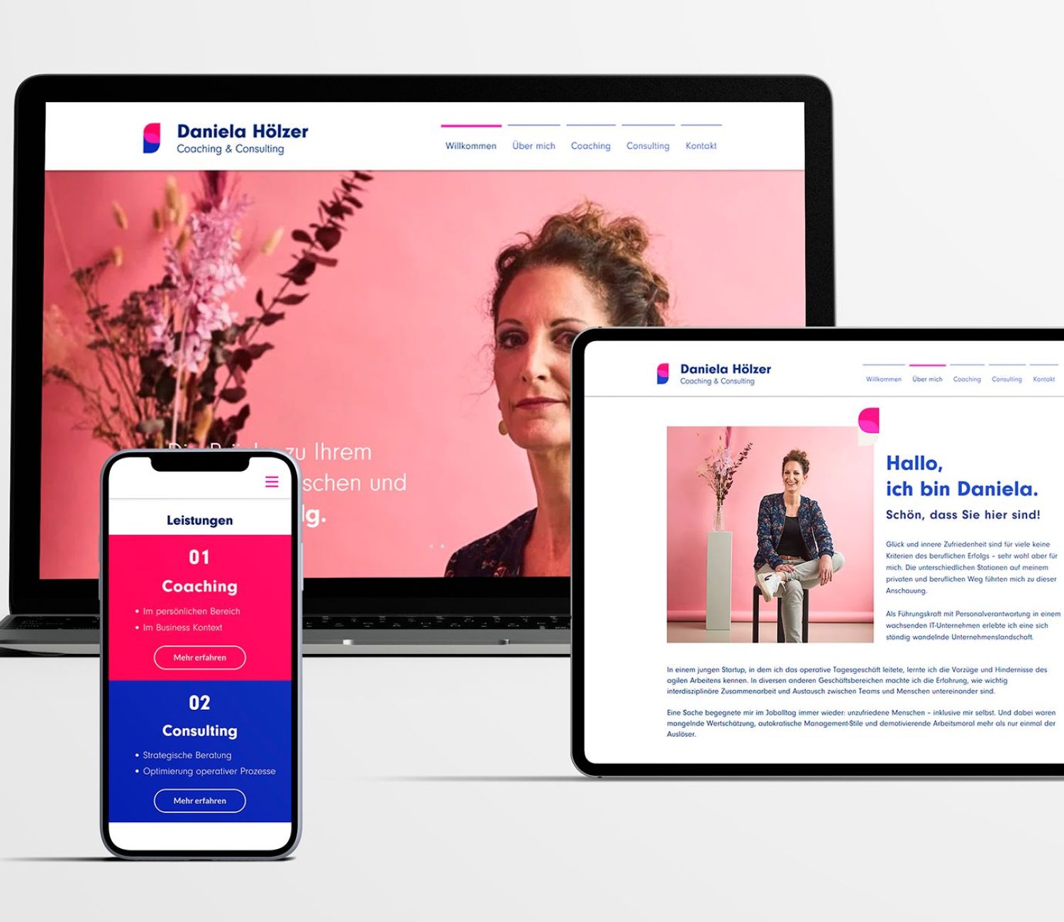
Daniela Hölzer – Branding &Website Design

Daniela Hölzer Coaching & Consulting

Daniela Hölzer

Branding & Website Design

About the client:

Daniela Hölzer is an independent coach and consultant. She supports private in their day-to-day life, as well as business owners who need a strategic and targeted support with communication inside their companies. 

Daniela Hölzer Coaching & Consulting

Challenges

Not taken seriously

Clients often didn’t take her services seriously or didn’t fully trust them. Her digital prescence lacked professionalism. 

Esoteric image

People had a strong esoteric/ guru perception of Daniela, eventhough she is a highly specialized consultant.

Current color palette doesn't reflect her personality

As many other solopreneurs, the colors she had didn’t reflect the services and values she actually offered.

Strategy

Create a solopreneur consulting brand that communicates professionalism and trust.

Solution

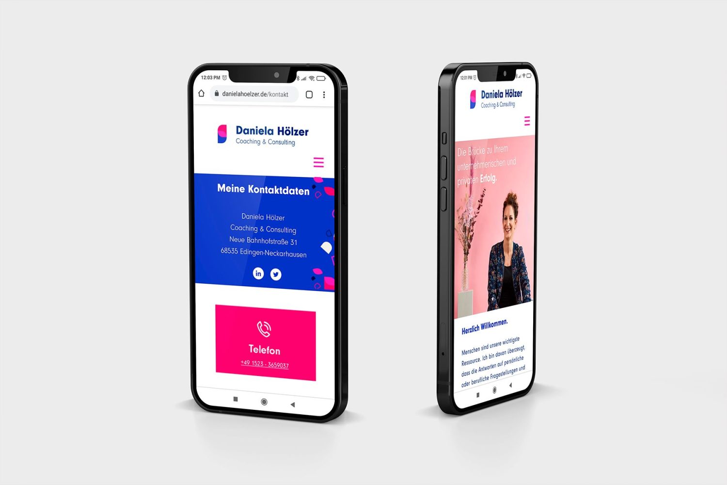
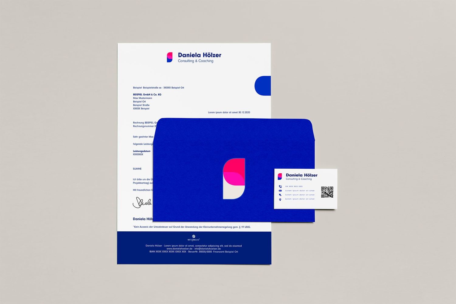
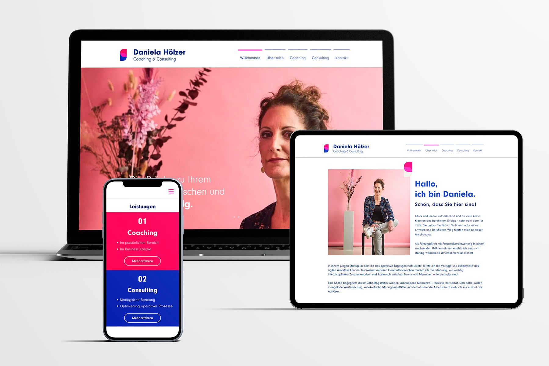
I created a vibrant color palette that represented Daniela’s energetic personality, keeping in mind the professionalism. The logo’s intention was a very minimalistic shape to be taken seriously by big concerns, and at the same time could be placed anywhere and get a direct brand recognition with the pass of time.

Services provided:

• Brand Strategy Workshop

• Corporate Identity (Logo, Color Palette, CI Guide, etc)

• Website Design

Benefits

Faster appointment scheduling

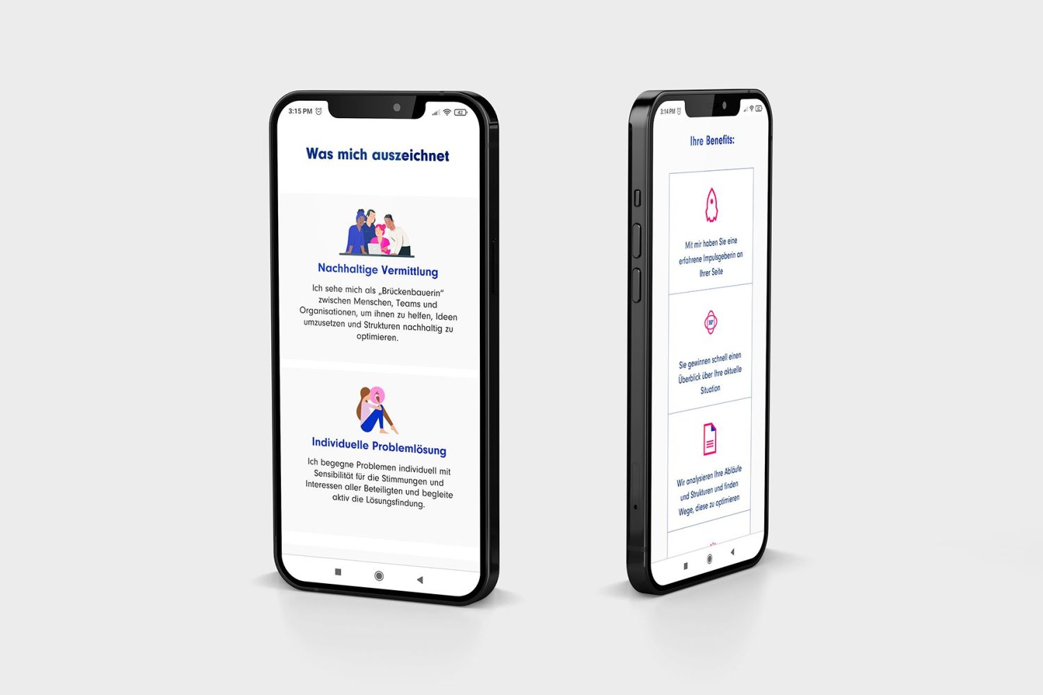
With the new website design, it is now easier for clients to make an appointment with Daniela without so much searching and trying.

More potential leads through the right key words

Having the right key words in addition to the new design at her homepage is a crucial thing. She now can be found much easier through google and get seen by more potential clients!

Earn clients trust

Making a good first impression with potential clients is much easier now for Daniela having a professional well-designed brand and website. No more esoteric confusion 😉

Posted on

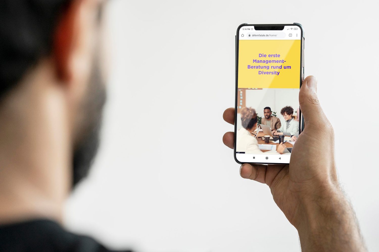
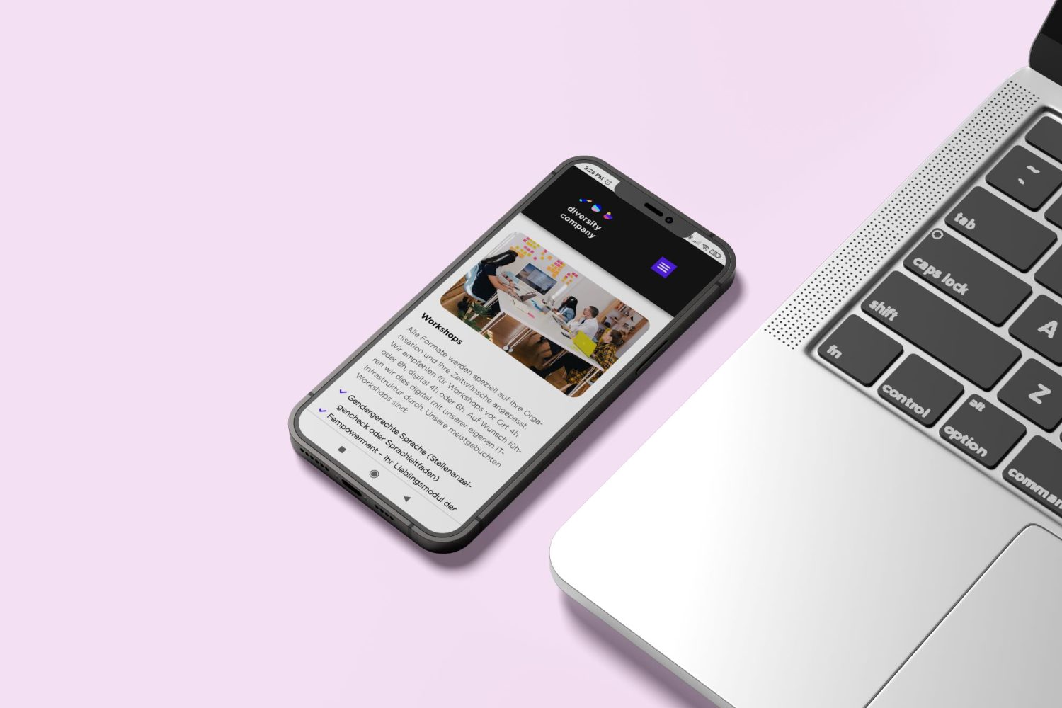
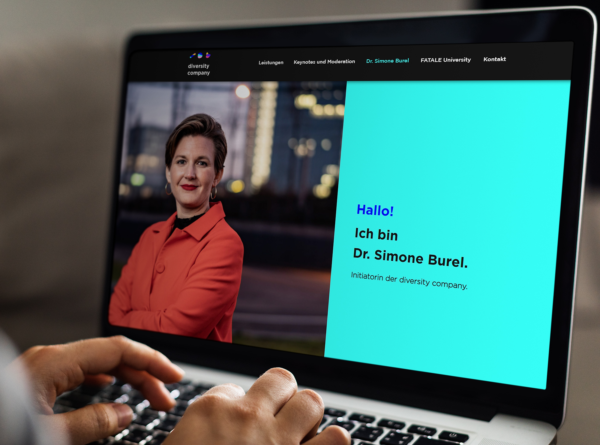
Diversity Company – Branding & Website Design

Diversity Company

Branding & Website Design

About the client:

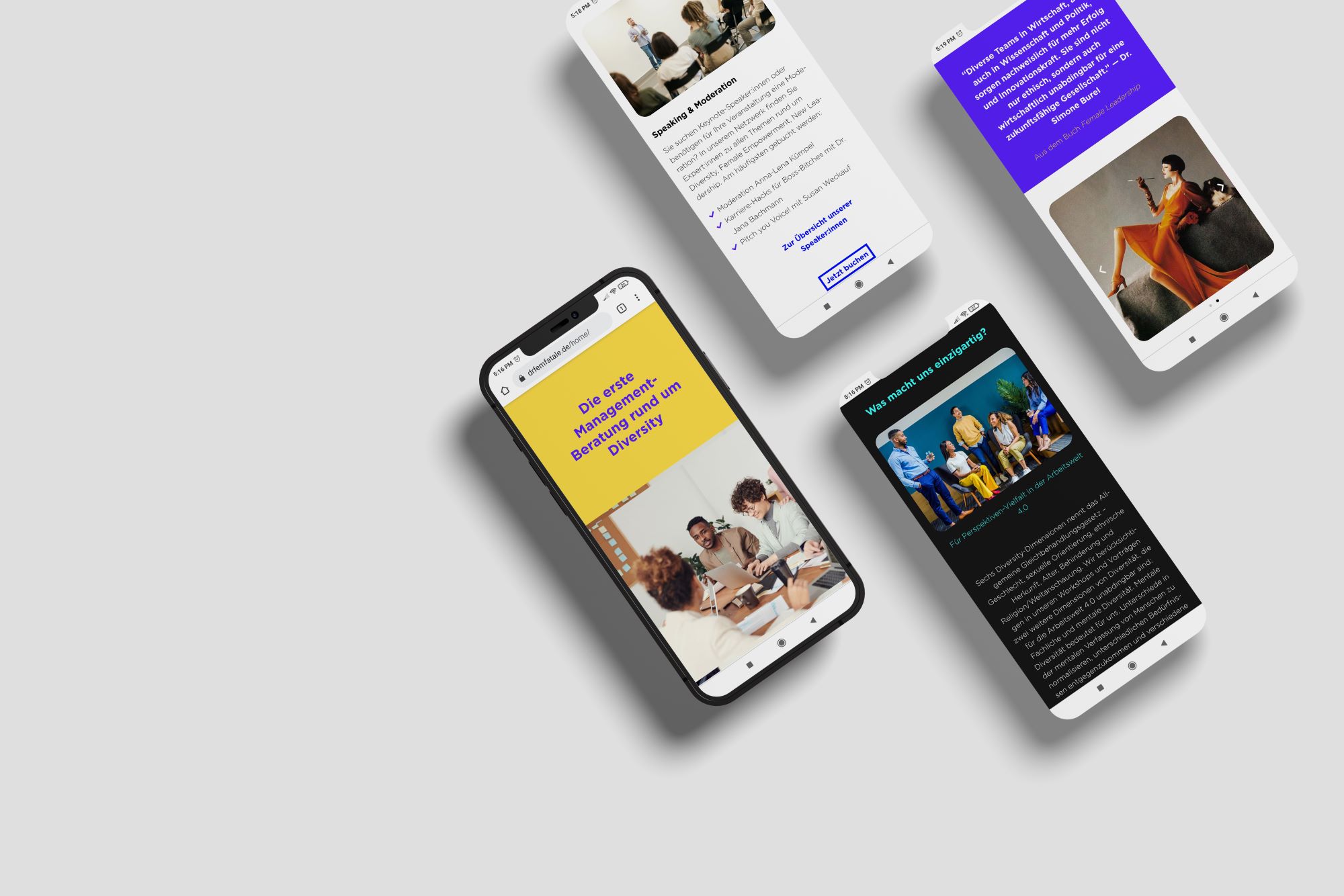
The Diversity Company is a business consultant company specialized in diversity. They advise and support companies, universities and institutions that want to make a change to a more diverse future. 
DC_1 - JPG

Challenges

Confusion about company's mission and services

People were often confused about:

•  What is the company about?
•  What services do they offer?
What are customers paying for?
Is it just for women?

Wrong perception of the company's image

The brand was perceived as a radical feminist asociation from and strictly for women. This in fact was a very wrong perception of what they intended to communicate in the first place.

Logo, colors & aesthetics are not consistent and don't match their values

The Diversity Company had a different name and the old color palette was very “woman-focused”. Besides, they didn’t stick to one consistent image through all their marketing platforms.

Strategy

Design a gender neutral brand which welcomes any person no matter what cultural background or color, and transmits a fresh and open-minded mentality.
Solution

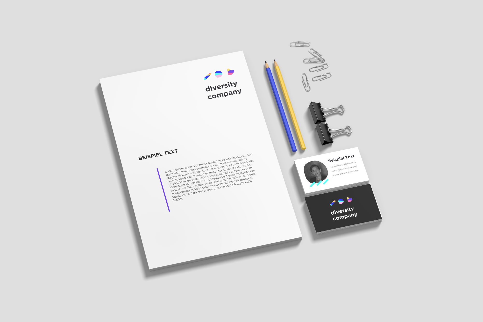
I extended the color palette and chose carefully a wide variety of colors full of energy. Also I created three amorphous forms that should represent the diversity in our society.

Services provided:

• Brand Strategy Workshop

• Corporate Identity (Logo, Color Palette, CI Guide, etc)

• Website Design

Social Media Content

Benefits

More potential leads

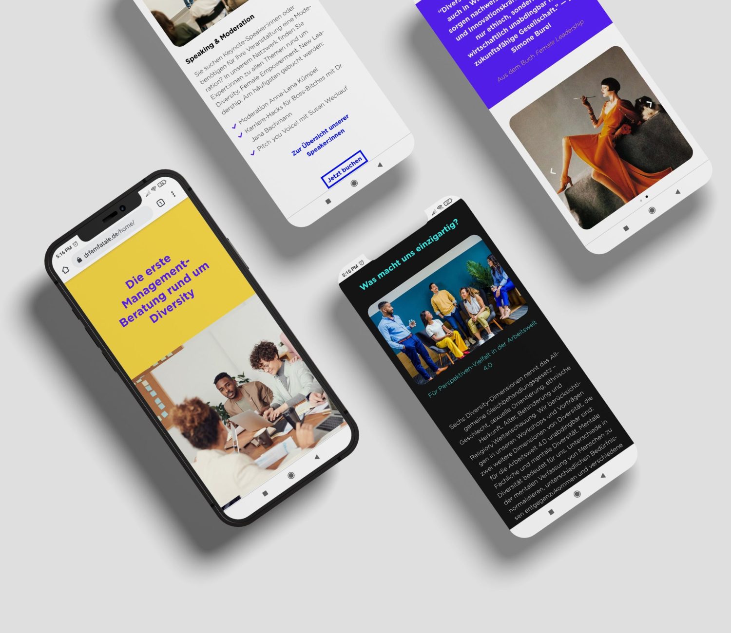
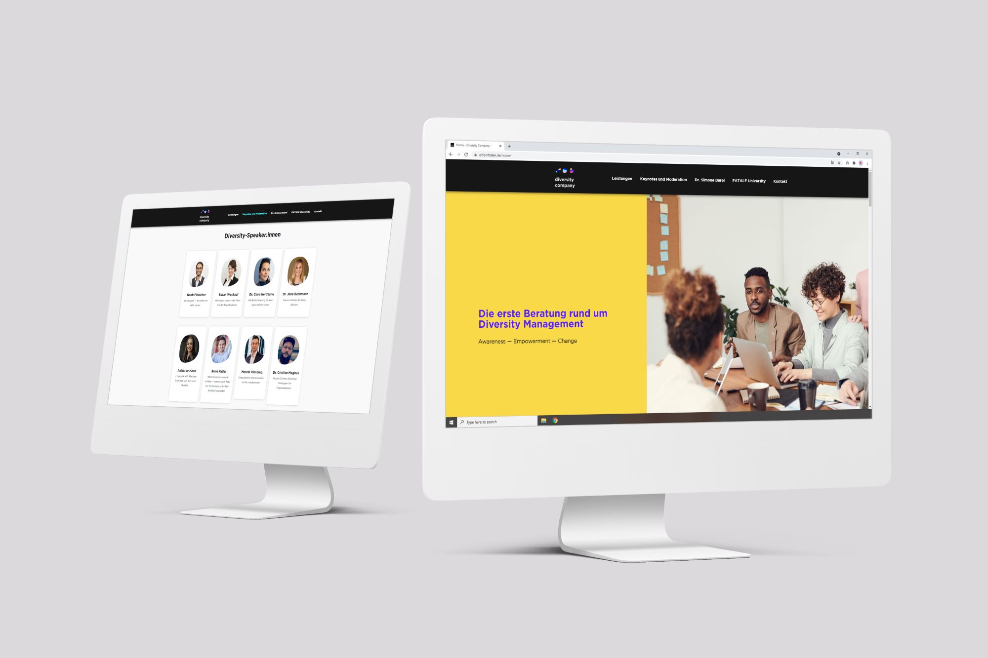
The new website attracts more companies and institutions that didn’t seem to quite understand their services before. The new website has more CTAs and a higher retention rate than the previous one.

Wider community on social media

Since the new image is gender-neutral it invites men, as well as females to support their cause and share their message.

Stable and consistent digital presence

The Diversity Company now has an own personality and identity. This helps their brand to stand out and it sets the tone in all their digital channels. This is a crucial component to make people recognize their brand over time.